Tactics over strategies
In our last post, we discussed the potential for adding a tactical trigger to execute a strategy. In this case, the strategy is investing in a large cap stock index that allows us achieve a compounded annual return of 7% and limits the yearly deviation of that return not to exceed 16%, essentially an index roughly in line with the S&P500. As we noted, there was a 54% chance we might not make our total return goal. And even when we lowered that goal significantly, there was still a 48% chance of missing the goal. That didn’t sound very promising. But perhaps there is a way to execute the strategy that we don’t suffer as much on the downside. The old saw, “Cut your losses and let your winners run!”
There are, of course, a number of ways to implement this tactic. We could limit yearly drawdowns to some predetermined percentage or use some volatility indicator. Another method is to use some trend indicator. The indicator identifies entry and exit points based on some logic. One of the simplest of these is the 200-day moving average, made famous by Prof. J. Siegel in Stocks for the Long Run but also discussed (with some modifications) here and critiqued here. For those familiar with R, there is also a package (Quantstrat) that includes a demo of the strategy based on the paper mentioned above. One can find some details here.
The concept behind the 200-day moving average as an indicator is that:
- the average is sufficiently long to capture a solid trend, distinguishing signal from noise.
- if the trend is broken, you are better to be out of the market.
- it appears simple to understand and easy to implement.
Some issues with the indicator are that one can still get whipsawed (losing money because the trend/signal reverses rapidly when it would have been better simply to hold on) and that psychological factors may make it tough to implement.
Whatever the case, let’s examine the indicator and analyze the data to see if there’s anything to it.
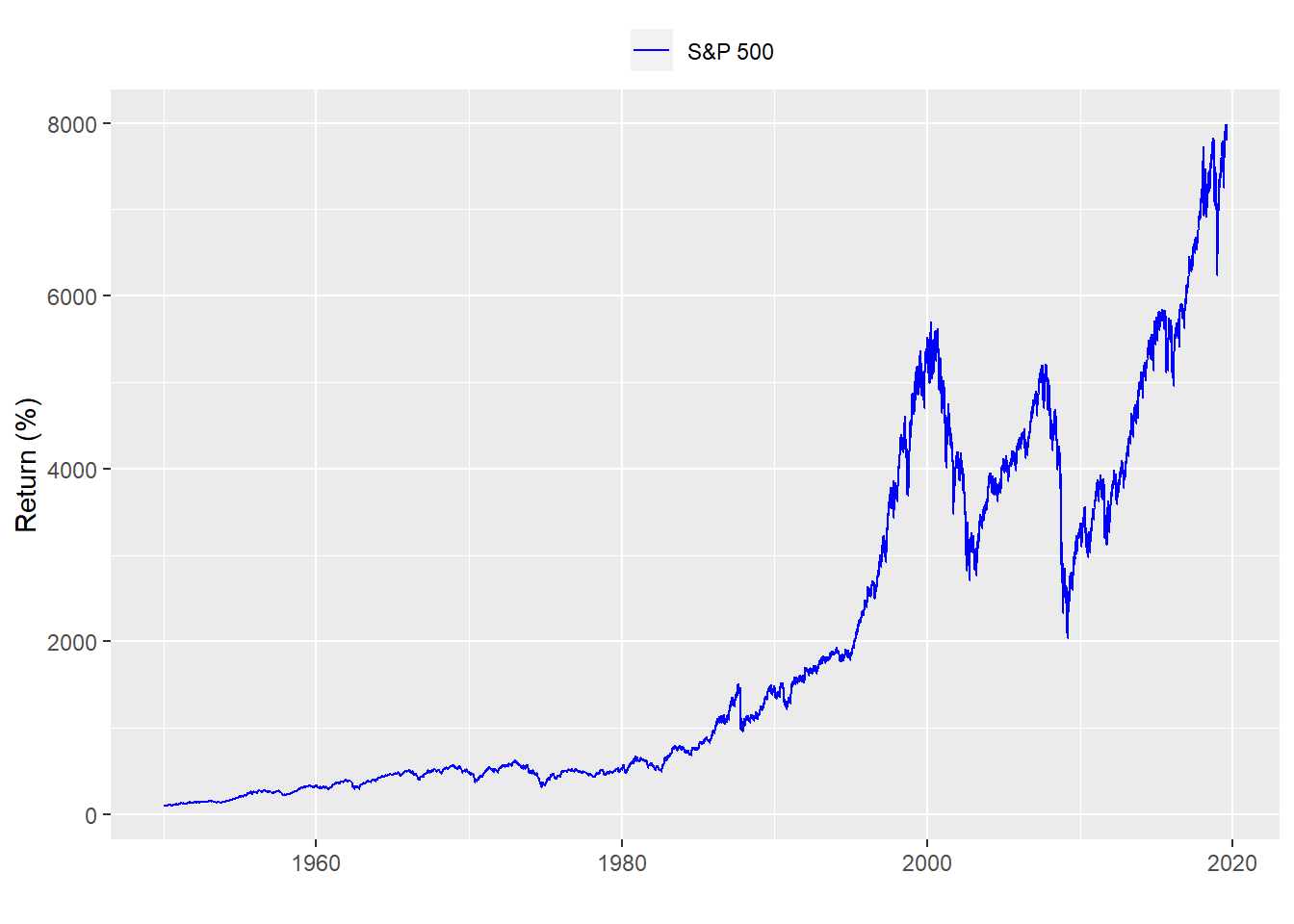
Here’s the long term chart of the price returns for the S&P500:
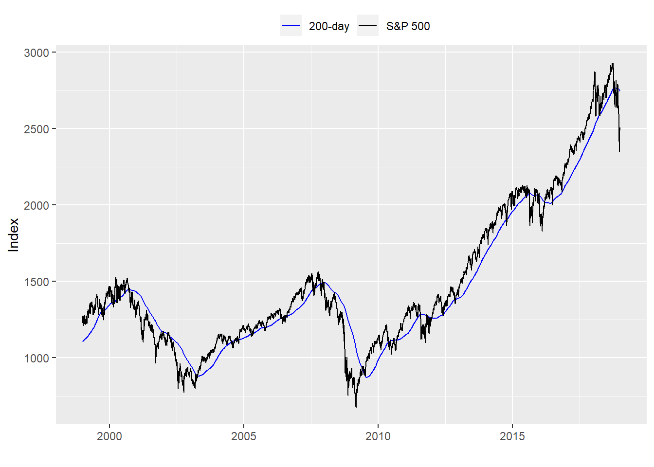
Let’s see what a chart of the S&P with the 200-day moving average looks like. We’ll zoom a bit to make it easier to see. The time period runs from 1999 to 2018.
Now we build a strategy in which we only buy the S&P500 if it is above the 200-day moving average and sell it if it is below. We then calculate the cumulative returns and graph them.
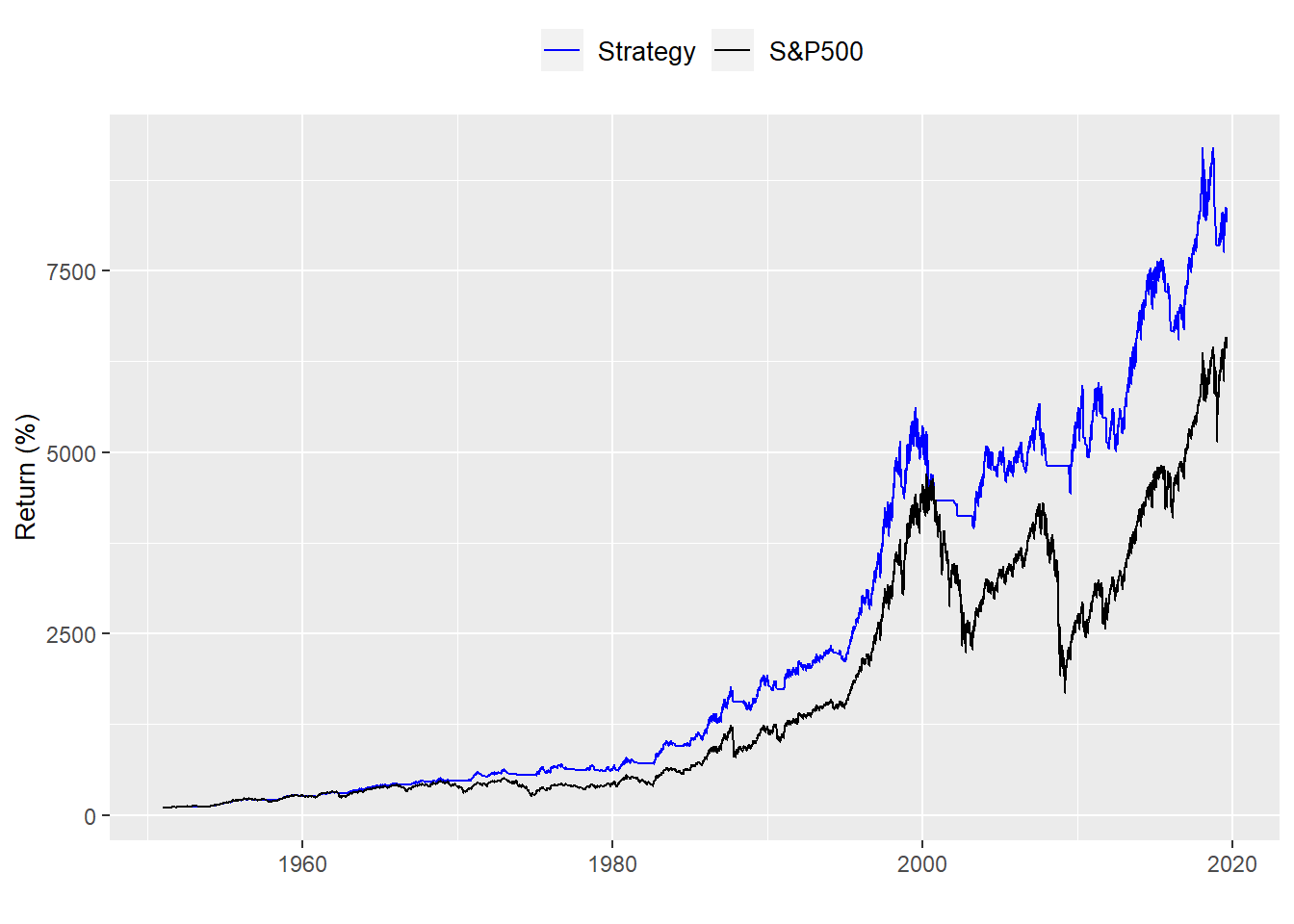
Wow! That looks great. Dramatic outperformance. But let’s take a step back and examine the results. What do the distribution of returns look like?
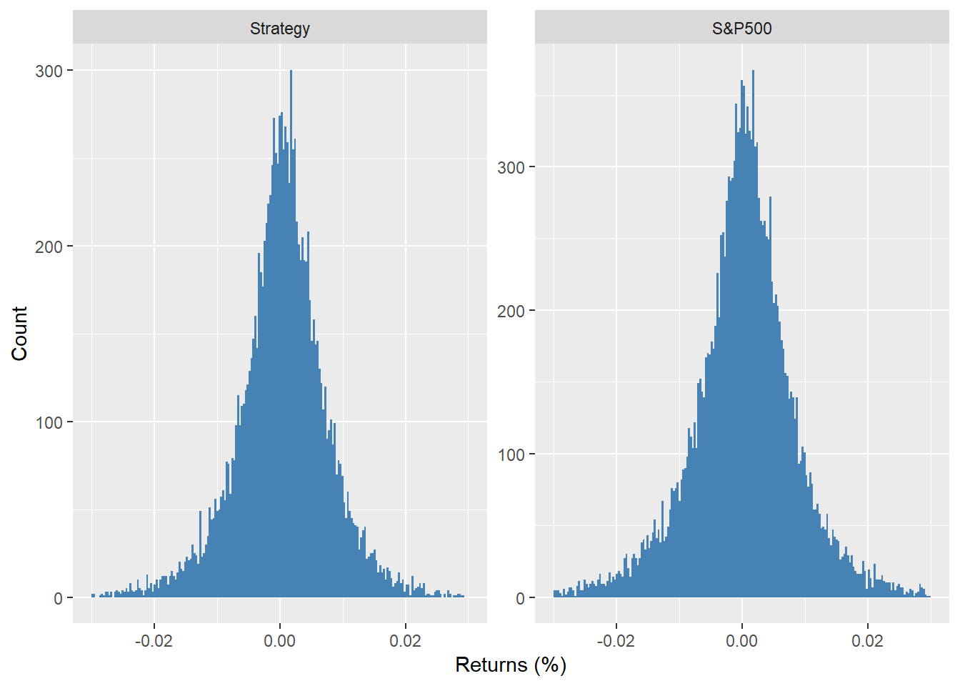
It’s hard to see anything dramatically different although we did remove data for when the strategy was not in the market. That is roughly 5076 days or 14.7% of the time. And what about the risk/reward? Here we compare the average return divided by the volatility scaled by time for the tactical allocation vs. the benchmark. The strategy performs noticeably better. But does that mean we should employ this tactic?
| Portfolio | Return-to-risk |
|---|---|
| Strategy | 0.69 |
| S&P500 | 0.47 |
Recall, we looked at this strategy over a more than 50 year period. Most investors don’t have that time frame. What about over a more realistic 20 to 30-year period?
For the last 30 years ending in 2018 the performance looks as follows:
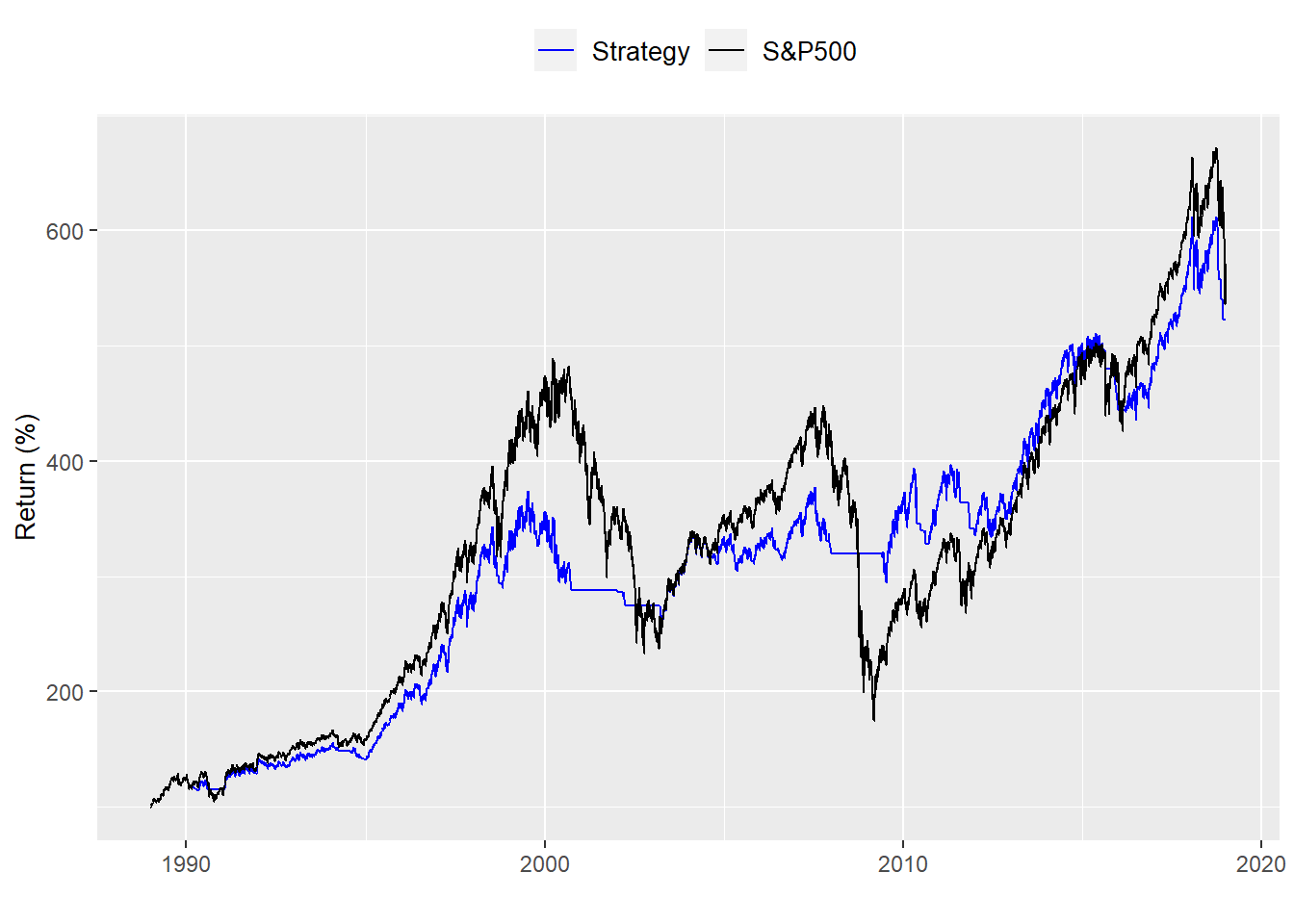
That’s dissapointing. The allocation underperformed on an absolute basis. But on a risk-adjusted basis it was still better.
| Portfolio | Return-to-risk |
|---|---|
| Strategy | 0.54 |
| S&P500 | 0.42 |
What about over the last twenty years ending in 2018
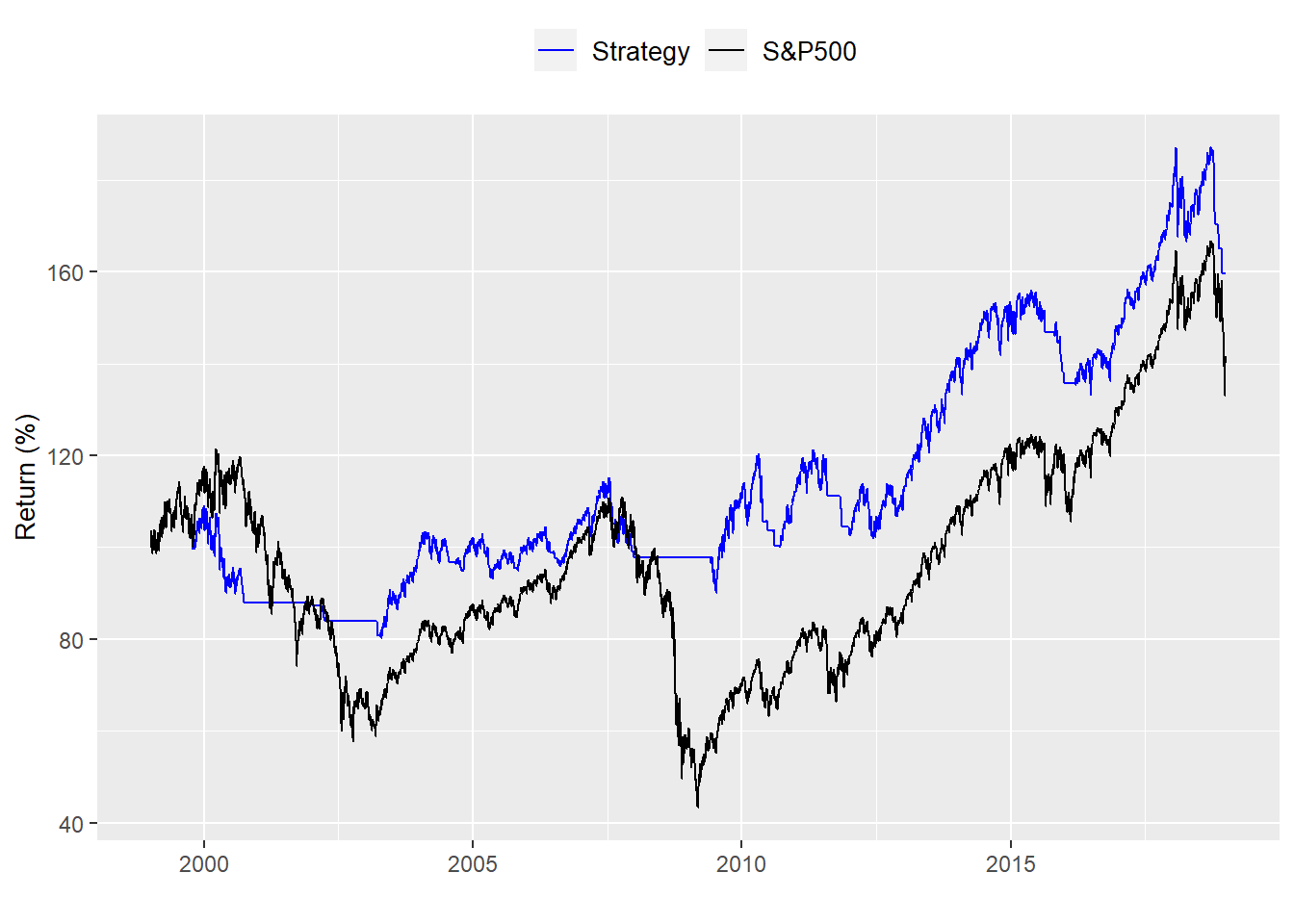
That looks a little better. But it is no where near as dramatic as the performance over the total period. Risk-adjusted performance was also better. But notice the outperformance is narrowing. For the total period the tactic outperformed the benchmark by 21 percentage points. But that narrowed to only 8 percentage points over the last 20 years.
| Portfolio | Return-to-risk |
|---|---|
| Strategy | 0.27 |
| S&P500 | 0.19 |
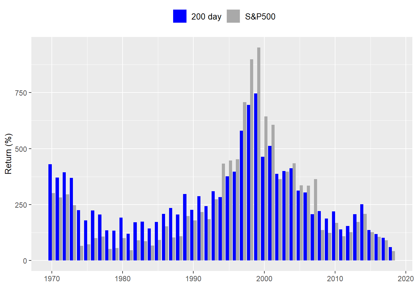
The overall return-to-risk metric has generally declined, but part of that is due to two major recessions in the last tweny years. The key question to ask is, based on this data is it worthwhile employing the 200-day moving average tactic? We’ve looked at only one or two realistic time slices. What if we looked at every 20-year period since the S&P data begins?
While this is a bit of an eye test. Let’s zoom in on the last twenty years or so.
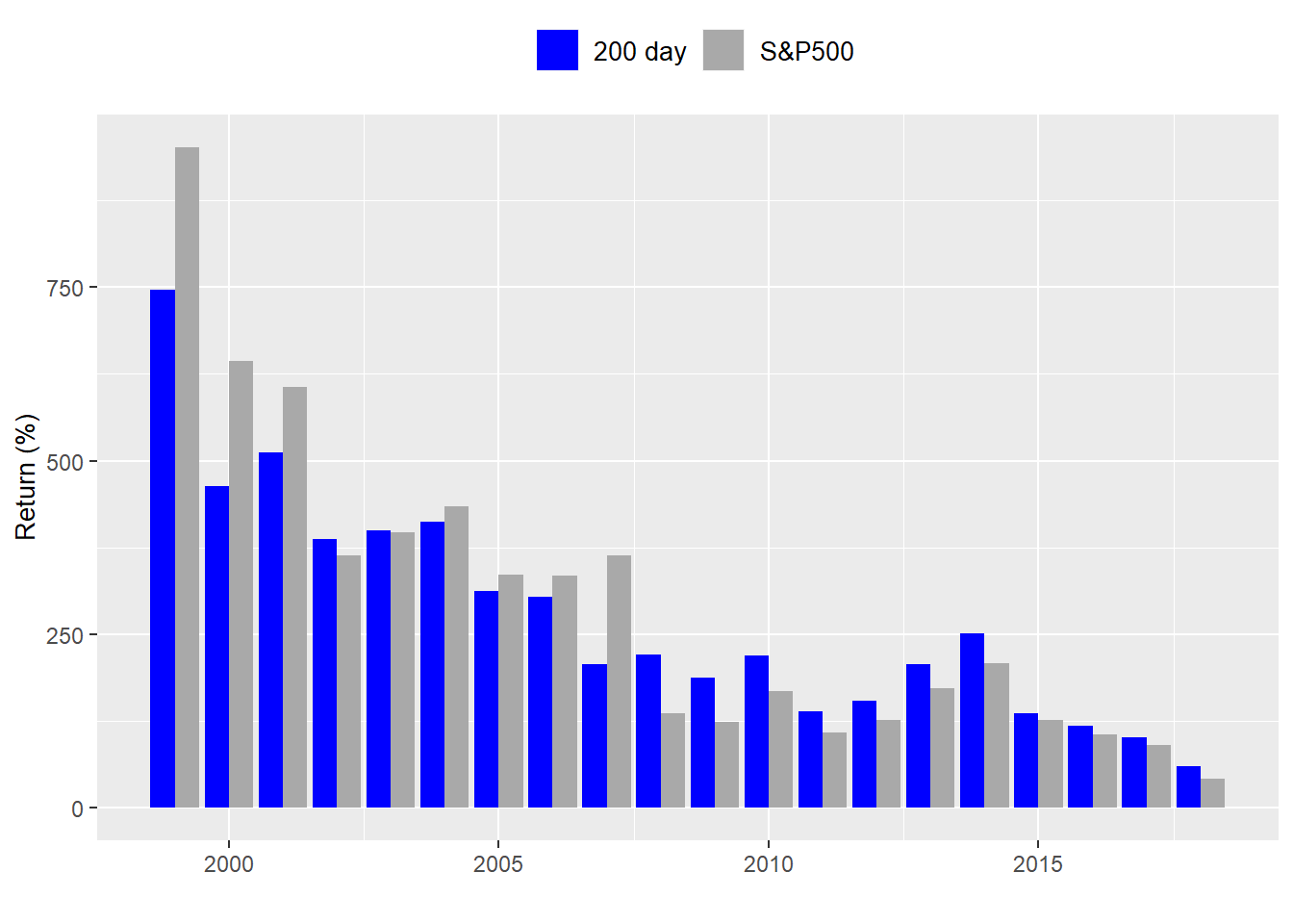
Over the entire period, the tactical allocation outperforms 76% of the time. But since 1990 it only outperforms 59% of the time. Such periods of underperformance may not be so bad particularly if the volatility of performance of the tactical allocation is softened. For now there are two questions to ponder:
Does the tactical allocation allow us to hit our long-term return goal with a higher probability than simply investing in the index?
If it does, is it worth the extra effort to execute the strategy?
Something we’ll look at in another post.
Here’s the code:
# Load package
library(tidyquant)

## Get the data
sp500 <- getSymbols("^GSPC", from = "1950-01-01", auto.assign = FALSE)
sp500 <- Cl(sp500)
sp_ret <- ROC(sp500)
sp_ret[is.na(sp_ret)] <- 0

# Tidy data
df <- data.frame(date = index(sp500), coredata(sp500), coredata(sp_ret))
colnames(df)[2:3] <- c("sp", "ret")
df <- df %>% gather(key, value, -date)

# Plot the data
df %>%
  filter(key == "ret") %>%
  mutate(return = cumprod(1+value)) %>%
  ggplot(aes(date, return*100)) +
  geom_line(aes(color = "return")) +
  ylab("Return (%)") + xlab("") +
  scale_color_manual("", labels = c("S&P 500"),
                     values = c("blue")) +
  theme(legend.position = "top", legend.box.spacing = unit(0.05, "cm"))

# Plot
# Create data frame
df_sp <- data.frame(date = index(sp500), coredata(sp500))
names(df_sp)[2] <- "sp500"

# Create indicator and plot
sma <- SMA(sp500, n = 200)
df_sp <- df_sp %>%
  mutate(sma = ifelse(is.na(as.numeric(sma)), 0, as.numeric(sma)))

# Plot
df_sp %>% gather(index, value, -date) %>%
  filter(date >= "1999-01-01", date <= "2018-12-31") %>%
  ggplot(aes(date, value, color = index)) +
  geom_line() +
  ylab("Index") + xlab("") +
  scale_color_manual("", labels = c("200-day", "S&P 500"),
                     values = c("blue", "black")) +
  theme(legend.position = "top", legend.box.spacing = unit(0.05, "cm"))

# create signal
sig <- Lag(ifelse(sma$SMA < sp500, 1, 0))

# Calculate daily returns
ret <- ROC(sp500)*sig

# Create benchmark returns
sp_ret <- ROC(sp500)

# Name strategies
names(ret) <- "ret"
names(sp_ret) <- "sp_ret"

# Graph strategies

# Create tidy data frame
strat <- data.frame(date = index(ret), ret = coredata(ret), sp_ret = coredata(sp_ret)) %>%
  gather(key, value, - date) %>%
  filter(date > "1950-12-31")

# Graph strategy
strat %>%
  group_by(key) %>%
  mutate(value = cumprod(value+1)*100) %>%
  ggplot(aes(date, value, color = key)) +
  geom_line() +
  xlab("") + ylab("Return (%)") +
  scale_color_manual("", labels = c("S&P500", "Strategy"),
                     values = c("black", "blue")) +
  theme(legend.position = "top",
        legend.text = element_text(size = 10),
        axis.title = element_text(size = 10))

# histogram excluding periods in which strategy is not in the market
strat %>%
  select(-date) %>%
  mutate(value = ifelse(key == "ret",ifelse(as.numeric(sig["1951/2019"]) == 0,
                                                 NA, value), value)) %>%
  na.omit() %>%
  ggplot(aes(value)) +
  geom_histogram(bins = 200, fill = "steelblue") +
  xlim(c(-0.03, 0.03))+
  xlab("Returns (%)") + ylab("Count") +
  facet_wrap(. ~ key, scales = "free_y",
             labeller = labeller(key = c(ret = "Strategy", sp_ret = "S&P500")))

# metrics
strat %>%
  group_by(key) %>%
  summarise("Return-to-risk" = round(mean(value)/sd(value) * sqrt(252),2)) %>%
  mutate(key = ifelse(key == "ret", "Strategy", "S&P500")) %>%
  rename("Portfolio" = key) %>%
  knitr::kable()

#   1989-2018 graph
strat %>%
  filter(date >= "1989-01-01", date <= "2018-12-31") %>%
  group_by(key) %>%
  mutate(value = cumprod(value+1)*100) %>%
  ggplot(aes(date, value, color = key)) +
  geom_line() +
  xlab("") + ylab("Return (%)") +
  scale_color_manual("", labels = c("Strategy", "S&P500"),
                     values = c("blue", "black")) +
  theme(legend.position = "top",
        legend.text = element_text(size = 10),
        axis.title = element_text(size = 10))

# 1989-2018 table
strat %>%
  filter(date >= "1989-01-01", date <= "2018-12-31") %>%
  group_by(key) %>%
  summarise("Return-to-risk" = round(mean(value)/sd(value) * sqrt(252),2)) %>%
  mutate(key = ifelse(key == "ret", "Strategy", "S&P500")) %>%
  rename("Portfolio" = key) %>%
  knitr::kable()

# 1999-2018 graph
strat %>%
  filter(date >= "1999-01-01", date <= "2018-12-31") %>%
  group_by(key) %>%
  mutate(value = cumprod(value+1)*100) %>%
  ggplot(aes(date, value, color = key)) +
  geom_line() +
  xlab("") + ylab("Return (%)") +
  scale_color_manual("", labels = c("Strategy", "S&P500"),
                     values = c("blue", "black")) +
  theme(legend.position = "top",
        legend.text = element_text(size = 10),
        axis.title = element_text(size = 10))

# 1999-2018 table
strat %>%
  filter(date >= "1999-01-01", date <= "2018-12-31") %>%
  group_by(key) %>%
  summarise("Return-to-risk" = round(mean(value)/sd(value) * sqrt(252),2)) %>%
  mutate(key = ifelse(key == "ret", "Strategy", "S&P500")) %>%
  rename("Portfolio" = key) %>%
  knitr::kable()

# Create index of years
index <- data.frame(start_date = seq(as.Date("1951-01-01"), length = 49, by = "years"),
                    end_date = seq(as.Date("1970-12-31"), length = 49, by = "years"))

# Function to calculate 20-year cumulative return
perf_func <- function(df, start_date, end_date){
  data <- df %>%
    filter(date >= start_date, date <= end_date) %>%
    group_by(key) %>%
    summarise(perf = Return.cumulative(value)) %>%
    select(perf) %>%
    t()
  return(as.numeric(data))
}

# Create data frame and run For loop
perf <- data.frame(ret = rep(0,49), sp_ret = rep(0,49))
for(i in 1:49){
  perf[i,] <- perf_func(strat, index[i,1], index[i,2])
}
perf

# Add years
perf <- perf %>%
  mutate(year = year(index$end_date))

# graph perf
perf %>%
  gather(key, value, -year) %>%
  ggplot(aes(year, value, fill = key)) +
  geom_bar(stat = "identity", position = "dodge") +
  scale_fill_manual("", labels = c("200 day", "S&P500"),
                    values = c("blue", "darkgrey")) +
  xlab("") + ylab("Return (%)") +
  theme(legend.position = "top",
        legend.text = element_text(size = 10),
        axis.title = element_text(size = 10))

# shorter graph
perf %>%
  gather(key, value, -year) %>%
  filter(year >= "1999") %>%
  ggplot(aes(year, value, fill = key)) +
  geom_bar(stat = "identity", position = "dodge") +
  scale_fill_manual("", labels = c("200 day", "S&P500"),
                    values = c("blue", "darkgrey")) +
  xlab("") + ylab("Return (%)") +
  theme(legend.position = "top",
        legend.text = element_text(size = 10),
        axis.title = element_text(size = 10))

# Outperformance

tot_opf <- perf %>%
  summarise(prop = round(mean(ret > sp_ret),2)*100) %>%
  as.numeric()

part_opf <- perf %>%
  filter(year >= "1990") %>%
  summarise(prop = round(mean(ret > sp_ret),2)*100) %>%
  as.numeric()
```