Diversification: fact or fiction?
“Diversify, diversify, diversify!” Mantra, call-to-arms, or warning. Whether you’re an amateur or professional, a student or professor, a pedestrian or pundit you’ve been told that diversification is patently good when it comes to investing. Golly, it makes sense. Don’t bet it all black. Don’t own just one stock. Even grandma knows this. After all, she told you not to put all your egss in one basket. Then again she also told you about the Easter Bunny, who did just that.
But there is another side to this coin. And on that side we find the likes of legendary investor, Warren Buffett, who disparages diversification and likens it to the less-than-pc analogy of having a large harem.1 His point is that if you’re trying to find the best investments, the number of assets you need to own to make diversification work precludes optimal performance. There simply aren’t that many stocks (or bonds, or real assets, or anything else) that fit the criteria of potentially high risk-adjusted returns. Note that at time he made these comments, Buffett’s goal was to beat the Dow by 10 percentage points per year.
Who should we believe the consensus or the outlier? The wisdom of crowds or the wisdom of the master? Let’s look at the data.
Playing with toys
There are many ways to explain the effects of diversification; some arcane, some folksy. We’ll use the tools of data science to build a random group of stocks that we then incorporate into a portfolio, which we can then manipulate to get an intuition (graphically) for the benefits (and drawbacks) of diversification.
First, let’s assume we have ten stocks called, creatively, A through J. We randomly generate the stocks’ monthly returns over a five-year period. Here’s a graph of those cumulative returns.
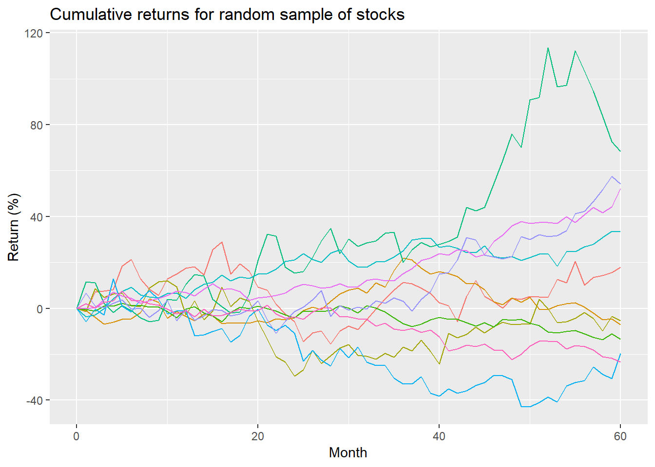
To produce this group of stocks we created a range of prospective returns and volatilities and then randomly selelcted from those ranges to generate each of the stock’s growth and risk pattern. As one can see, one stock performed pheonomenally well, a few were pretty good, and a couple were poor. This is not meant to represent perfectly the range of returns one would normally expect within a universe a stocks; it merely seeks to outline a smattering of stocks that approximate different risk and return profiles to flesh out a toy exmaple.
The cumulative return of each stock over the entire period is represented below. The red line is the average.
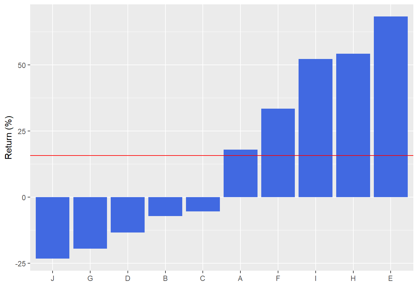
As one can see at the end of 5 years, the cumulative return clusters around a range of -23.3% to 54.3%. The average cumulative return is around 15.7%. But that includes the outsized return of stock E. Excluding E, the average return is 9.9%.
The sepecific numbers aren’t that important. Rather, it’s to see that there’s a range of risk/return outcomes that one might normally find looking at a random group of stocks.
Playing with diversification
What is the point of diversification? Presumably, it’s to protect the investor from a large loss, But how do you decide what is large? That question does not have a single answer since it will depend on the investment obejectives of the investor (individual or group). Each investor has different return and risk preferences and tolerances. As these preferences and tolerances imply particular (rather than general) scenarios, a comprehensive answer to the question might be untenable. Perhaps a different question would be better. Is one always better off being diversified? The clever answer is of course not! If you had bought Apple when it was $1 why would you need diversification!! But that is a decidedly hindsight 20-20 answer. Hence, the more nuanced question is, if you didn’t know how each stock would perform, would you be better off being diversified rather than not?
Tough to answer for a couple reasons. Even though no one truly knows how a stock will perform, everyone has an opinion. Removing those opinions (or biases if you will) is difficult. The second reason it is tough to answer is because you won’t actually know you would have been better off until after the fact, which might be too late. In other words, the question implies future knowledge, which no one has. Fortunately, using the toy model we can play with some ways to diversify to see if we would have been better off if we hadn’t diversified. This shoud build our inttuition of possible future outcomes. But we should keep in mind that we’re analyzing something that could happen, rather than will.
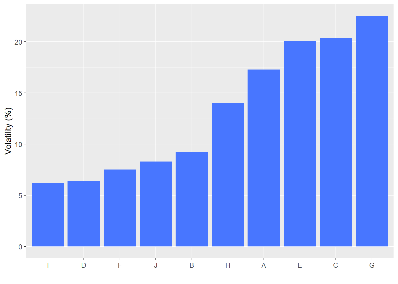
The typical metric used to assess risk is volatility, which we baked into our toy model. Volatility measures how much a stock moves up or down. The assumption being that most invvestors would prefer stocks that move up and down less, rather than more. We won’t get into the issue that “standard” volatility measures weigh the up and down movements almost equally, but investors tend to prefer stocks that move up a lot, and move down not at all.
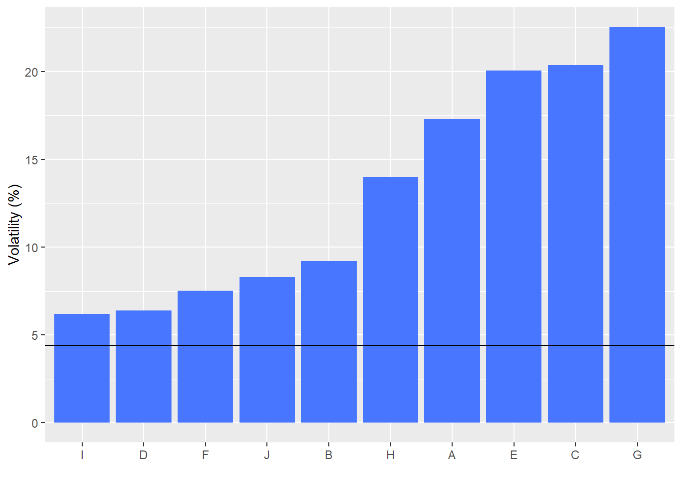
Let’s build a portfolio of the ten stock and see whether the volatility of the portfolio is better or worse than the volatility of any individual stock. Here we simply equal weight the exposure to each stock and measure the volatility over the entire period of the portfolio and then compare it to the volatility of each stock. The following graph shows the annualized volatility of each stock over the period. That means, for example, that stock J moved up or down around 15% per year about 70% of the time.
So how does the volatility of the portfolio compare to the volatility of each stock? Surprisingly good. The volatility of the portfolio is the horizontal black line. We see that it is below the volatility of every one of the stocks, sometimes substantially so. The main reason that the portfolio performed so much better than the individual stocks has to do with correlation. Rather than get sidetracked by that concept, just take it as given, and we’ll explain it more fully in one of the next posts.
Great! Clearly we’re better off being diversified than not. Since in all cases the portfolio exhibited lower volatility. But not so fast. This was only one case in which we equal-weighted the assets. Secondly, risk is only one side of the coin. We care about returns. Let’s focus on this second issue.
We graph the average annualized return of each stock with the horizontal line showing the portfolio return. This is essentially the average of the average returns since the portfolio is equal-weighted.
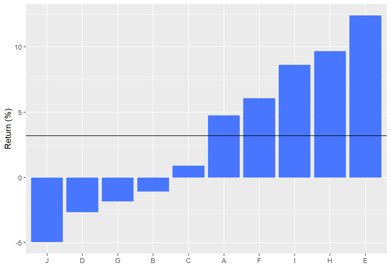
Looking at this graph just a bit deeper we can see why Buffett might disparage diversification. The portfolio’s average return is just that, average. Recall, Buffett’s goal was to outperform the market substantially. This gets back to the preferences issue we discussed above. By the way, cumulative returns to the portfolio and the individual stocks end up looking about the same as average returns.
Now lets put ths all together to see what the graph of the portfolio’s return over the period looks like compared to the individul stocks. The portfolio is the thicker black line in the graph below. The portfolio has a modest upward trend with peaks and valleys less acute than any of the individual stocks.
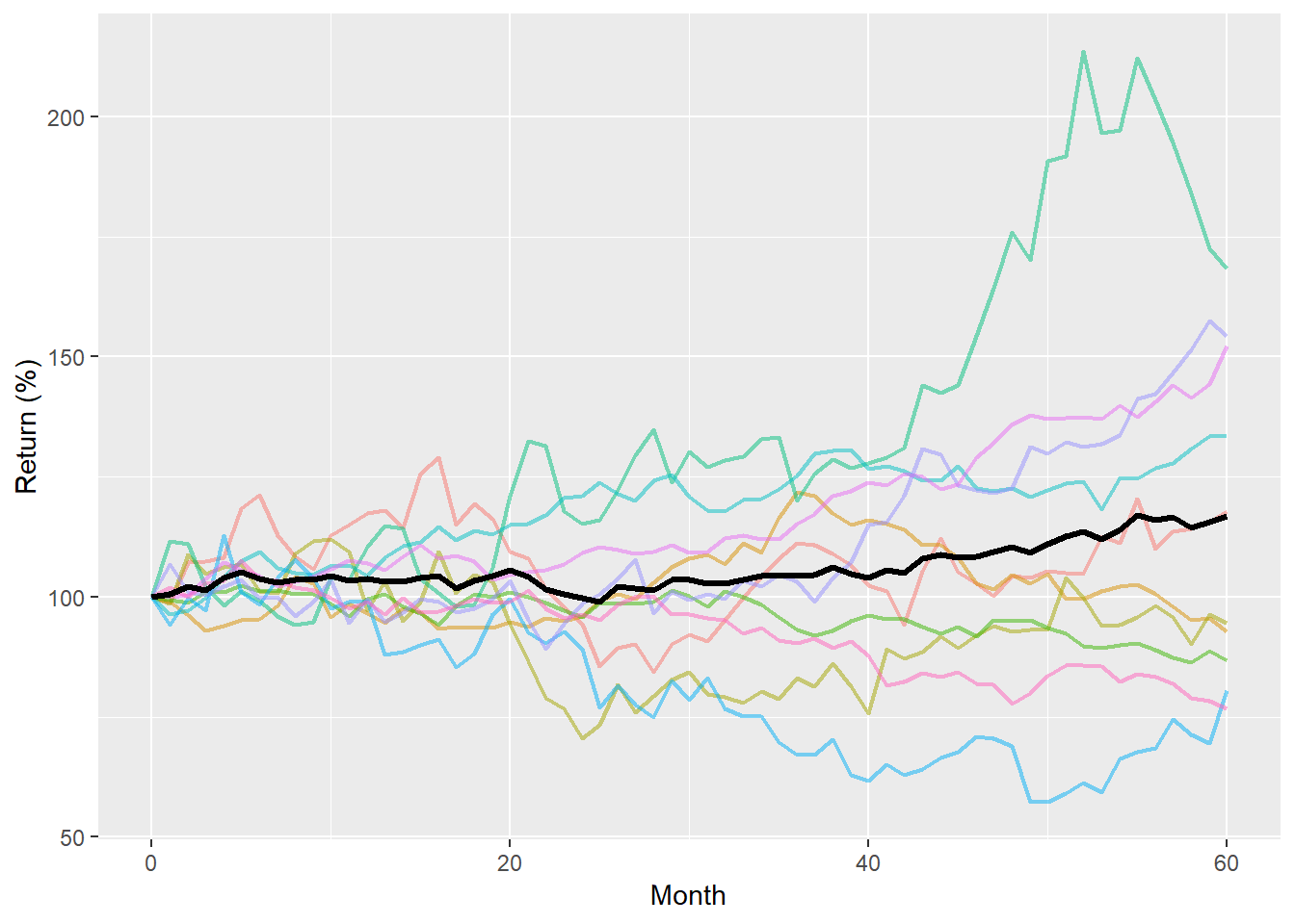
This graph raises many questions. First, did we answer our earlier question? While it is easy to see that the portfolio is a lot less volatile, the cumulative return is a coin toss. Is it better in this case to accept average performance for minimal volatility? Or risk the grave misfortune of stock picking? If you think about various answers and how to judge which one is better, you notice that, in general, most answers are more about preferences than facts. One investor might say he’d rather risk losing 10% if he could reasonably expect to earn 20%. Another investor might say that she prefers a lower return in favor of not having to worry about losing more than 5%. It’s tough to say either answer is objectively better, only that one is better based on preferences or tolerances.
Nonethelesss, there is a way to rank whether the return you get is better for one stock (or the portfolio) given the risk you must bear. Simply divide the return by the risk, which gives you a metric of how much return you get per unit of risk. For example if your return-to-risk ratio is 40%, for every dollar you risk you can expect to generate about 40cts of return. When we calculate the return-to-risk ratios. We see that the portfolio has a better ratio than eight out of the ten stocks.
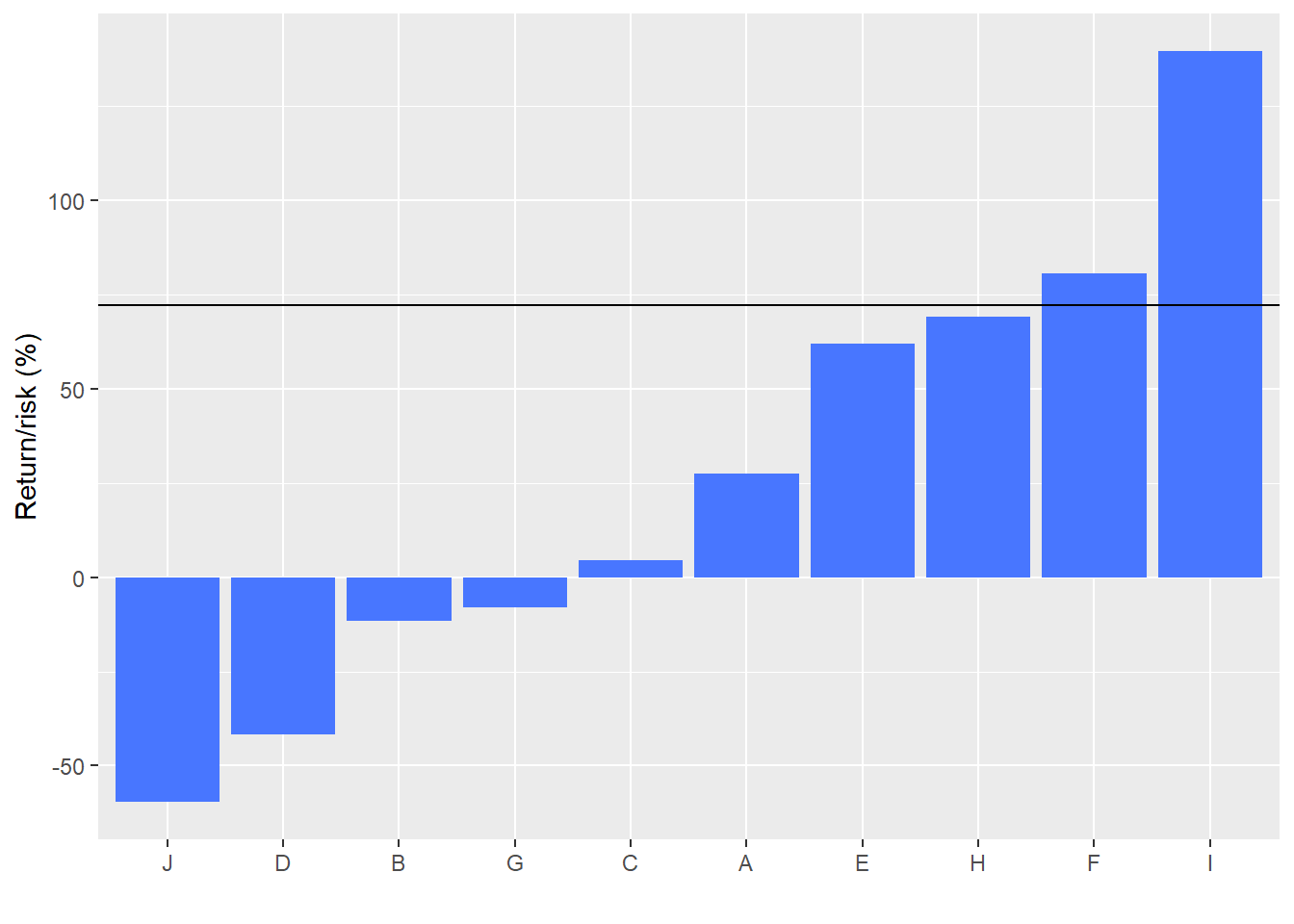
This clearly takes us much closer to answering our question. Yet it answers a yes or no question, with a maybe. True, it’s 80% maybe in favor of yes (the portfolio’s return-to-risk ratio is 80% better than any stock). But still incomplete for a host of reasons. The big one is that We only looked at one portfolio weighting. In reality, there are millions of ways to weight the stocks or choose fewer stocks and weight those combinations. 2
Nonetheless, many combinations are not meaningfully different, and, as you reduce the number of stocks you own, the diversification benefits slip away. Is there some combination of stocks that is better than all others based on return-to-risk ratios? Academic theory asserts there is. But we want to build a data-driven intuition. In our next post, we’ll look at why we saw a benefit from diversification in this example and then try to create a large sample of portfolios to see if we can answer our initial question on a larger scale.
Here’s the code behind the analysis and graphs:
# Load package
library(tidyquant)

# Create toy portfolio
set.seed(123)

mu <- seq(-.03/12,.08/12,.001)
sigma <- seq(0.02, 0.065, .005)

mat <- matrix(nrow = 60, ncol = 10)
for(i in 1:ncol(mat)){
  mu_samp <- sample(mu, 1, replace = FALSE)
  sig_samp <- sample(sigma, 1, replace = FALSE)
  mat[,i] <- rnorm(nrow(mat), mu_samp, sig_samp)
}

df <- as.data.frame(mat)
asset_names <- toupper(letters[1:10])
colnames(df) <- asset_names


# Generate cumulative returns
df_comp <- rbind(rep(1,10), cumprod(df+1))

# Graph cumulative returns
df_comp %>%
  mutate(date = 0:60) %>%
  gather(key, value, -date) %>%
  ggplot(aes(date, (value-1)*100, color = key)) +
  geom_line() +
  ylab("Return (%)") + xlab("Month") +
  theme(legend.position = "none")


# Calculate average cumulative return and excluding large outlier
avg_cumul <- df_comp %>%
  slice(61) %>%
  summarise(avg = (rowMeans(.)-1)*100) %>%
  as.numeric()

avg_ex <- round(mean(as.numeric(df_comp[61, names(df_comp) != "E"]))-1,3)*100
range_ex <- round(range(df_comp[61, names(df_comp) != "E"])-1,3)*100

# Column chart of cumulative return with average
df_comp %>%
  gather(key,value) %>%
  group_by(key) %>%
  slice(61) %>%
  ggplot(aes(reorder(key, value), (value-1)*100)) +
  geom_bar(stat = 'identity', fill = "royalblue") +
  geom_hline(yintercept = avg_cumul, color = "red") +
  ylab("Return (%)") + xlab("")

# Create volatility date frame
vol <- df %>% summarise_all(., sd) %>% t() %>% as.numeric()
vol <- data.frame(asset = asset_names, vol = vol)

# Create portfolio volatility
weights <- rep(0.1, 10)
port_vol <- sqrt(t(weights) %*% cov(df) %*% weights)

# Graph asset volatility
vol %>%
  mutate(vol = vol*sqrt(12)*100) %>%
  ggplot(aes(reorder(asset, vol), vol)) +
  geom_bar(stat = "identity", fill = "royalblue1") +
  ylab("Volatility (%)") + xlab("") +
  theme(legend.position = "none")


# Graph volatility of assets vs portfolio
vol %>%
  mutate(vol = vol*sqrt(12)*100) %>%
  ggplot(aes(reorder(asset,vol), vol)) +
  geom_bar(stat = "identity", fill = "royalblue1") +
  geom_hline(yintercept = round(port_vol*sqrt(12),3)*100) +
  ylab("Volatility (%)") + xlab("") +
  theme(legend.position = "none")

# Calculate mean returns
mean_ret <- df %>% summarise_all(., mean) %>% as.numeric()
mean_ret <- data.frame(asset = asset_names, returns = mean_ret)

## Portfolio returns
port_ret <- sum(weights*mean_ret$returns)


# Graph mean asset returns vs portfolio
mean_ret %>%
  mutate(returns = returns*1200) %>%
  ggplot(aes(reorder(asset,returns), returns)) +
  geom_bar(stat = "identity", fill = "royalblue1") +
  geom_hline(yintercept = port_ret*1200) +
  ylab("Return (%)") + xlab("") +
  theme(legend.position = "none")

# Cumulative portfolio return
ret <- rowSums(df*weights)
cum_ret <- c(1, cumprod(1+ret))

# Graph cumulative return of assets vs portfolio
df_comp %>%
  gather(key, value) %>%
  group_by(key) %>%
  slice(61)%>%
  ggplot(aes(reorder(key, value), (value-1)*100)) +
  geom_bar(stat = "identity", fill = "royalblue1") +
  geom_hline(yintercept = (cum_ret[61]-1)*100) +
  ylab("Return (%)") + xlab("")

# Create two data frames for stocks and portfolio
individual <- df_comp %>%
  mutate(date = 0:60) %>%
  gather(key, value, -date)

portfolio <- data.frame(date = 0:60, portfolio = cum_ret)

# Graph portfolio and individual stocks
ggplot() +
  geom_line(aes(date, value*100, color = key), data = individual, size = 0.8, alpha = 0.5) +
  geom_line(aes(date, portfolio*100), data = portfolio, color = "black", size = 1.1) +
  ylab("Return (%)") + xlab("Month") +
  theme(legend.position = "none")

## Risk return trade-off

# Create portfolio tibble
port <-tibble(key = "Portfolio",
                   return = mean(ret),
                   vol = sd(ret),
                   ret_vol = mean(ret)/sd(ret)*sqrt(12))

# create graph
df %>%
  gather(key, value) %>%
  group_by(key) %>%
  summarize(return = mean(value),
            vol = sd(value),
            ret_vol = return/vol*sqrt(12)) %>%
  ggplot(aes(reorder(key, ret_vol), ret_vol*100)) +
  geom_bar(stat = "identity", fill = "royalblue1") +
  geom_hline(yintercept = port$ret_vol*100) +
  ylab("Return/risk (%)") + xlab("")