Null hypothesis
In our previous post we ran two investing strategies based on Apple’s last twelve months price-to-earnings multiple (LTM P/E). One strategy bought Apple’s stock when its multiple dropped below 10x and sold when it rose above 20x. The other bought the stock when the 22-day moving average of the multiple crossed above the current multiple and sold when the moving average crossed below. In both cases, annualized returns weren’t much different than the benchmark buy-and-hold, but volatility was, resulting in significantly better risk-adjusted returns.1 Despite these results, we were skeptical that either strategy was necessarily viable for different reasons—behavioral for the first, and biased for the second.
Nonetheless, we think it could be instructive to follow-through with the analysis and test how the strategies would have performed year-to-date in 2019. Our post today, carries on with that analysis and then introduces a metric for analyzing strategy performance that relies on data science principles not traditionally employed in performance analytics.
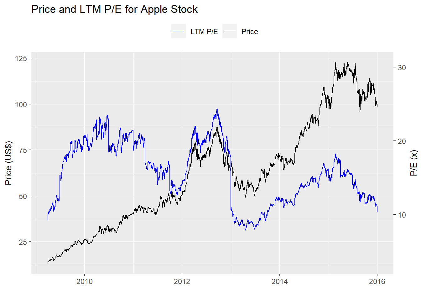
First, let’s load the data and look at some stock price and multiple charts before getting into the meat of the post. Here’s the original chart on which we based our strategy hypothesis.
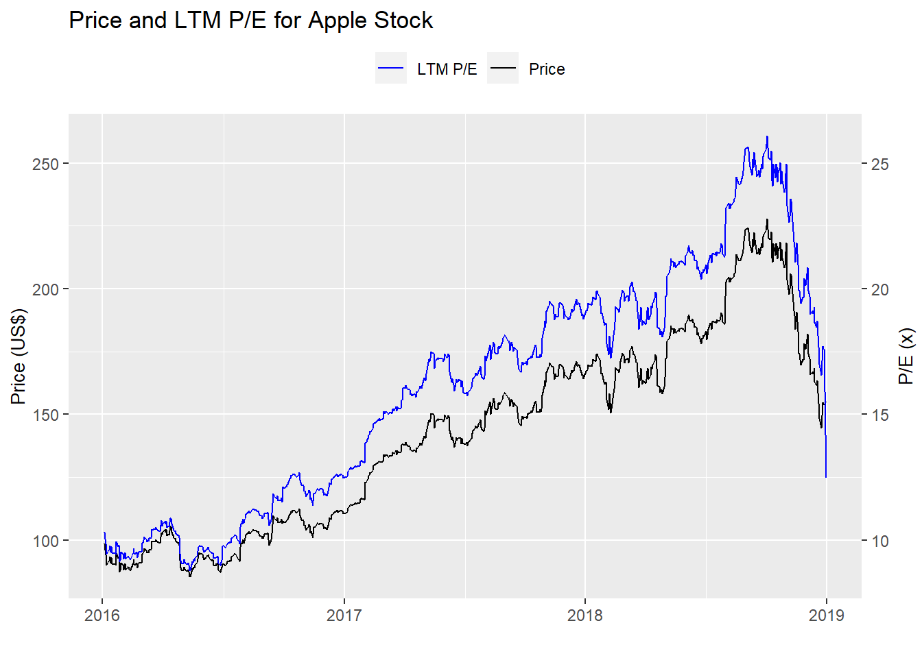
And here’s the period on which we validated the strategies. Not exactly the same market.
Testing, testing, 2019
We run the first strategy—buy at 10x earnings and sell at 20x—on the year-to-date 2019 data and graph the result below.
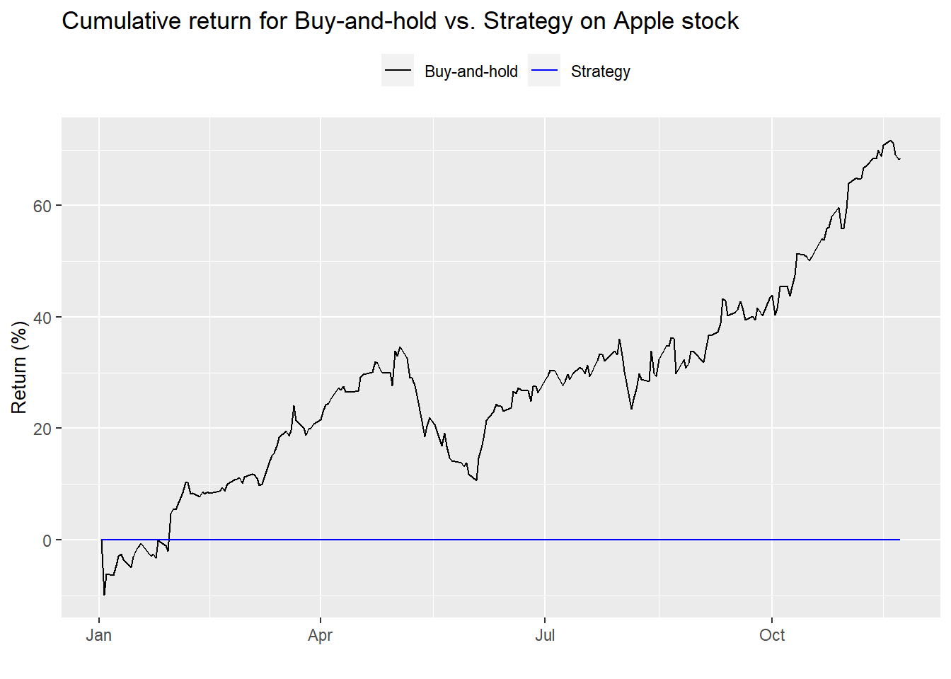
Uh, dude, where’s my strategy? The strategy isn’t even in the market because Apple’s multiple was over 20x for most of 2019. Hence, as we said before, the strategy’s a non-starter. No point in even showing summary performance statistics. Let’s move on to the next strategy—the moving average multiple
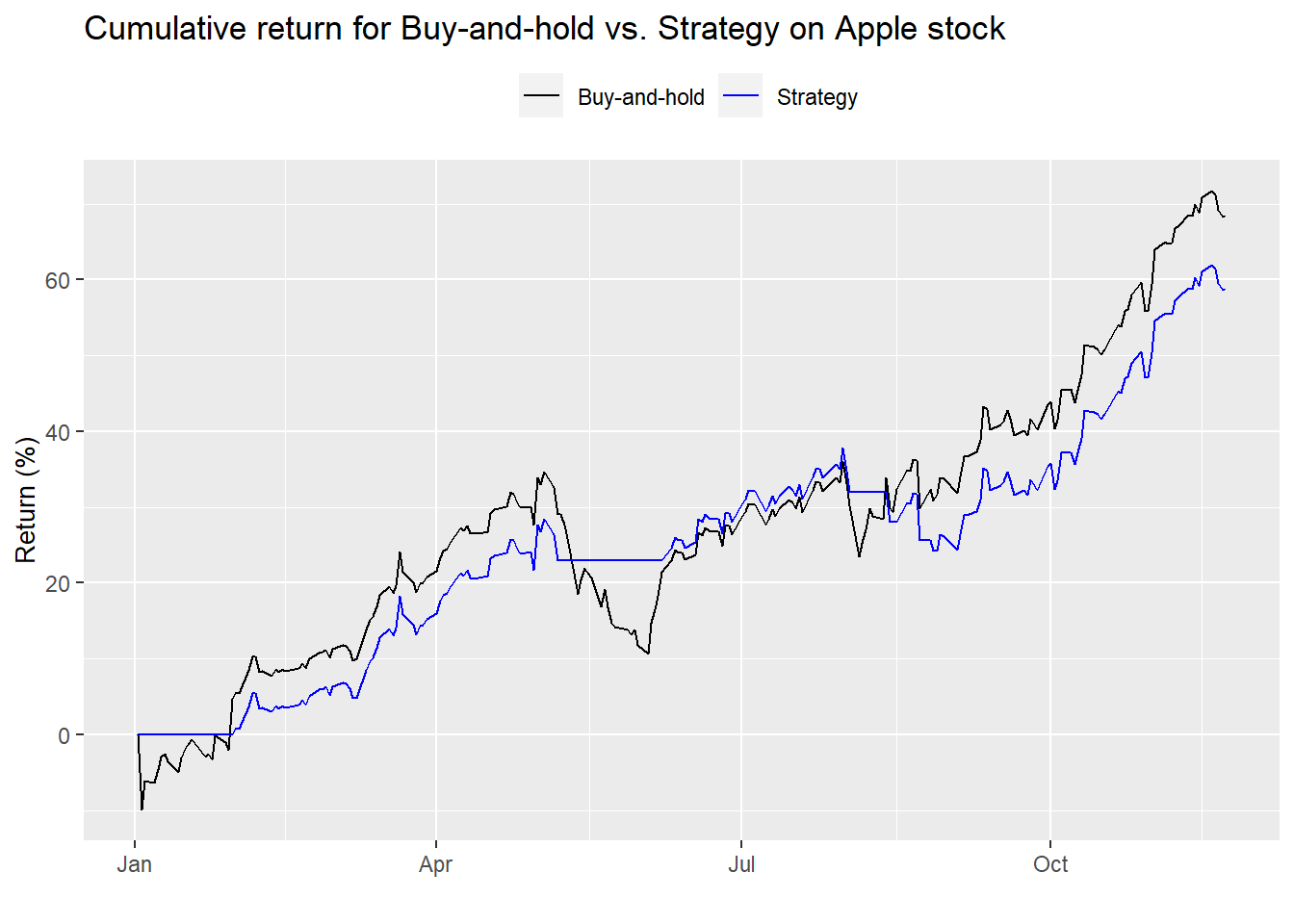
Encouraging. The strategy follows the trend, but appears to underperform on an absolute basis. Let’s look at the summary performance statistics.2
| Buy-and-hold | Strategy | Buy-and-hold | Strategy | Buy-and-hold | Strategy |
|---|---|---|---|---|---|
| 61.5 | 53.0 | 27.0 | 18.3 | 227.9 | 290.1 |
Even though the moving average strategy underperformed on an absolute basis, we see that it’s risk-adjusted returns were better. If we had employed the strategy since 20163, it would have significantly outperformed buy-and-hold on an absolute and risk-adjusted basis. But does that mean it’s a good strategy? How do you quantify good?
Quantitative investors use a number of performance analytics to analyze proposed portfolios and strategies. These include Sharpe, Sortino, and Treynor ratios. Others are max drawdown, win/loss ratios, value-at-risk, alpha, beta, information ratio, tracking error, and the list goes on. There’s nothing wrong with these ratios. We often use a modified Sharpe ratio.4 Each of these metrics can play an important role in strategy selection. But it’s difficult for many novice to intermediate investors to know what all these metrics mean, let alone understand which are more important to others.
We propose using the tools from data science to get a first-blush feel for the strategy. Data Science practitioners often use a confusion matrix to see how accurately a machine learning model identifies a particular outcome or class. The matrix is presented in a 2x2 format with the yes/no actual outcome on top and the predicted yes/not outcome on the side. Of course, it doesn’t have to be a binary outcome, it could be just about any number, though greater than four or five it might start to get impractical.
The cells of the matrix correspond to overlapping outcomes. They give the number of times the outcome of the model matched (or didn’t) the actual outcome. For example, if you’re trying to predict a disease and the confusion matrix shows a high number of occurrences in which the model predicted the disease when there actually was a disease, then the model is doing a good job in avoiding false negatives. The flip side would be avoiding false positives. Few false negatives and false positives on out-of-sample data? You’ve got a great model.
What does this have to do with investment strategies? For many strategies, how do you know if the strategy actually performed according to your hypothesis? That is, if you’re testing a trend-following strategy, how do you know if the strategy actually captured the trend? One could argue that if the strategy performed poorly, it clearly missed the trend. But what about range bound markets or highly cyclical ones?
In those cases, it’s clearly the wrong strategy for that market environment. But how would one compare the results of two different trend-following strategies? Differences in returns would be the typical comparison. But, luck could be involved if one strategy happened to capture the tenor of the trend better than another strategy. Overfitting could be a culprit too.
So confused
Indeed, we’re not entirely sure if confusion matrices will help us parse strategy performance better than other metrics. But let’s see how we’d employ a confusion matrix in examining the previous backtests in any case. We’ll identify three outcomes—up, down, or flat, encoded as to whether stock closed up, down, or flat from the previous day. That will be for the actual outcome. For the strategy, the outcomes will be relatively the same except they’ll be based on the signal. If the signal puts the strategy in the market and the stock closed up, that counts as up. Not in the market and the stock closed up or down equals flat. And so on. Here’s how the first strategy (the multiple-based one) performed on the first test period.
| Down | Flat | Up | |
|---|---|---|---|
| Down | 210 | 0 | 0 |
| Flat | 142 | 3 | 146 |
| Up | 0 | 0 | 253 |
On first glance, we can see that the strategy missed some of the up-moves (the strategy is flat when the actual is up). But it was also out of the market on some of the down moves too (the strategy is flat when the actual is down). What does this mean in terms of accuracy? The strategy participated in 63.4% of the up moves and avoided 40.3% of the down moves. Seems pretty good. But if we think about it, it’s not all that great. That participation rate, if you will, is modestly better than a coin flip, which would be 50% in both cases.
How does the second backtest perform? The table is below.
| Down | Flat | Up | |
|---|---|---|---|
| Down | 219 | 0 | 0 |
| Flat | 133 | 3 | 131 |
| Up | 0 | 0 | 268 |
The first takeaway reveals a larger number of correct up moves relative to the prior strategy. But it also had a higher number of down moves. The moving average strategy participated in 67.2% of the up moves and avoided 37.8% of the down moves.
Notice that since this is a long-only strategy, we want it to participate as much as possible in the up moves and avoid the down moves. If shorting were allowed, we’d want maximal participation in the down.
In any case, how would we compare the two strategies using the results of the confusion matrix? One way would be to multiply the up-capture by the risk-avoidance as percents. This would give us a scale between 0 and 10,000. Admittedly, thinking in terms of 10,000 is not immediately intuitive, but the boundedness helps. Additionally, the strategy should, at the very least, be above 5,000; otherwise, it’s no better than a coin toss.
But the problem with this approach is that you could have a strategy that is entirely successful at keeping one out of the market on the downside, but worse than a coin flip on the upside, potentially yielding a high index position. Yet you wouldn’t want to trade it and you’d need to dig a bit deeper to uncover the skewed performance. We’d like a metric that is a bit more revealing on first blush.
A better approach might be to measure the amount by which the strategy’s upside capture and risk avoidance are greater than 50%; then add those two differences to one another. That produces a sort of diffusion index that runs from -100 (0% up-capture and risk-avoidance) to 100 (100% up-capture and risk-avoidance.) We’ll call this the OSM Performance Metrictm. 5 What are the results for 2016-2018 test?
| Test | Result |
|---|---|
| Backtest 1 | 13.3 |
| Backtest 2 | 17.0 |
First, both strategies are positive, indicating accuracy that’s better than a coin flip overall. Second, the moving average does yield a higher accuracy figure than the first strategy. But how meaningful is a 17 vs. a 13? It’s probably not correct to say that it’s 30% more accurate (17/13-1). A better interpretation is probably closer to saying that its accuracy is 8% better (4ppts/50ppts) since we’re using 50% as the cut-off.
It would be interesting to calculate the accuracy for 2019. Alas, the first backtest was entirely out of the market, so there’s no upside capture, which equates to a -50 for that component of the OSM Performance Metric. And since it avoided all downside, its risk avoidance component was 50. Thus, for 2019, the first backtest yields a big donut on the OSM Performance Metric. There’s not much point in comparing such a poor result to the moving average strategy.
What if we aggregated the 2016-2019 period? The results are below.
| Test | Result |
|---|---|
| Backtest 1 | -2.1 |
| Backtest 2 | 19.6 |
Enlightening. We see the effect of being totally out of the market captured better in backtest 1’s result—it’s negative. It also shows how much better the moving average strategy performed relative to the first backtest—around 43.5% better.
Of course, this is only the first pass at creating a useful performance metric. We still need to iron out some kinks including how best to apply it comparing in-sample vs. out-of-sample tests. Additionally, we need to see how reliable it is on simulated data and how it compares to other performance metrics. But we’ll leave that for many future posts. Until then, any questions, please email us at the address after the code. Speaking of which, here’s the code behind the above analysis, charts, and tables.
# Load package
library(tidyquant)

# Load data
multiple <- readRDS("aapl_multiple.rds")

# Pre 2016
multiple %>%
  filter(date < "2016-01-01") %>%
  ggplot(aes(date)) +
  geom_line(aes(y = price, color = "Price")) +
  geom_line(aes(y = pe_ltm*4, color = "LTM P/E")) +
  scale_color_manual("", values = c("blue", "black")) +
  scale_y_continuous(name = "Price (US$)",
                     sec.axis = sec_axis(~./4, name = "P/E (x)")) +
  labs(title = "Price and LTM P/E for Apple Stock",
       x = "") +
  theme(legend.position = "top", axis.title.y.right = element_text(angle = 90, size = 10),
        axis.title.y.left = element_text(size = 10))

# 2016-2018
multiple %>%
  filter(date >= "2016-01-01", date <= "2018-12-31") %>%
  ggplot(aes(date)) +
  geom_line(aes(y = price, color = "Price")) +
  geom_line(aes(y = pe_ltm*4, color = "LTM P/E")) +
  scale_color_manual("", values = c("blue", "black")) +
  scale_y_continuous(name = "Price (US$)",
                     sec.axis = sec_axis(~./4, name = "P/E (x)")) +
  labs(title = "Price and LTM P/E for Apple Stock",
       x = "") +
  theme(legend.position = "top", axis.title.y.right = element_text(angle = 90, size = 10),
        axis.title.y.left = element_text(size = 10))

## Create signal
signal <- rep(NA, nrow(multiple))
position <- 0
for(i in 1:nrow(multiple)){
  if(multiple$pe_ltm[i] < 11){
    signal[i] <- 1
    position <- 1
  }

  if(multiple$pe_ltm[i] > 19){
    signal[i] <- 0
    position <- 0
  }

  if(multiple$pe_ltm[i] < 19 & position == 1){
    signal[i] <- 1
    position <- 1
  }

   if(multiple$pe_ltm[i] < 19 & position == 0){
    signal[i] <- 0
    position <- 0
  }
}

## Apply strategy
apply_strat <- function(df, signal, start_date, end_date){
  out <- df %>%
    mutate(signal = ifelse(is.na(lag(signal)), 0, lag(signal))) %>%
    filter(date >= start_date, date <= end_date) %>%
    mutate(ret = ifelse(is.na(price/lag(price)-1), 0, price/lag(price)-1),
           ret_sig = ifelse(is.na(price/lag(price)-1), 0, price/lag(price)-1) * signal,
           bench = cumprod(1+ret),
           strat = cumprod(1+ret_sig))

  out
}

backtest_1 <- apply_strat(multiple, signal, "2016-01-01", "2018-12-31")
backtest_1a <- apply_strat(multiple, signal, "2019-01-01", "2019-12-31")

## Graph strategy
graph_strat <- function(df){
  df %>%
    ggplot(aes(date)) +
    geom_line(aes(y = bench*100, color = "Buy-and-hold")) +
    geom_line(aes(y = strat*100, color = "Strategy")) +
    scale_color_manual("", values = c("black", "blue")) +
    labs(title = "Cumulative return for Buy-and-hold vs. Strategy on Apple stock",
         y = "Return (%)",
         x = "") +
    theme(legend.position = "top", axis.title.y.right = element_text(angle = 90, size = 10),
          axis.title.y.left = element_text(size = 10))
}

graph_strat(backtest_1a)

# Create signals
mov_avg <- ifelse(is.na(SMA(multiple$pe_ltm, 22)),0, SMA(multiple$pe_ltm, 22))
signal_2 <- ifelse(mov_avg < multiple$pe_ltm, 1, 0)

## Apply strategy
backtest_2 <- apply_strat(multiple, signal_2, "2016-01-01", "2018-12-31")
backtest_2a <- apply_strat(multiple, signal_2, "2019-01-01", "2019-12-31")

# Graph strategy
graph_strat(backtest_2a)


# Blog table
blog_table <- function(df){
  df %>%
    summarise(bh_ret = format(round(mean(ret*252, na.rm = TRUE),3)*100, nsmall=1),
              strat_ret = format(round(mean(ret_sig*252, na.rm = TRUE),3)*100, nsmall=1),
              bh_vol = round(sd(ret, na.rm = TRUE)*sqrt(252),3)*100,
              strat_vol = round(sd(ret_sig, na.rm = TRUE)*sqrt(252),3)*100,
              bh_sharpe = round(mean(ret)/sd(ret)*sqrt(252),3)*100,
              strat_sharpe = round(mean(ret_sig)/sd(ret_sig)*sqrt(252),3)*100) %>%
    knitr::kable(caption = "Backtest results",
                 format = "html",
                 col.names = c("Buy-and-hold",
                               "Strategy",
                               "Buy-and-hold",
                               "Strategy",
                               "Buy-and-hold",
                               "Strategy")) %>%
    kableExtra::add_header_above(c("Return (%)" = 2,
                                   "Volatility (%)" = 2,
                                   "Return-to-risk (%)" = 2))
  }

blog_table(backtest_2a)

## Strategy confusion matrix
strat_conf_mat <- function(strategy){
  out <- strategy %>%
    mutate(bench_dir = ifelse(ret > 0, "Up", ifelse(ret == 0, "Flat", "Down")),
           strat_dir = ifelse(ret_sig > 0, "Up", ifelse(ret_sig == 0, "Flat", "Down"))) %>%
    select(strat_dir, bench_dir) %>%
    rename("Strategy" = strat_dir,
           "Actual" = bench_dir)

  if(nrow(table(out))<3){
    list_out <- list(cont_mat = table(out),
                     risk_avoid = NA,
                     up_capture = NA,
                     up_down = NA)

  }else{
    tab_out <- table(out)
    list_out <- list(conf_mat = tab_out,
                     risk_avoid = tab_out[2,1]/(tab_out[1,1]+tab_out[2,1]),
                     up_capture = tab_out[3,3]/(tab_out[2,3]+tab_out[3,3]),
                     up_down = (tab_out[2,1]/(tab_out[1,1]+tab_out[2,1]))*
                       (tab_out[3,3]/(tab_out[2,3]+tab_out[3,3]))*10000)
  }
  list_out

}

conf_mat1 <- strat_conf_mat(backtest_1)

conf_mat1$conf_mat

## Backtest 2 confusion matrix

conf_mat2 <- strat_conf_mat(backtest_2)

conf_mat2$conf_mat

# Print table
data.frame(Test = c("Backtest 1",
                    "Backtest 2"),
           Result = c(round(conf_mat1$up_down,1),
                      round(conf_mat2$up_down,1))) %>%
  knitr::kable(caption = "OSM Performance Metric 2016-2018")

## Apply strategies over 2016-2019 time frame
backtest_1c <- apply_strat(multiple, signal, "2016-01-01", "2019-12-31")
backtest_2c <- apply_strat(multiple, signal_2, "2016-01-01", "2019-12-31")

## Create confusion matrices
conf_mat1c <- strat_conf_mat(backtest_1c)
conf_mat2c <- strat_conf_mat(backtest_2c)

# Print table
data.frame(Test = c("Backtest 1",
                    "Backtest 2"),
           Result = c(round(conf_mat1c$up_down,1),
                      round(conf_mat2c$up_down,1))) %>%
  knitr::kable(caption = "OSM Performance Metric 2016-2019")
We use “significantly” as adverb not as a well-defined statistics term in this case.↩︎
Special thanks to reader Dário for pointing out an error in the table that has since been corrected in this and the prior post, “Valuation hypothesis.”↩︎
Results table not shown.↩︎
In many of our posts, we call it return-to-risk or risk-adjusted returns. It excludes the risk-free rate.↩︎
We’re being only moderately tongue-in-cheek.↩︎