Valuation hypothesis
In our last post on valuation, we looked at whether Apple’s historical mutiples could help predict future returns. The notion was that since historic price multiples (e.g., price-to-earnings) reflect the market’s value of the company, when the multiple is low, Apple’s stock is cheap, so buying it then should produce attractive returns. However, even though the relationship between multiples and returns was significant over different time horizons, its explanatory power was pretty low. The intuition still holds, but question now is, whether it holds enought to build a profitable investing strategy.
For this post, we’ll look at two signals one could use to build such a strategy. Caution! This is for educational purposes only. While it should be obvious we’re not trying to sell this or anything else (other than that the power of data science and R yields insights and improves analysis), we want to spell it out just in case.
To motivate our analysis, we’ll play a thought experiment. Assume it’s the end of 2015 and we’ve been staring at graphs of Apple’s stock price and its multiple hoping to find some exploitable pattern. Based on these bleary-eyed musings, we’ll formulate trading signals, which will dictate when to buy or sell Apple’s stock. We’ll then validate those hypotheses on the 2016 to 2018 timeframe. If warranted, we’ll carry the analysis into 2019. From these results we should be able to tell whether we’ve formulated the next great trading algorithm or whether we’ll need get back our old paper route to offset our losses.
Backtest 1
First, let’s bring up the chart of interest and see if eyeballing it we can come up with something. Except for the period coming out of the global financial crisis, Apple’s multiple appears somewhat cyclical. Generally, it doesn’t drop much below 10x and and doesn’t climb much higher than 20. While there are some perturbations in between, the trend does seem to follow one in which the stock steadily rises from 10x earnings to 20x before easing back to 10. It’s not perfect, but it’s a good starting point.
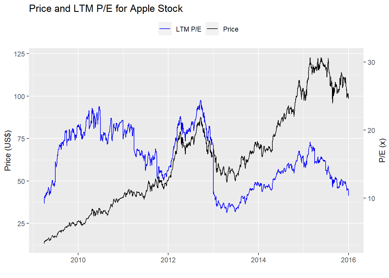
Let’s run a summary output just to confirm. Indeed, the 10th and 90th percentiles of Apple’s multiple are 10x and over 20x.
| Average | Std. deviation | Minimum | Maximum | 10th % | 90th % |
|---|---|---|---|---|---|
| 15.8 | 4.1 | 7.8 | 24.4 | 10.1 | 21.1 |
For our first strategy, we’ll buy Apple when it trades below 10x and sell it above 20x on the notion that at the low multiple it’s cheap and on the high one, expensive. We graph the performance of the strategy vs. a “naive” buy-and-hold stragegy below.
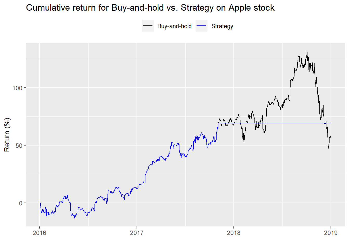
Funny. The strategy essentially mimics the naive buy-and-hold until Apple’s multiple exceeds 20x and then is out of the market for the rest of the time. Before we discuss the pros and cons of the strategy let’s look at a few performance metrics.1
| Buy-and-hold | Strategy | Buy-and-hold | Strategy | Buy-and-hold | Strategy |
|---|---|---|---|---|---|
| 18.1 | 19.0 | 23.7 | 16.5 | 76.3 | 114.9 |
The strategy has almost exactly the same annualized return as the buy-and-hold, but significantly less volatility, which leads to better risk-adjusted returns, as evidenced by the return-to-risk columns. But, if you look at the graph, the strategy generates better performance entirely due of avoiding the late year sell-off in 2018.
This strategy is pretty much a non-starter. Forget performance metrics and Sharpe ratios. For most people, most of the time, being out of the market for over a year would be psychologically challenging. The impulse to do something from the fear of missing out or any other reason would make this strategy difficult to follow.
Backtest 2
What about another strategy? Before we answer that question, another word of caution. Creating additional strategies on a single stock, when we’ve already seen the results from history, runs the risk of snooping or over-fitting to say the least. But let’s pretend we can forget what we saw and think of another strategy that might be more appropriate. Recall from the previous price and multiple graph that Apple’s mutliple tends to cycle between 10x and 20x. But it doesn’t always exceed 20x before it starts to decline; and it doesn’t always slip below 10x before it starts to rise.
Why would multiples gyrate in the first place? Recall that in our multiple calculation, the denominator is the last twelve months of reported earnings. In other words, it’s backward looking. The market, however, is forward looking—it’s constantly discounting the expectation of future cash flows of a company. So when the market believes future cashflows will increase, multiples go up, all else being equal, because that future growth has yet to materialize in reported earnings.
Maybe we should look at forward earnings expectations. That is generally a better approximation of market expectations. But we don’t because accessing expensive databases that compile historical forward estimates doesn’t yield reproducible research. Even if we did, we’d still see multiples expand and contract almost as much as they do on backward-looking data. Just do a search on forward price-to-earnings images to verify.
What if we tried to capture the trend in multiple expansion? One way to do that would be to use a rolling average multiple. Here’s the intution. When the moving average multiple crosses above the current multiple, the trend in expectations is improving, implying that investors have become more convinced that prospects (long-term or short-term) are getting better. When the moving average crosses below, the trend in expectations has moderated or is starting to worsen. Thus, buy the shares on the upward crossover and sell them on the downward.
Which moving average should we chose? If we wanted to get sophisticated, we could use different autoregressive time series models to estimate an appropriate moving average. But we’ll geek out in another post. Instead, we’ll keep it simple, using a 22-day moving average, which approximates about a month of trading days. The cumulative returns of the strategy and the buy-and-hold benchmark are below.
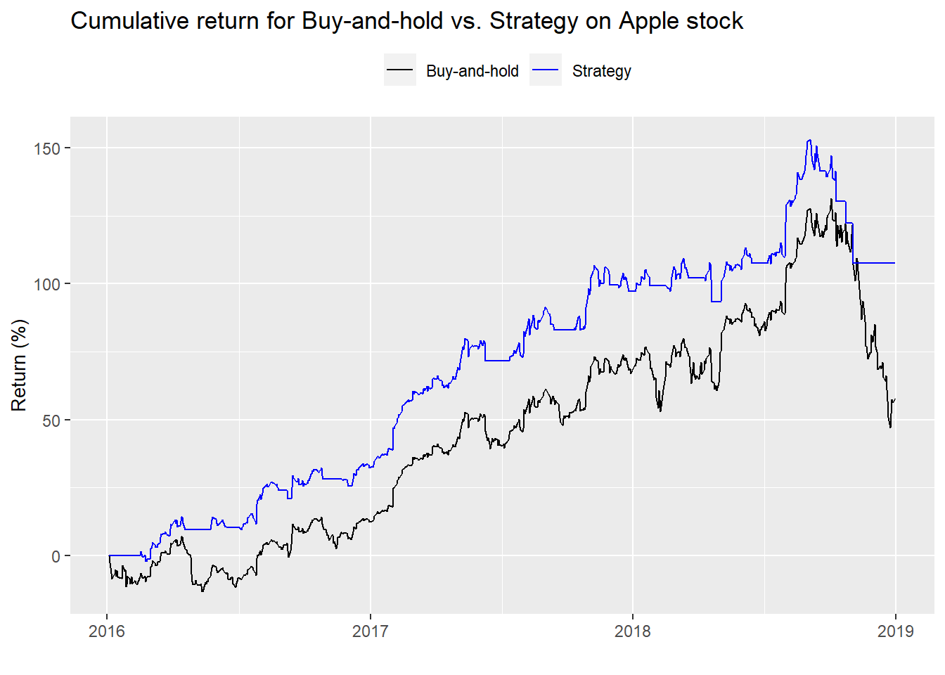
Rock and roll! This strategy crushed buy-and-hold. It captured most of the upswings in the multiple and suffered only a bit of the down draft. Let’s pull up the performance summary table.
| Buy-and-hold | Strategy | Buy-and-hold | Strategy | Buy-and-hold | Strategy |
|---|---|---|---|---|---|
| 18.1 | 25.7 | 23.7 | 15.8 | 76.3 | 162.6 |
Risk-adjusted returns were much better than buy-and-hold and and better than the first backtest. In fact, this new strategy outpeforms the previous strategy on a risk-adjusted basis by 47.7 percentage points.
But think about this for a moment. Apple’s share price enjoyed a strong climb for most of the period, except for the latter part of 2018. Employing a trend following strategy in a mainly upwardly trending market should outperform. So is this strategy anymore viable than the first? A bit. But we have to be concerned that we’ve only captured part of a cycle.
To understand the issues around the two strategies we should look to 2019 to see how they performed on a slightly different cycle. But we’ll save that for our next post. Until then, the code behind all the analysis, charts, and tables is below.
# Load package
library(tidyquant)

# Load data
multiple <- readRDS("aapl_multiple.rds")

# Pre 2016
multiple %>%
  filter(date < "2016-01-01") %>%
  ggplot(aes(date)) +
  geom_line(aes(y = price, color = "Price")) +
  geom_line(aes(y = pe_ltm*4, color = "LTM P/E")) +
  scale_color_manual("", values = c("blue", "black")) +
  scale_y_continuous(name = "Price (US$)",
                     sec.axis = sec_axis(~./4, name = "P/E (x)")) +
  labs(title = "Price and LTM P/E for Apple Stock",
       x = "") +
  theme(legend.position = "top", axis.title.y.right = element_text(angle = 90, size = 10),
        axis.title.y.left = element_text(size = 10))

# Pre 2016
multiple %>%
  filter(date < "2016-01-01") %>%
  summarise(Average = round(mean(pe_ltm),1),
            "Std. deviation" = round(sd(pe_ltm),1),
            Minimum = round(min(pe_ltm),1),
            Maximum = round(max(pe_ltm),1),
            "10th %" = round(quantile(pe_ltm, 0.1),1),
            "90th %" = round(quantile(pe_ltm, 0.9)+.01,1)) %>%
  knitr::kable(caption = "Apple multiple summary statistics")

### Backtest 1 buy at low multiple, sell at high

## Create signal
signal <- rep(NA, nrow(multiple))
position <- 0
for(i in 1:nrow(multiple)){
  if(multiple$pe_ltm[i] < 11){
    signal[i] <- 1
    position <- 1
  }

  if(multiple$pe_ltm[i] > 19){
    signal[i] <- 0
    position <- 0
  }

  if(multiple$pe_ltm[i] < 19 & position == 1){
    signal[i] <- 1
    position <- 1
  }

   if(multiple$pe_ltm[i] < 19 & position == 0){
    signal[i] <- 0
    position <- 0
  }
}

## Apply strategy
apply_strat <- function(df, signal){
  out <- df %>%
    mutate(signal = ifelse(is.na(lag(signal)), 0, lag(signal))) %>%
    filter(date >= "2016-01-01", date <= "2018-12-31") %>%
    mutate(ret = ifelse(is.na(price/lag(price)-1), 0, price/lag(price)-1),
           ret_sig = ifelse(is.na(price/lag(price)-1), 0, price/lag(price)-1) * signal,
           bench = cumprod(1+ret),
           strat = cumprod(1+ret_sig))

  out
}

backtest_1 <- apply_strat(multiple, signal)

## Graph strategy
graph_strat <- function(df){
  df %>%
    ggplot(aes(date)) +
    geom_line(aes(y = bench*100, color = "Buy-and-hold")) +
    geom_line(aes(y = strat*100, color = "Strategy")) +
    scale_color_manual("", values = c("black", "blue")) +
    labs(title = "Cumulative return for Buy-and-hold vs. Strategy on Apple stock",
         y = "Return (%)",
         x = "") +
    theme(legend.position = "top", axis.title.y.right = element_text(angle = 90, size = 10),
          axis.title.y.left = element_text(size = 10))
}

graph_strat(backtest_1)

# Create blog table function
blog_table <- function(df){
  df %>%
    summarise(bh_ret = format(round(mean(ret*252, na.rm = TRUE),3)*100, nsmall=1),
              strat_ret = format(round(mean(ret_sig*252, na.rm = TRUE),3)*100, nsmall=1),
              bh_vol = format(round(sd(ret, na.rm = TRUE)*sqrt(252),3)*100, nsmall = 1),
              strat_vol = format(round(sd(ret_sig, na.rm = TRUE)*sqrt(252),3)*100, nsmall=1),
              bh_sharpe = round(mean(ret)/sd(ret)*sqrt(252),3)*100,
              strat_sharpe = round(mean(ret_sig)/sd(ret_sig)*sqrt(252),3)*100) %>%
    knitr::kable(caption = "Backtest results",
                 format = "html",
                 col.names = c("Buy-and-hold",
                               "Strategy",
                               "Buy-and-hold",
                               "Strategy",
                               "Buy-and-hold",
                               "Strategy")) %>%
    kableExtra::add_header_above(c("Return (%)" = 2,
                                   "Volatility (%)" = 2,
                                   "Return-to-risk (%)" = 2))
  }

blog_table(backtest_1)

## Backtest 2

# Create signals
mov_avg <- ifelse(is.na(SMA(multiple$pe_ltm, 22)),0, SMA(multiple$pe_ltm, 22))
signal_2 <- ifelse(mov_avg < multiple$pe_ltm, 1, 0)

## Apply strategy
backtest_2 <- apply_strat(multiple, signal_2)

# Graph strategy
graph_strat(backtest_2)


# Show table
blog_table(backtest_2)
Special thanks to reader Dário for pointing out an error in the table that has since been corrected in this and the next post, “Null hypothesis.”↩︎