SKEWed perceptions
The CBOE’s SKEW index has attracted some headlines among the press and blogosphere, as readings approach levels not see in the last year. If the index continues to draw attention, doomsayers will likely say this predicts the next correction or bear market. Perma-bulls will catalogue all the reasons not to worry. Our job will be to look at the data and to see what, if anything, the SKEW divines. If you don’t know what the SKEW is, we’ll offer a condensed definition. But our main focus will be to examine whether the SKEW is accurate or useful.
What is the SKEW?
The SKEW index attempts to quantify tail-risk. Think of it as trying to sight the likelihood of a black swan1 event. It is related to the VIX, which tracks the implied volatility of 30-day options on the S&P 500. While the VIX weights the implied volatility of various options to arrive at a single implied volatility measure for the S&P, the SKEW attempts to price the expectation of a large downside move based on those options. The calculations are involved and require one to impute some values that aren’t readily observed. But think about it this way. If the S&P were at 100, the price of an option with a strike of 105 or 95 could tell you what the market sees as the risk-neutral probability of the S&P closing at the that price at expiration. When you aggregate all those prices and chug through a bunch of equations, it is “theoretically” possible to get a market imputed price of a large move.
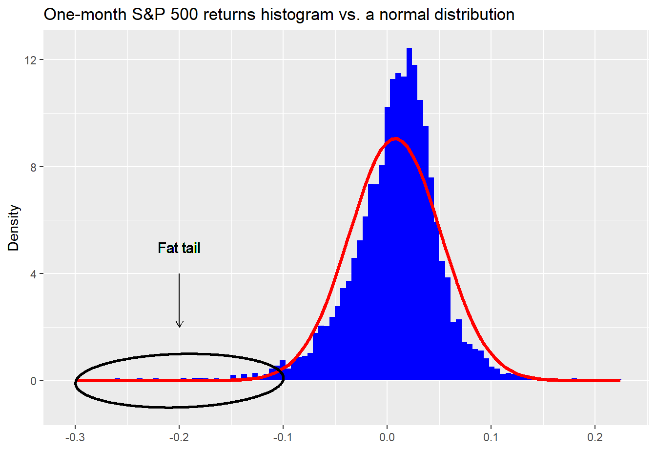
Why is it called the SKEW? That has to do the nature of equity returns, whose distribution is not symmetrical about the mean. They’re skewed, which means that there tend to be more occurrences outside of the “normal” range on one side or the other, known as having “fat tails.” This phenomenon is visible in the histogram we show below. The blue bars are the actual one-month returns on the S&P 500, while the red line is what a normal distribution would look like based on the same mean and standard deviation as the S&P. When you see blue bars popping up above the red line as in the ellipse, that is a fat tail.
For the S&P 500, the SKEW is negative due to the presence of larger than normal market declines over time. Before Black Monday in 1987, option prices didn’t reflect this phenomenon. Afterward they did and now it is generally known that puts (options that pay if the market declines a certain amount) are usually priced higher than equidistant calls. Options price in skew. Measuring how much skew they price in, is the goal of the SKEW index.
It is important to distinguish between what the SKEW measures and how folks interpret it. Just like the VIX measures the implied volatility for a constant period, but is called the “Fear Index”, the SKEW measures the price of skew (department of redundancy department?) for a constant period, but is a black swan barometer.
However, since the price of skew tends to be small, it’s a bit of wrangle to create an index. Hence, the CBOE subtracts ten times the price of skew, which is negative, from 100 to generate an index. This ends up yielding a range of values that have oscillated between 101 and 159 over time.2
Show me the data
Now that we’ve laid some of the background for the SKEW, let’s get into the data to see what we can learn. Our motivation is to analyze the SKEW for accuracy, usefulness, or both. If accurate, it should do a good job of predicting the likelihood of an out sized down move. If useful, we can use it to help us generate better risk-adjusted returns. Note, it doesn’t have to be accurate to be useful. Think contrary indicator.
We’ll start with the chart. Then examine what the market does at various levels of the SKEW. Here’s the the SKEW index.
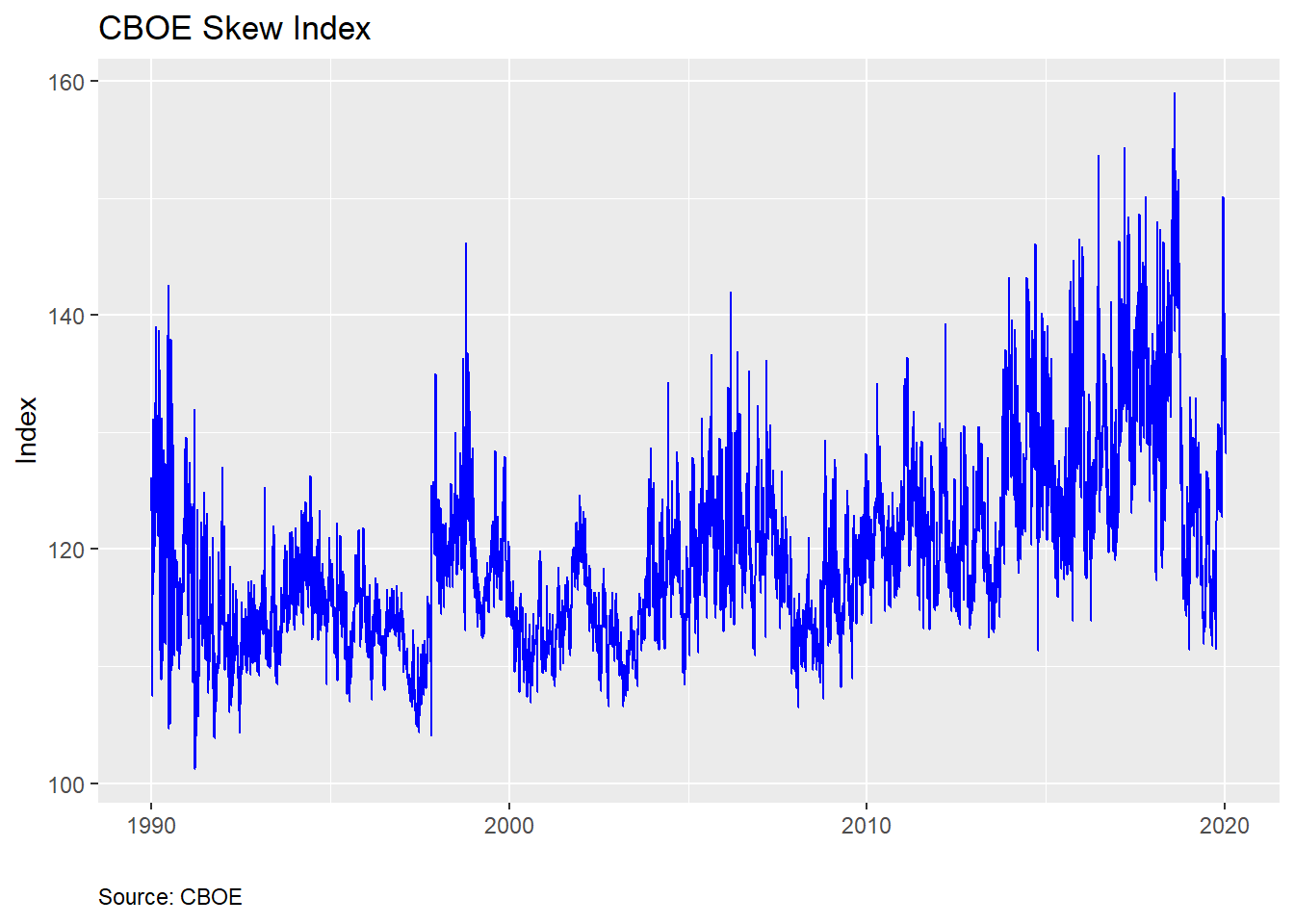
And summary statistics…
| Min | Qu.1 | Median | Mean | Qu.3 | Max |
|---|---|---|---|---|---|
| 101.23 | 114.03 | 118.23 | 119.5971 | 123.5575 | 159.03 |
From the chart above, we see that the index is relatively noisy and right-skewed based on the summary statistics. The skewness of the SKEW (not a joke!) is intuitive since we expect large down moves to cause occasional over-sized spikes in the index. When the market drops, the VIX increases, driving up the price of skew. But one should already sense a tension. If the SKEW is supposed to price in outlier returns, shouldn’t it do that before the market drops?
Here’s the issue. This is the risk-neutral probability. That means there’s no arbitrage. If the SKEW were 100% accurate in pricing outlier events, then market participants would be hedged and wouldn’t react to precipitating events, which would likely not lead to a market downdraft, making the SKEW a bad predictor. Circular right?
Alternatively, if the SKEW priced in an outlier event, that would mean S&P 500 options were elevated relative to what the rest of the market believed, which could lead to an arbitrage opportunity, which would be exploited quickly, reversing the SKEW. None of this precludes the presence of noise in which large oscillations might be interpreted as a change in market tenor but is just randomness.
Whatever the case, let’s see what actually happens to returns based on the SKEW. Here we’ll break up the index based on rough quintiles, as shown in the table below, to make it easier to bucket the data.
| 20% | 40% | 60% | 80% | 100% |
|---|---|---|---|---|
| 113.12 | 116.52 | 119.976 | 125.11 | 159.03 |
Then we’ll calculate the returns for the S&P 500 on a rolling daily, monthly, quarterly, half-yearly, and yearly basis. We present the average returns for each period segmented by bucket below.
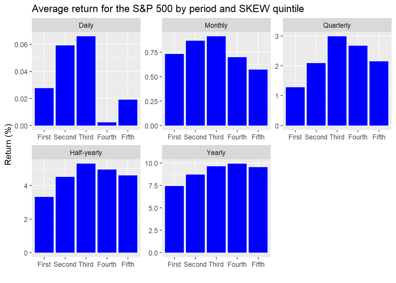
A strong pattern doesn’t emerge from this output. But we’re showing this more for exploratory purposes. If anything jumps out, it’s that average returns do drop off on a monthly basis when the SKEW gets into the top two quintiles. That should be somewhat expected since the SKEW is a 30-day measure of probable tail risk. Hence, the higher the SKEW, the lower the forward returns. Interestingly, we see a similar phenomenon in the quarterly and half-yearly results, suggesting some momentum, or auto-correlation.
The gimlet-eyed reader will notice that the y-scales are different. This is by design since the magnitude of returns increase with time. Leaving each graph on the same scale would result in a few unreadable charts. One should note that the difference in returns is small in most cases—a maximum of two points for the half-yearly and yearly periods.
In any case, we’re really trying to discern how accurate the SKEW is in predicting outlier events. In stat speak, that would be a downside move greater than two standard deviations. For a normal distribution that should occur a bit less than 2.5% of the time.3 But how much is a two standard deviation (2SD) move? The CBOE uses the VIX to estimate what the market-implied moves are to derive a 2SD move. Since the VIX moves, that means a 2SD move changes too. How that filters into what the SKEW implies is a bit convoluted.
We’ll keep it simple for now and calculate how often we see a move of greater than 9% to the downside in the next month grouped by SKEW quintiles. The 9% decline may seem like an arbitrary number, but it actually coincides with what a greater than 2SD move would have been on average based on the S&P’s historical volatility.4 We graph the frequency of these large moves relative to the quintiles below.
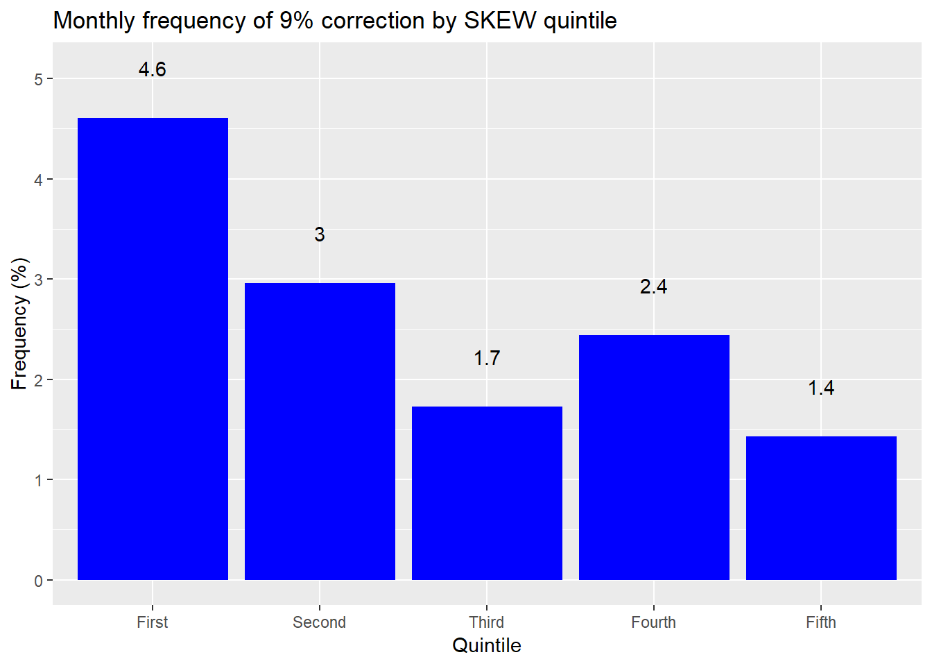
That graph’s a funny-puzzler. To interpret this graph we should first remember that the normal distribution suggests a 2SD move only about 2.5% of the time. But markets aren’t normally distributed, so it should be higher than that on average. Additionally, as the SKEW increases, so should larger than normal moves. Yet that’s not what the graph shows. When the SKEW is low, it’s almost two times more likely to see a greater than 2SD move than a normal distribution would predict. But when the SKEW is high it’s actually less likely to see a large move.
Based on this analysis, it seems that the SKEW is not a very accurate.5 But we did cut the data in a certain way. If we look at the overall period, the S&P exhibits a greater than 9% decline over any thirty day period around 2.6% of the time. The SKEW averages 120 over the same period, which equates to a 7.7% chance of seeing a greater than 2SD downside move. Thus, even the base average seems to exhibit poor accuracy.
Still, this might not be the most fair characterization since the SKEW is, well, skewed. Maybe we need to account for how the probabilities change. The CBOE states that one can translate the value of the SKEW into a “risk-adjusted probability that the one-month S&P 500 log-return falls two or three standard deviations below the mean, and use VIX as an indicator of the magnitude of the standard deviation.” That’s a bit of a mouthful. Nonetheless, perhaps using the risk-adjusted probabilities will result in a better accuracy measure. The CBOE provides a probability table associated with the various levels of the SKEW, which we reproduce below but extrapolate estimates for values above 145, which the CBOE does not provide.
| SKEW | Probability (%) |
|---|---|
| 100 | 2.30 |
| 105 | 3.65 |
| 110 | 5.00 |
| 115 | 6.35 |
| 120 | 7.70 |
| 125 | 9.05 |
| 130 | 10.40 |
| 135 | 11.75 |
| 140 | 13.10 |
| 145 | 14.45 |
| 150 | 15.80 |
| 155 | 17.15 |
| a Source: CBOE, OSM estimates |
We’ll use this table to compare the implied probability of a 2SD down move with what actually occurred. The cut-off will be a greater than 9% decline, as before. We’ll group the one-month returns on the S&P by implied probability buckets, based on the table above. We’ll then calculate the frequency that the S&P dropped by more than 9% for that bucket. The results are as follows.
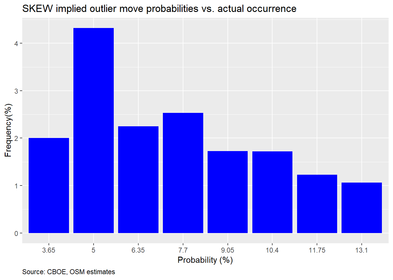
Another hard to interpret graph. First, you should notice that the 2.3% and above 13.1% probability buckets are missing. That’s because the market did not drop more than 9%. Second, in most cases the frequency of occurrence undershot the probability, except for the 5% probability bucket, which was pretty close. One would expect that if there’s a 10% implied probability that the market will decline 2SDs, the frequency of occurrence should be around 10% too, give or take some perturbations. We should thus expect occurrences above or below the implied probability just due to randomness; not uniformly below.
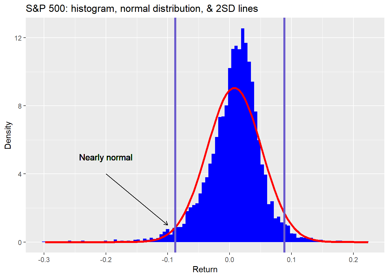
So what’s going on here? The SKEW appears to be over-estimating the likelihood of a 2SD move. But isn’t the SKEW supposed to account for the fact that large down moves are more likely due to the non-normal distribution of the S&P? While that’s true, that doesn’t mean all of parts of the distribution are non-normal. In fact, if we revisit the one-month histogram from above we can see that, surprisingly, the 2SD down move is pretty close to normal. We show this in the graph below.
What conclusions should we draw? First, while we were initially surprised at how inaccurate the SKEW is, we shouldn’t have been. Since the SKEW is in part based off the same option chain as the VIX and it is a relatively known artifact of the VIX that it often over-estimates future volatility, that should have alerted us to the possibility that the SKEW would also over-estimate 2SD moves. Second, despite everything we’ve discussed thus far, we’re not ready to say with high conviction that the SKEW is downright inaccurate. While it may overprice 2SD moves, it may correctly price larger moves. The SKEW is a point estimate that is supposed to represent a distribution of values. Not exactly possible given Euclidean geometry. Hence, the estimate may fail on accuracy, but succeed on approximation when looking at a range of outcomes. Third, even though the first pass accuracy looks poor, since it is consistenly poor, especially at extremes, that might prove useful as an investing insight.
We’ll leave you with the following takeaway. The SKEW appears to do a poor job pricing in 2SD down moves, but that may be due to the fact that it is more accurate at pricing larger moves, which occur with greater frequency relative to the normal distribution in the S&P. In our next post, we’ll test that hypothesis and then look to see whether or not the SKEW will prove useful as an investing indicator. Until then, here’s the code that produced the preceding analyses and graphs.
# Load package
library(tidyquant)
library(knitr)
library(kableExtra)

# Load data
url <- "http://www.cboe.com/publish/scheduledtask/mktdata/datahouse/skewdailyprices.csv"
skew <- read_csv(url, skip = 1)

# Clean data
skew <- skew %>%
  mutate(Date = mdy(Date)) %>%
  rename('date' = Date,
         'skew' = SKEW) %>%
  select(date, skew)

# Find NAs
skew %>% filter(is.na(skew))
skew <- skew %>%
  mutate(skew = ifelse(is.na(skew), lag(skew), skew))

# Load vix and wrangle
vix1 <- read_csv("vixarchive.csv") # need to download from CBOE site. Link doesn't work
vix1 <- vix1[1:3532,]

# Select close only
vix1 <- vix1[,c(1,5)]
colnames(vix1) <- c("date","vix")
vix1$vix <- as.numeric(vix1$vix)
sum(is.na(vix1$vix))

# Fix NAs
vix1 <- vix1 %>%
  fill(vix)
vix1$date <- mdy(vix1$date)

# Load recent vix
url2 <- "http://www.cboe.com/publish/scheduledtask/mktdata/datahouse/vixcurrent.csv"
vix2 <- read_csv(url2, skip = 2)

vix2 <- vix2[,c(1,5)]
colnames(vix2) <- c("date","vix")
vix2$date <- mdy(vix2$date)

# Combine VIX periods
vix <- vix1 %>%
  bind_rows(vix2)

# Load S&P
sp <- getSymbols("^GSPC", from = "1990-01-01", to = "2019-12-13", auto.assign = FALSE)
sp_df <- data.frame(date = index(sp), sp = as.numeric(Ad(sp)))

# Add Vix & S&p
skew <- skew %>%
  left_join(vix, by = 'date')
  left_join(sp_df, by = "date")

# Create period returns
skew <- skew %>%
  mutate(sp_1d = lead(sp)/sp-1,
         sp_1m = lead(sp,22)/sp-1,
         sp_3m = lead(sp, 66)/sp-1,
         sp_6m = lead(sp, 132)/sp - 1,
         sp_1y = lead(sp,252)/sp-1,
         two_sd = vix/sqrt(12)*2)

# S&P 500 histogram
# Create ellipse
xc <- -0.2 # center x_c or h
yc <- 0 # y_c or k
a <- 0.1 # major axis length
b <- 1 # minor axis length
phi <- 0 # angle of major axis with x axis phi or tau

t <- seq(0, 2*pi, 0.01)
x <- xc + a*cos(t)*cos(phi) - b*sin(t)*sin(phi)
y <- yc + a*cos(t)*cos(phi) + b*sin(t)*cos(phi)

xel <- xc + a*cos(t)*cos(phi) - b*sin(t)*sin(phi)
yel <- yc + a*cos(t)*cos(phi) + b*sin(t)*cos(phi)
ell <- data.frame(x = xel, y = yel)


skew %>%
  ggplot(aes(sp_1m)) +
  geom_histogram(aes(y = ..density..),
                 fill = "blue",
                 bins = 100) +
  stat_function(fun = dnorm,
                args = list(mean = mean(skew$sp_1m, na.rm = TRUE),
                            sd = sd(skew$sp_1m, na.rm = TRUE)),
                color = "red",
                lwd = 1.25) +
  geom_text(aes(x = -0.2, y = 5,
            label = "Fat tail"),
            size = 4) +
  geom_segment(aes(x = -0.2, xend = -0.2,
                   y = 4, yend = 2),
               arrow = arrow(length = unit(2, "mm"))) +
  geom_path(data = ell, aes(x = x,y = y), lwd = 1.05) +
  labs(x = "",
       y = "Density",
       title = "One-month S&P 500 returns histogram vs. a normal distribution")

# Graph
skew %>%
  ggplot(aes(date, skew)) +
  geom_line(color = "blue") +
  labs(x = "",
       y = "Index",
       title = "CBOE Skew Index",
       caption = "Source: CBOE") +
  theme(plot.caption = element_text(hjust = 0))

# Summary stats
data.frame(Min = min(skew$skew),
           "Qu 1" = as.numeric(quantile(skew$skew, 0.25)),
           Median = median(skew$skew),
           Mean = mean(skew$skew),
           "Qu 3" = as.numeric(quantile(skew$skew, 0.75)),
           Max = max(skew$skew)) %>%
  knitr::kable(caption = "Skew summary statistics")

# Quntiles
quant <- quantile(skew$skew, seq(0.2,1,.2), na.rm = TRUE)

data.frame(a = as.numeric(quant[1]),
           b = as.numeric(quant[2]),
           c = as.numeric(quant[3]),
           d = as.numeric(quant[4]),
           e = as.numeric(quant[5])) %>%
  rename("20%" = a,
         "40%" = b,
         "60%" = c,
         "80%" = d,
         "100%" = e) %>%
    knitr::kable(caption = "Skew quintiles")

skew %>%
  mutate(skew = cut(skew,c(100,113,116,120,125,160),
                    labels = c("First", "Second", "Third", "Fourth", "Fifth"))) %>%
  group_by(skew) %>%
  summarise_at(vars(sp_1d:sp_1y), mean, na.rm = TRUE) %>%
  gather(key,value, - skew) %>%
  mutate(key = factor(key, levels = c("skew", "sp_1d",
                                      "sp_1m", "sp_3m",
                                      "sp_6m", "sp_1y"))) %>%
  ggplot(aes(skew, value*100)) +
  geom_bar(stat = 'identity',
           position = 'dodge',
           fill = "blue") +
  facet_wrap(~key,
             labeller = as_labeller(c(skew = "Skew",
                                      sp_1d = "Daily",
                                      sp_1m = "Monthly",
                                      sp_3m = "Quarterly",
                                      sp_6m = "Half-yearly",
                                      sp_1y = "Yearly")),
             scales = "free") +
  labs(x = "",
       y = "Return (%)",
       title = "Average return by period and Skew quintile")

# Data for text
perc_down <- skew %>%
  summarise(perc_down = sum(sp_1m < -0.09, na.rm = TRUE)/n()) %>%
  as.numeric() %>%
  round(.,3)*100

avg_skew <- round(mean(skew$skew))

# Percent times see a 5% correction in next month
skew %>%
  mutate(skew = cut(skew,c(100,113,116,120,125,160),
                    labels = c("First", "Second", "Third", "Fourth", "Fifth"))) %>%
  group_by(skew) %>%
  summarise(perc_down = sum(sp_1m < -0.09, na.rm = TRUE)/n()) %>%
  ggplot(aes(skew, perc_down*100)) +
  geom_bar(stat = "identity", fill = "blue") +
  geom_text(aes(label = round(perc_down,3)*100), nudge_y = 0.5) +
  labs(x = "Quintile",
       y = "Frequency (%)",
       title = "Monthly frequency of 9% correction by Skew quintile")

## Accuracy
seq <- seq(100,160,5)
skew_idx <- cut(seq[-1], seq)
prob <- c(0.023, 0.0365, 0.05,
          0.0635, 0.077, 0.0905,
          0.104, 0.1175, 0.1310,
          0.1445, .158, 0.1715)
radj_prob <- data.frame(skew = skew_idx, prob = prob)

data.frame(Skew = seq(100,160,5),
           Probabiilty = prob*100) %>%
  knitr::kable(caption = "CBOE estimated risk-adjusted probability (%)") %>%
  kableExtra::add_footnote("Source: CBOE")

# Data wrangle
skew_cuts <- cut(skew$skew, seq(100,160,5))
probs <- c()
for(i in 1:length(skew_cuts)){
  probs[i] <- as.numeric(radj_prob[which(skew_cuts[i] == radj_prob$skew),][2])
}

# Graph
skew %>%
  mutate(prob = probs,
         sp_move = ifelse(sp_1m <= -0.09, 1, 0)) %>%
  na.omit() %>%
  group_by(prob) %>%
  summarise(correct = mean(sp_move)) %>%
  filter(!prob %in% c(0.023, 14.45, 15.8, 0.1715)) %>%
  ggplot(aes(as.factor(prob*100), correct*100)) +
  geom_bar(stat = "identity", fill = "blue") +
  labs(x = "Probability (%)",
       y = "Frequency(%)",
       title = "Skew implied outlier move probabilities vs. actual occurrence",
       caption = "Source: CBOE, OSM estimates") +
  theme(plot.caption = element_text(hjust = 0))

# S&P hisogram with SD lines
skew %>%
  ggplot(aes(sp_1m)) +
  geom_histogram(aes(y = ..density..),
                 fill = "blue",
                 bins = 100) +
  stat_function(fun = dnorm,
                args = list(mean = mean(skew$sp_1m, na.rm = TRUE),
                            sd = sd(skew$sp_1m, na.rm = TRUE)),
                color = "red",
                lwd = 1.25) +
  geom_vline(xintercept = sd(skew$sp_1m, na.rm = TRUE)*-2, size = 1.25, color = "slateblue") +
  geom_vline(xintercept = sd(skew$sp_1m, na.rm = TRUE)*2, size = 1.25, color = "slateblue") +
  geom_text(aes(x = -0.2, y = 5,
                label = "Nearly normal"),
            size = 4) +
  geom_segment(aes(x = -0.2, xend = -0.1,
                   y = 4, yend = 1),
               arrow = arrow(length = unit(2, "mm"))) +
  labs(x = "Return",
       y = "Density",
       title = "S&P 500: histogram, normal distribution, & 2SD lines")
Is this still a useful metaphor?↩
Even though the index data starts in 1990, it wasn’t created until 2011. That begs the question as to whether pre-2011 data is relevant since there would have been no index to influence investing decisions.↩
Precisely, a one-sided greater than two standard deviation move should occur 2.3% of the time.↩
The S&P 500’s long-term annualized volatility is roughly 16%. Hence, a one-month 2SD move would be 9.24%. That’s 16% divided by the square root of number of months in the year times two for the number of standard deviations.↩
There are some reasonable explanations for this counter-intuitive behavior, but we won’t get into those now. Our focus is measuring the SKEW’s accuracy and usefulness.↩