OMG O2G!
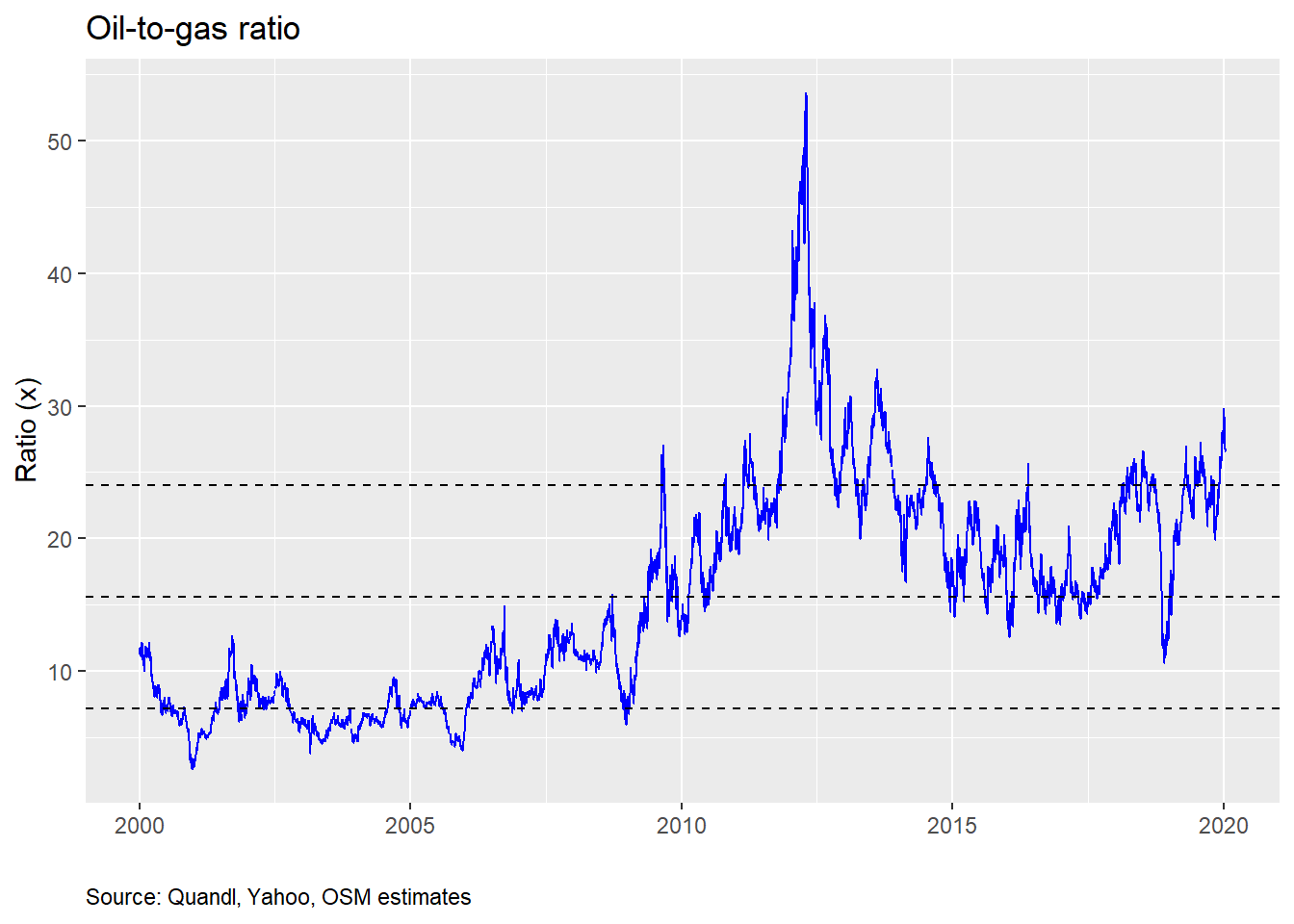
The oil-to-gas ratio was recently at its highest level since October 2013, as Middle East saber-rattling and a recovering global economy supported oil, while natural gas remained oversupplied despite entering the major draw season. Even though the ratio has eased in the last week, it remains over one standard deviation above its long-term average. Is now the time to buy chemical stocks leveraged to the ratio? Or is this just another head fake foisted upon unsuspecting generalists unaccustomed to the vagaries of energy volatility?
If you’re reading this thinking “what the…”, not to worry. This post will go a little bit off our normal beaten path. But it can give you a glimpse into the world of equity research. You see before we discovered data science, the power of R programming, and created this blog, we toiled away on Medieval spreadsheets, trying to make sense of ethylene and polyethylene, global cost curves, ethane’s cheapness relative to naphtha, and whether any of this mattered to earnings or share prices of the various publicly-traded chemical companies we followed. In short, we were equity research analysts, making recommendations on a slew of chemical stocks to the benefit or chagrin of companies and investors.
Even though we haven’t analyzed chemical stocks in a while, when we recently noticed that the oil-to-gas ratio (once, one of our favorite metrics to discuss) was nearing territory not seen since the inception of the “shale-gas revolution”, we began to grow nostalgic. Why not dust off the old playbook? But this time we’d be armed with R and could chug through data and statistical models faster than it takes to format charts and tables for regurgitated earnings reports.
Before we start, please note this post is not an investment recommendation! Nor should it or any other post on this website be construed as one. This is for educational puproses only.
With that over, we will be looking at the oil-to-gas ratio and its predictive power for chemical stock price returns. What’s the punchline? We find that the ratio’s impact on returns is significant. But it’s overall explanatory power is limited. We also find that if the ratio is above 30, there is encouraging evidence that returns over the next 30 days will be nicely positive, in most cases, too. But we need to test that particular model further. If you want more detail around our analyses, read on!
A useful rule-of-thumb?
Many analysts watch the oil-to-gas ratio, which is the price of a barrel of oil divided by the price of a million BTUs of natural gas. The reason: it is thought to capture the profitability of the US chemical producer. In short, US producers consume natural gas (and its derivatives) to make a whole bunch of chemicals, while most of the world consumes oil. That implies four things:
Since most of the global supply of chemicals is produced from oil, the marginal cost to supply and hence the price of most chemicals is set by oil.
Since most of the US chemical suppliers consume natural gas, how expensive natural gas is compared to oil is a significant determinant of profitability.
When the oil-to-gas ratio is widening, US producers should enjoy improving profitability, all else equal.
As profitability goes up, so should stock prices, as that means more cash-flow to equity holders.
All logical on first glance. We can make some arguments against each of these statements, but that is beyond the scope of the current post. If statements one and two are correct, three should be as well, at least provisionally. All of which leads us to ask whether statement four is correct. R programming to the rescue!
Typically, the companies most levered to the oil-to-gas ratio are those that are direct consumers of natural gas or its close derivatives. Historically, that has been Dow Chemical (DOW), Eastman Chemical (EMN), LyondellBasell (LYB), and Westlake Chemical (WLK). Now the actual exposure varies due to the range products these companies sell. And while it would be too complicated to explain that range here, suffice it to say that the least exposed probably ranges from Dow or Eastman at the low-end to Lyondell or Westalke at the high-end.
Here’s our road map for analyzing the ratio’s predictive power. We’ll start off with some price charts, then drill down into some exploratory graphical analysis, and end with some regressions.
First, a chart of indexed stock prices for each of the companies along with the indexed oil-to-gas ratio. We do this to make comparisons a little easier. Note that this isn’t the cleanest of data series. Dow has gone through a bunch of corporate actions, as has Lyondell, resulting in missing data for the period of reference—2010-2019. We did our best to create a complete series. But it is imperfect. See our footnote for more detail.1
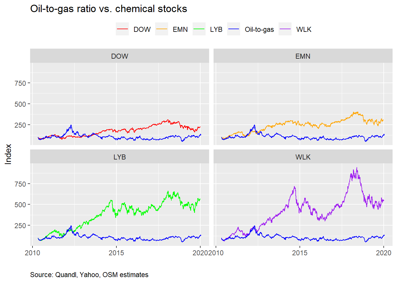
We indexed the stock price and oil-to-gas values to the beginning of 2010 to compare the changes across time on a normalized basis. But having everything on the same scale, doesn’t always help one see the time series correlation with oil-to-gas. Below, we present the same charts with each y-axis scaled to the individual stock index.
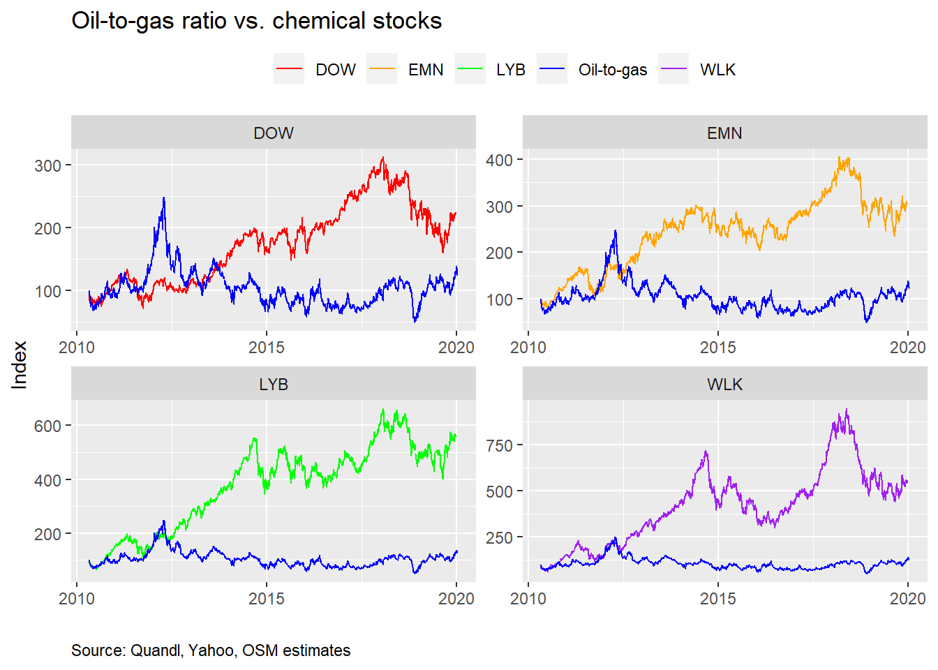
That gives one a slightly different picture, but it’s hard to see a strong relationship. Let’s run some scatter plots to see if there’s a more recognizable relationship. In the following graphs, we plot the daily percentage change in the oil-to-gas ratio (on the x-axis) against the daily return in the respective stock (on the y-axis). We also include a 45o line to help identify a pure one-to-one relationship.
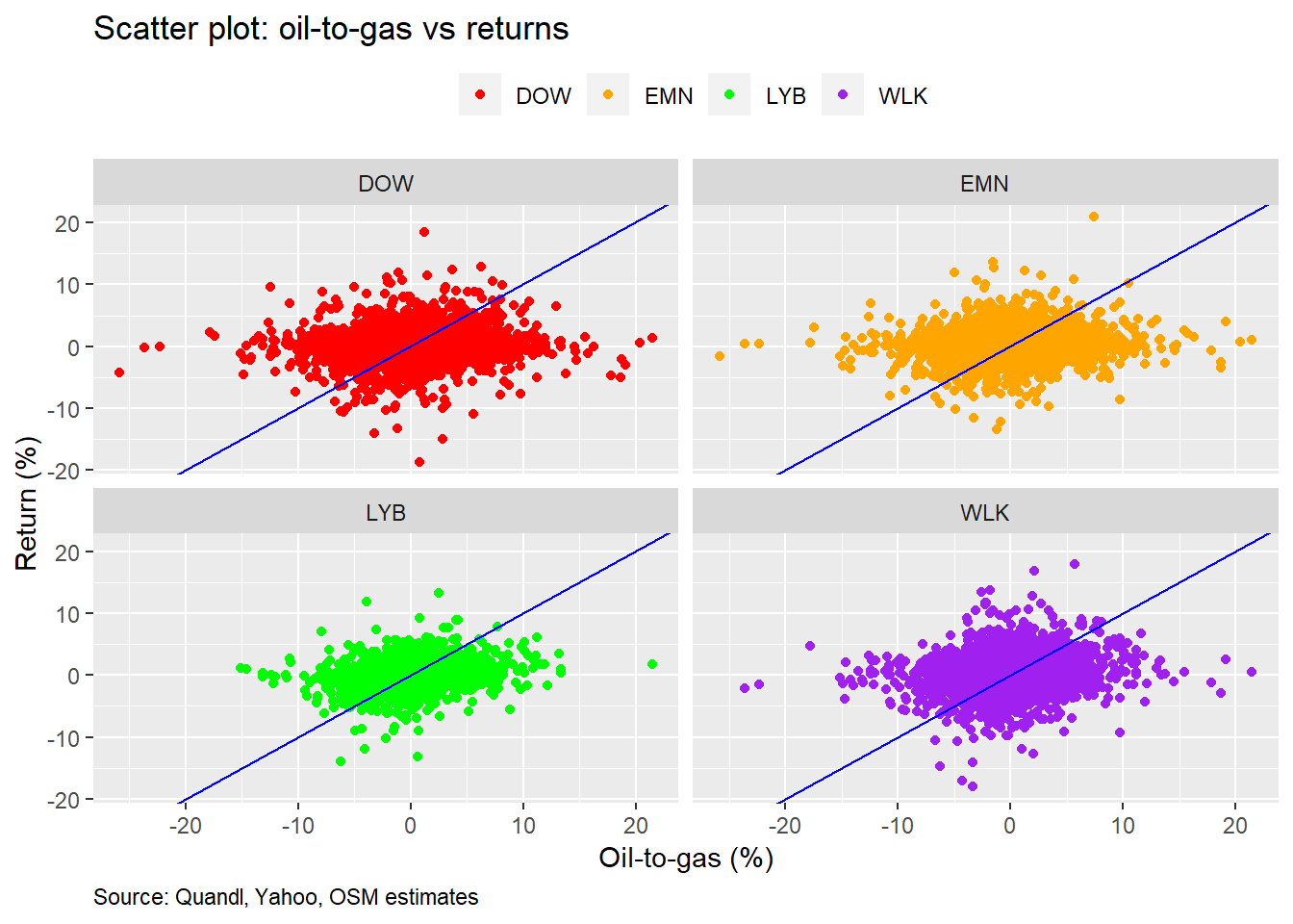
As we can, see the linear relationship isn’t that strong. But the scatter plots don’t show any odd clustering or massive outliers other than what we’d expect with share price data. What’s the correlation between the oil-to-gas ratio and stock returns? We show that in the table below.
| Stock | Correlation (%) |
|---|---|
| DOW | 20.0 |
| EMN | 20.3 |
| LYB | 21.0 |
| WLK | 24.7 |
| Source: Quandl, Yahoo, OSM estimates |
While correlations of 20% may not be that high, they do show a positive linear relationship. Importantly, many variables, systematic and idiosyncratic, drive stock returns, so it would be surprising to see such a relatively esoteric ratio having an impact above 40-50%. Hence, on first glance, this appears enough to warrant a deeper investigation.
Regression time!
We’ll now regress the changes in the oil-to-gas ratio against the returns of the various stocks. We’ll first look at the size effect (the slope of the regression equation) on stock returns and then the explanatory power.
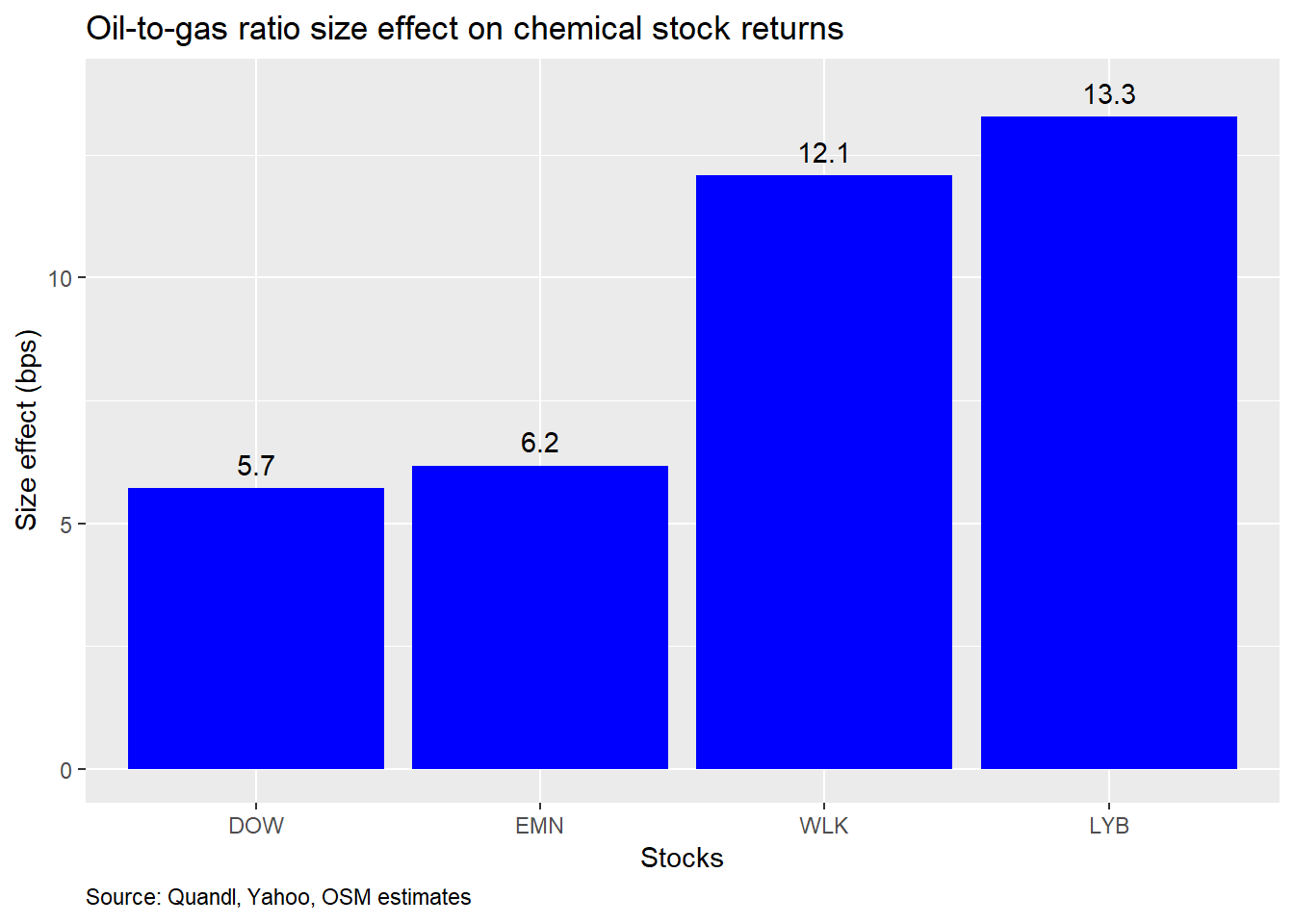
So what does this mean? Since we’re regressing stock returns against changes in the oil-to-gas ratio, for every 1% change in the ratio, the chemical stocks move 6-13 basis points.2 That seems pretty modest. What’s more interesting is that the size effects relative to one another are close to what we would expect based on exposure to natural gas and product slate. Also, while we don’t show it, the size effects are all significant below the 5% level, implying a solid relationship between the ratio and returns.
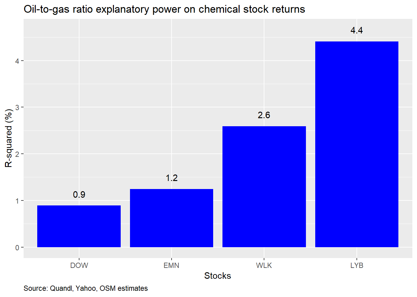
How much does the variability in the oil-to-gas ratio explain the variability in stock returns? Not very much. As one can see from the chart below, even the highest R-squared is less than 5%.
One might wonder why you should pay attention to the oil-to-gas ratio at all given what appears to be a limited impact on stock returns. But, recall, we’ve been using daily data. There’s a lot of noise in daily returns. If we switch to monthly data, we might be able to tease out the signal. With R, a few tweaks to the code and we can re-run all the analysis. If we were trying to do this in a spreadsheet, we’d have started thinking about getting our dinner order in, because it was sure to be a long night!
Here’s the size effect based on monthly data.
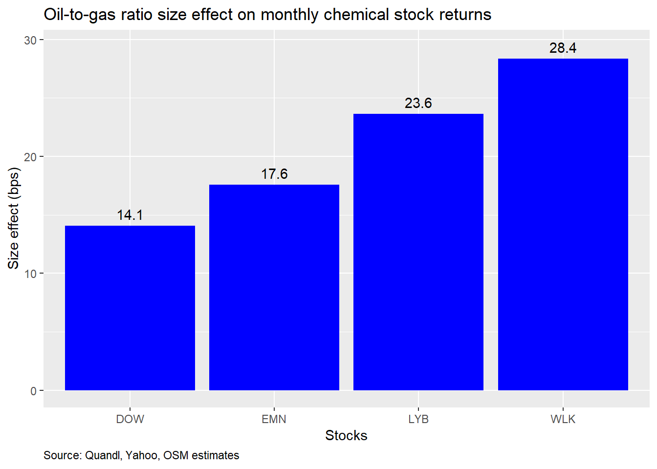
That appears to be a significant improvement. For every one percent change in the oil-to-gas ratio, monthly returns change by 14-to-28 bps. What about the explanatory power? Check out the graph below.
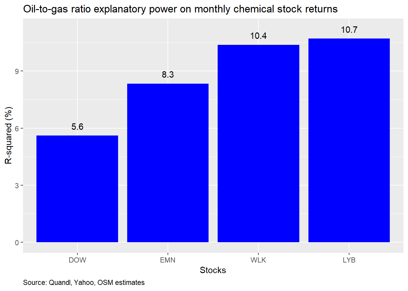
Again, a noticeable improvement in explanatory power. The variability in the oil-to-gas ratio explains about 5-10% of the variability in monthly returns.
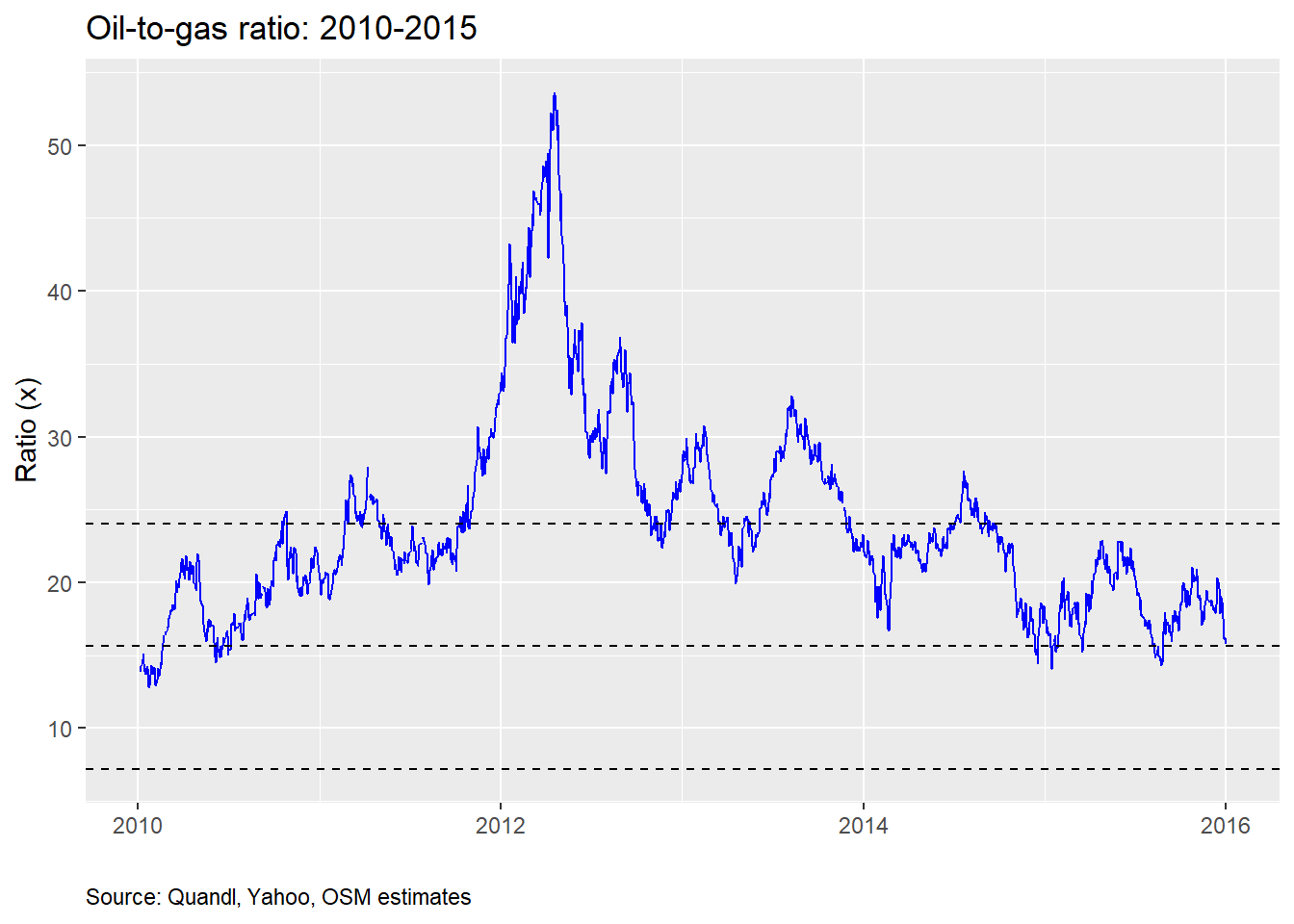
Where might we go from here? One avenue would be to build a machine learning model to see how well the oil-to-gas ratio might predict stock returns on out-of-sample data. We can split the data from 2010 to 2015, which includes just about a round trip in the oil-to-gas ratio, as we can see from the graph below. The dashed lines are the average and standard deviation levels for the 2000-2019 period.
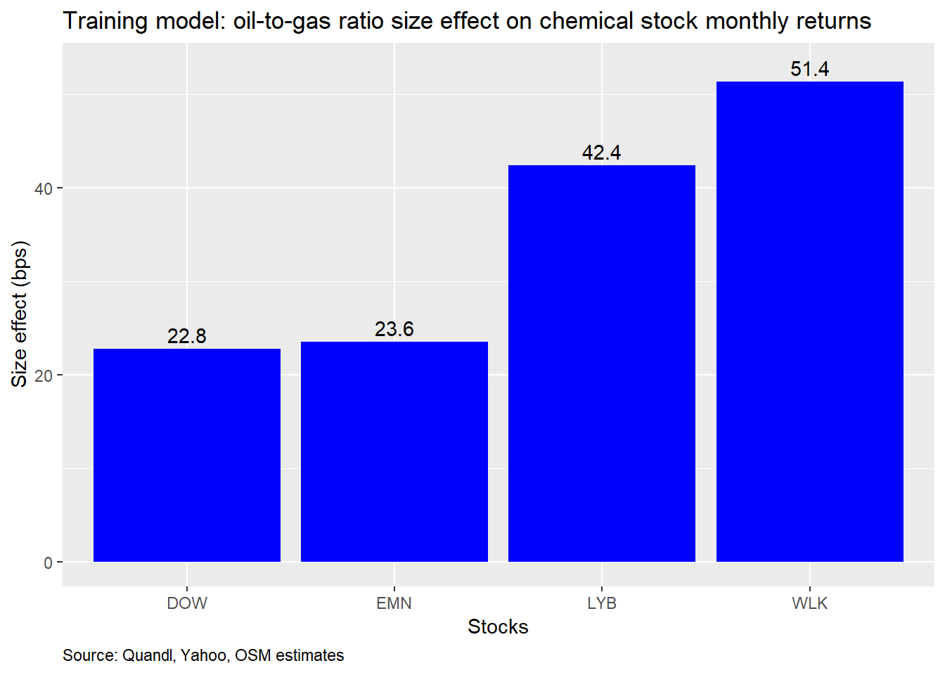
We’ll then test the model trained on the 2010-2015 data on the out-of-sample 2016-2019 data and compare the predicted returns to the actual returns. Here is the size effect graph based on the training data. Notice the greater effect on LYB and WLK for the training period vs. the previous total period.
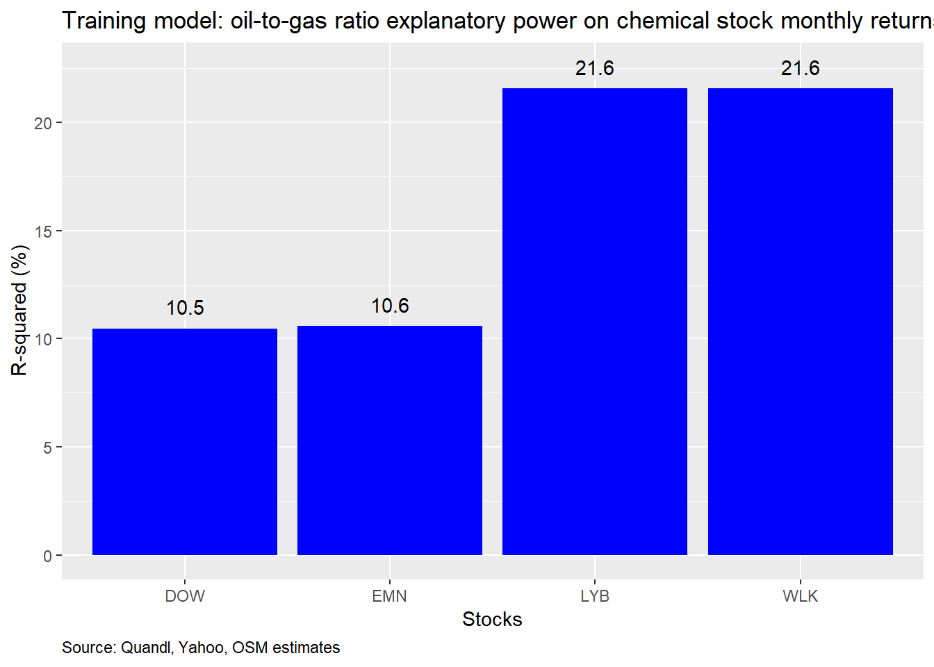
And here is a graph of the R-squareds. Note how the stocks form pairs, which roughly match the higher correlations between the two—i.e, LYB and WLK are more highly correlated with each other, than with the other stocks.
Now, to get a visual sense of the how the predicted values stack up to the actual, we present scatter plots of the two series with a regression line to show accuracy.
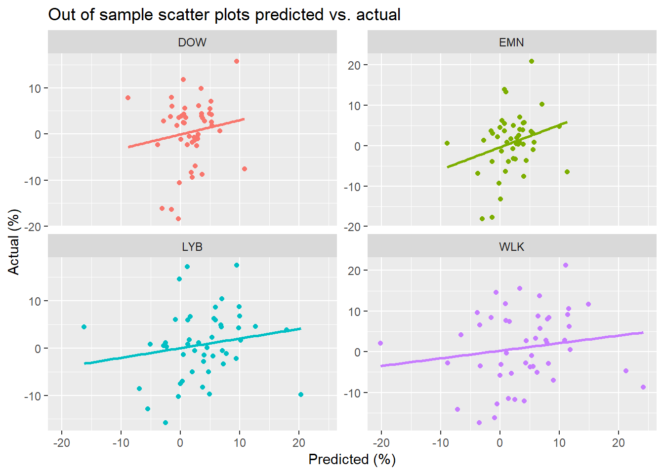
Not exactly the one-for-one correspondence one might hope for. But there appears to be a nice linear relationship, suggesting that the out-of-sample results aren’t atrocious. If we want a single numerical comparison, we can compute the the root mean-squared error (RMSE), which tells us how much the predicted values deviate from the actual values.
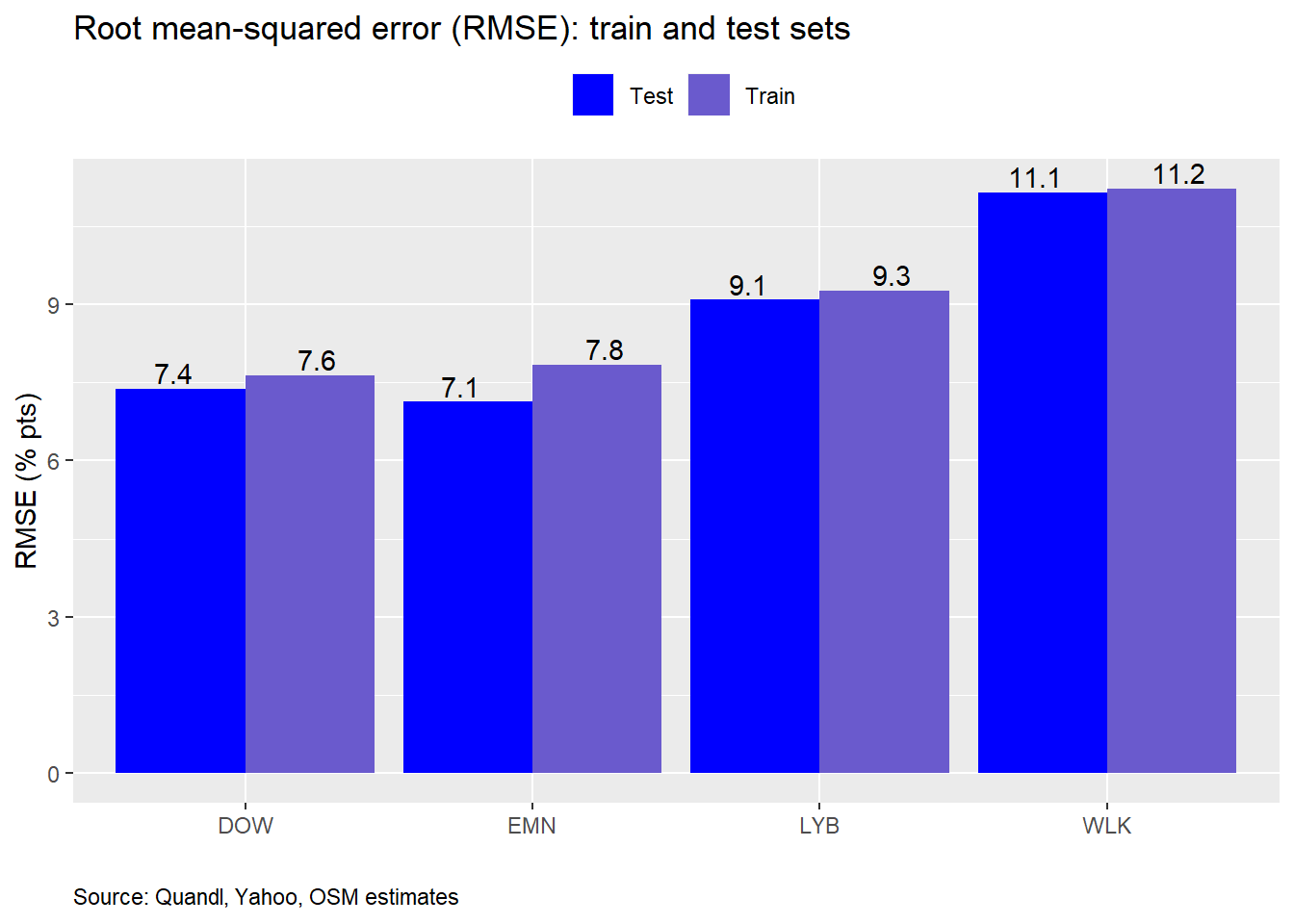
Interestingly, the out-of-sample RMSE’s are modestly better than the in-sample. This is unusual, though not unheard of. The main reason for the difference is that the period from 2016 to present had less volatility in the oil-to-gas ratio (and generally less in equities, excluding some late bursts in 2018), so there would be less error. Since the differences in RMSE are small, it suggests this is a good model in the sense that the training model has not over fit the data. But there may be a problem here since, as we mentioned above, the training period was “harder” than the testing period.
Our goal is to see how accurate the model is at predicting returns. To do that we can compare the RMSE to size effect, since they’re on the same scale. Recall, that a percent change in the oil-to-gas ratio resulted in about a 25-50bps change in monthly stock returns. So if the prediction is off by seven-to-eleven percentage points, then we’d have to conclude that this model isn’t the best in terms of prediction. Of course, we knew going in that the oil-to-gas ratio is only one component of stock returns.
Getting back to the original headline of the oil-to-gas ratio at multi-year highs, we need to ask whether that has any implications for returns. The fact that in the last two months the oil-to-gas ratio increased by 17% per month on average, while the stocks only moved 2-4% suggests the stocks aren’t performing in a way the model would have predicted. That begs the question of why, which, unfortunately, is beyond the scpoe of this post. Of course, a big problem with the model is that there’s still a fair amount of unexplained variation that needs to be addressed. We could do that by adding additional risk factors like excess equity returns, valuation, size, etc.
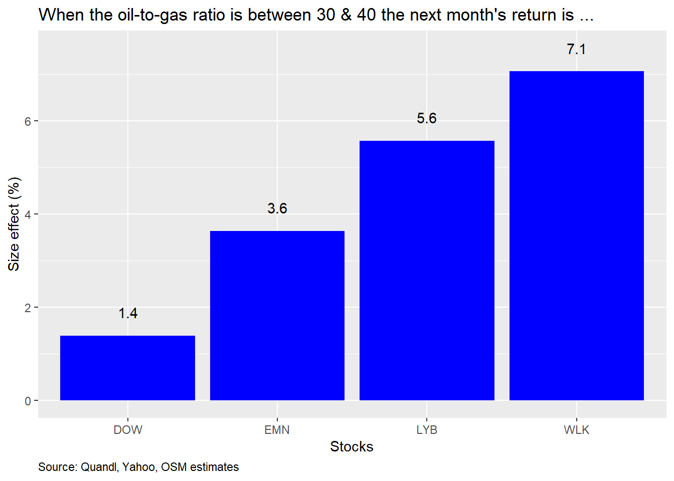
Another alternative might be to look at various levels of the oil-to-gas ratio, rather than changes, and to see what impact that has on future returns. We are, after all, concerned with future, not concurrent, returns. A quick regression where we grouped the ratio by every ten points and regressed those categories against returns a month in advance, suggests that when the ratio is between 30 and 40, the stocks have typically seen a 1-7% return in the next month on average. We provide the size effect graph below. Still, we’d need to perform more testing on this model as well as on additional risk factors mentioned above. But both of those would require another post.
What’s the conclusion? Changes in the oil-to-gas ratio exhibit a significant relationship with chemical stock returns, but the impact is modest on a univariate basis. The impact increases when examining a monthly rather than a daily time series. But we haven’t looked at longer periods. The ratio does not, however, have a strong explanatory power, though it does improve with monthly data. Given the rise in the oil-to-gas ratio over the last two months, a simple linear regression model trained on data from 2010-2015 suggests that the magnitude of the stocks’ reactions was not as great as would have been anticipated. A rough cut model in which the oil-to-gas ratio was transformed into categorical variables also suggests that returns should be nicely positive in most cases if the ratio surpasses 30. But there is a fair amount of unexplained variance in the models, so including other risk factors may yield more robust results. That’s an avenue we might pursue in future posts if interest warrants it. Until then, all the code used to produce the previous analyses and charts is below. Let us know if you have any questions.
# Load package
library(tidyquant)
library(broom)
library(Quandl)
Quandl.api_key("Your key!")

# Load data

# Energy
oil <- Quandl("CHRIS/CME_CL1", type = "xts", start_date = "2000-01-01")
nat_gas <- Quandl("CHRIS/CME_NG1", type = "xts", start_date = "2000-01-01")
energy <- merge(oil[,"Last"], nat_gas[,"Last"])
names(energy) <- c("oil", "nat_gas")
energy$oil_2_gas <- energy$oil/energy$nat_gas

# Equity
symbols <- c("LYB", "DOW", "WLK", "EMN", "^GSPC")
prices <- getSymbols(symbols,
                     from = "2000-01-01",
                     to = "2019-12-31",
                     warning = FALSE) %>%
  map(~Ad(get(.))) %>%
  reduce(merge) %>%
  `colnames<-`(symbols)

# Prices to backfill Dow
dow <- Quandl("WIKI/DOW", type = "xts", start_date = "2000-01-01")
dwdp <- Quandl("WIKI/DWDP", type = "xts", start_date = "2000-01-01")
getSymbols("DD", from = "2000-01-01")

# Merge Dow history with DowDupont & Dupont
dow_con <- rbind(dow$`Adj. Close`,
                 dwdp$`Adj. Close`["2017-09-01/2018-03-27"],
                 Ad(DD["2018-03-28/2019-03-19"]),
                 Ad(DOW))

# Create percent change index
dd_delt <- Ad(DD["2018-03-26/2019-03-20"])
dd_delt <- dd_delt/lag(dd_delt)

# Interpolate Dow's price during merge period
dow_int <- as.numeric(dwdp$`Adj. Close`["2018-03-27"])*
  cumprod(as.numeric(dd_delt["2018-03-28/2019-03-19"]))
dow_con["2018-03-28/2019-03-19"] <- dow_int

# Merge with other prices
prices <- merge(prices, dow_con)
prices$DOW <- NULL

## Create data frames
# Daily
xts_df <- merge(energy, prices)
colnames(xts_df)[4:8] <- c(tolower(colnames(xts_df)[4:6]), "sp", "dow")
df <- data.frame(date = index(xts_df), coredata(xts_df))

# Monthly
xts_mon <- to.monthly(xts_df, indexAt = "lastof", OHLC = FALSE)
df_mon <- data.frame(date = index(xts_mon), coredata(xts_mon))


# Graph ratio
df %>%
  ggplot(aes(date, oil_2_gas)) +
  geom_line(color = "blue") +
  geom_hline(yintercept = mean(df$oil_2_gas, na.rm = TRUE),
             linetype = "dashed") +
  geom_hline(yintercept = mean(df$oil_2_gas, na.rm = TRUE) + sd(df$oil_2_gas, na.rm = TRUE),
             linetype = "dashed") +
  geom_hline(yintercept = mean(df$oil_2_gas, na.rm = TRUE) - sd(df$oil_2_gas, na.rm = TRUE),
             linetype = "dashed") +
  labs(x = "",
       y = "Ratio (x)",
       title = "Oil-to-gas ratio",
       caption = "Source: Quandl, Yahoo, OSM estimates") +
   theme(plot.caption = element_text(hjust = 0))


# Facet graph
df %>%
  filter(date > "2010-05-01") %>%
  select(-oil, -nat_gas, -sp) %>%
  gather(key, value, -c(date, oil_2_gas)) %>%
  group_by(key) %>%
  mutate(value = value/first(value)*100,
         oil_2_gas = oil_2_gas/first(oil_2_gas)*100) %>%
  ggplot(aes(date)) +
  geom_line(aes(y = value, color = key)) +
  geom_line(aes(y = oil_2_gas, color = "Oil-to-Gas")) +
  scale_color_manual("",labels = c("DOW", "EMN", "LYB", "Oil-to-gas", "WLK"),
                     values = c("red", "orange", "green", "blue", "purple")) +
  facet_wrap(~key, labeller = labeller(key = c("dow" = "DOW",
                                               "emn" = "EMN",
                                               "lyb" = "LYB",
                                               "wlk" = "WLK"))) +
  labs(x = "",
       y = "Index",
       title = "Oil-to-gas ratio vs. chemical stocks",
       caption = "Source: Quandl, Yahoo, OSM estimates") +
  theme(legend.position = "top",
        plot.caption = element_text(hjust = 0))

# Facet graph
df %>%
  filter(date > "2010-05-01") %>%
  select(-oil, -nat_gas, -sp) %>%
  gather(key, value, -c(date, oil_2_gas)) %>%
  group_by(key) %>%
  mutate(value = value/first(value)*100,
         oil_2_gas = oil_2_gas/first(oil_2_gas)*100) %>%
  ggplot(aes(date)) +
  geom_line(aes(y = value, color = key)) +
  geom_line(aes(y = oil_2_gas, color = "Oil-to-Gas")) +
  scale_color_manual("",labels = c("DOW", "EMN", "LYB", "Oil-to-gas", "WLK"),
                     values = c("red", "orange", "green", "blue", "purple")) +
  facet_wrap(~key,
             scales = "free",
             labeller = labeller(key = c("dow" = "DOW",
                                               "emn" = "EMN",
                                               "lyb" = "LYB",
                                               "wlk" = "WLK"))) +
  labs(x = "",
       y = "Index",
       title = "Oil-to-gas ratio vs. chemical stocks",
       caption = "Source: Quandl, Yahoo, OSM estimates") +
  theme(legend.position = "top",
        plot.caption = element_text(hjust = 0))

df %>%
  select(-c(oil, nat_gas, sp, date)) %>%
  mutate_at(vars(oil_2_gas:dow), function(x) x/lag(x)-1) %>%
  gather(key, value, -oil_2_gas) %>%
  group_by(key) %>%
  ggplot(aes(oil_2_gas*100, value*100, color = key)) +
  geom_point() +
  geom_abline(color = "blue") +
  facet_wrap(~key,
             labeller = labeller(key = c("dow" = "DOW",
                                         "emn" = "EMN",
                                         "lyb" = "LYB",
                                         "wlk" = "WLK"))) +
  labs(x = "Oil-to-gas (%)",
       y = "Return (%)",
       title = "Scatter plot: oil-to-gas vs returns") +
  scale_color_manual("",labels = c("DOW", "EMN", "LYB", "WLK"),
                     values = c("red", "orange", "green", "purple")) +

  theme(legend.position = "top",
        plot.caption = element_text(hjust = 0))

# Correlation table
df %>%
  filter(date > "2010-01-01") %>%
  select(-c(date, oil, nat_gas, sp)) %>%
  mutate_at(vars(oil_2_gas:dow), function(x) x/lag(x) - 1) %>%
  rename("DOW" = dow,
         "EMN" = emn,
         "LYB" = lyb,
         "WLK" = wlk) %>%
  gather(Stock, value, -oil_2_gas) %>%
  group_by(Stock) %>%
  summarise(`Correlation (%)` = round(cor(value, oil_2_gas, use = "pairwise.complete.obs"),3)*100) %>%
  knitr::kable(caption = "Oil-to-gas correlation with chemical stocks") +
  kableExtra::add_footnote("Source: Quandl, Yahoo, OSM estimates")

# Graph of change in oil-to-gas ratio size effect
df %>%
  select(-c(oil, nat_gas, sp, date)) %>%
  mutate_at(vars(oil_2_gas:dow), function(x) x/lag(x)-1) %>%
  rename("DOW" = dow,
         "EMN" = emn,
         "LYB" = lyb,
         "WLK" = wlk) %>%
  gather(key, value, -oil_2_gas) %>%
  group_by(key) %>%
  do(tidy(lm(value ~ oil_2_gas,.))) %>%
  filter(term != "(Intercept)") %>%
  ggplot(aes(reorder(key, estimate), estimate*100)) +
  geom_bar(stat = 'identity', fill = "blue") +
  labs(x = "Stocks",
       y = "Size effect (bps)",
       title = "Oil-to-gas ratio size effect on chemical stock returns",
       caption = "Source: Quandl, Yahoo, OSM estimates") +
  geom_text(aes(label = round(estimate,3)*100), nudge_y = 0.5) +
  theme(plot.caption = element_text(hjust = 0))

# Graph of r-squareds
df %>%
  # filter(date <= "2015-01-01") %>%
  select(-c(oil, nat_gas, sp, date)) %>%
  mutate_at(vars(oil_2_gas:dow), function(x) x/lag(x)-1) %>%
  rename("DOW" = dow,
         "EMN" = emn,
         "LYB" = lyb,
         "WLK" = wlk) %>%
  gather(key, value, -oil_2_gas) %>%
  group_by(key) %>%
  do(glance(lm(value ~ oil_2_gas,.))) %>%
  ggplot(aes(reorder(key, r.squared), r.squared*100)) +
  geom_bar(stat = 'identity', fill = "blue") +
  geom_text(aes(label = round(r.squared,3)*100), nudge_y = 0.25 ) +
  labs(x = "Stocks",
       y = "R-squared (%)",
       title = "Oil-to-gas ratio explanatory power on chemical stock returns",
       caption = "Source: Quandl, Yahoo, OSM estimates") +
  theme(plot.caption = element_text(hjust = 0))

# Graph of change in oil-to-gas ratio size effect
df_mon %>%
  select(-c(oil, nat_gas, sp, date)) %>%
  mutate_at(vars(oil_2_gas:dow), function(x) x/lag(x)-1) %>%
  rename("DOW" = dow,
         "EMN" = emn,
         "LYB" = lyb,
         "WLK" = wlk) %>%
  gather(key, value, -oil_2_gas) %>%
  group_by(key) %>%
  do(tidy(lm(value ~ oil_2_gas,.))) %>%
  filter(term != "(Intercept)") %>%
  ggplot(aes(reorder(key, estimate), estimate*100)) +
  geom_bar(stat = 'identity', fill = "blue") +
  labs(x = "Stocks",
       y = "Size effect (bps)",
       title = "Oil-to-gas ratio size effect on monthly chemical stock returns",
       caption = "Source: Quandl, Yahoo, OSM estimates") +
  geom_text(aes(label = round(estimate,3)*100), nudge_y = 1) +
  theme(plot.caption = element_text(hjust = 0))

# Graph of r-squareds
df_mon %>%
  # filter(date <= "2015-01-01") %>%
  select(-c(oil, nat_gas, sp, date)) %>%
  mutate_at(vars(oil_2_gas:dow), function(x) x/lag(x)-1) %>%
  rename("DOW" = dow,
         "EMN" = emn,
         "LYB" = lyb,
         "WLK" = wlk) %>%
  gather(key, value, -oil_2_gas) %>%
  group_by(key) %>%
  do(glance(lm(value ~ oil_2_gas,.))) %>%
  ggplot(aes(reorder(key, r.squared), r.squared*100)) +
  geom_bar(stat = 'identity', fill = "blue") +
  geom_text(aes(label = round(r.squared,3)*100), nudge_y = 0.5 ) +
  labs(x = "Stocks",
       y = "R-squared (%)",
       title = "Oil-to-gas ratio explanatory power on monthly chemical stock returns",
       caption = "Source: Quandl, Yahoo, OSM estimates") +
  theme(plot.caption = element_text(hjust = 0))

df %>%
  filter(date >= "2010-01-01", date < "2016-01-01") %>%
  ggplot(aes(date, oil_2_gas)) +
  geom_line(color = "blue") +
  geom_hline(yintercept = mean(df$oil_2_gas, na.rm = TRUE),
             linetype = "dashed") +
  geom_hline(yintercept = mean(df$oil_2_gas, na.rm = TRUE) + sd(df$oil_2_gas, na.rm = TRUE),
             linetype = "dashed") +
  geom_hline(yintercept = mean(df$oil_2_gas, na.rm = TRUE) - sd(df$oil_2_gas, na.rm = TRUE),
             linetype = "dashed") +
  labs(x = "",
       y = "Ratio (x)",
       title = "Oil-to-gas ratio: 2010-2015",
       caption = "Source: Quandl, Yahoo, OSM estimates") +
  theme(plot.caption = element_text(hjust = 0))

## Train & test split
df_mon_train <- df_mon %>%
  select(-c(oil, nat_gas, sp)) %>%
  mutate_at(vars(oil_2_gas:dow), function(x) (x/lag(x)-1)) %>%
  filter(date >= "2010-05-01", date < "2016-01-01")

df_mon_test <- df_mon %>%
  select(-c(oil, nat_gas, sp)) %>%
  mutate_at(vars(oil_2_gas:dow), function(x) (x/lag(x)-1)) %>%
  filter(date >= "2016-01-01")

# Graph size effecs
df_mon_train %>%
  rename("DOW" = dow,
       "EMN" = emn,
       "LYB" = lyb,
       "WLK" = wlk) %>%
  gather(key, value, -c(oil_2_gas, date)) %>%
  group_by(key) %>%
  do(tidy(lm(value ~ oil_2_gas,.))) %>%
  filter(term != "(Intercept)") %>%
  ggplot(aes(reorder(key, estimate), estimate*100)) +
  geom_bar(stat = 'identity', fill = "blue") +
  labs(x = "Stocks",
       y = "Size effect (bps)",
       title = "Training model: oil-to-gas ratio size effect on chemical stock monthly returns",
       caption = "Source: Quandl, Yahoo, OSM estimates") +
  geom_text(aes(label = round(estimate,3)*100), nudge_y = 1.5) +
  theme(plot.caption = element_text(hjust = 0))

# Graph R-squareds
df_mon_train %>%
  rename("DOW" = dow,
          "EMN" = emn,
          "LYB" = lyb,
          "WLK" = wlk) %>%
  gather(key, value, -c(oil_2_gas,date)) %>%
  group_by(key) %>%
  do(glance(lm(value ~ oil_2_gas,.))) %>%
  ggplot(aes(reorder(key, r.squared), r.squared*100)) +
  geom_bar(stat = 'identity', fill = "blue") +
  geom_text(aes(label = round(r.squared,3)*100), nudge_y = 1 ) +
  labs(x = "Stocks",
       y = "R-squared (%)",
       title = "Training model: oil-to-gas ratio explanatory power on chemical stock monthly returns",
       caption = "Source: Quandl, Yahoo, OSM estimates") +
  theme(plot.caption = element_text(hjust = 0))

models <- list()
for(i in 1:4){
  formula <- as.formula(paste(colnames(df_mon_train)[i+2], "oil_2_gas", sep = "~"))
  models[[i]] <- lm(formula, data = df_mon_train)
}


preds <- data.frame(lyb_pred = rep(0, nrow(df_mon_test)),
                    wlk_pred = rep(0, nrow(df_mon_test)),
                    emn_pred = rep(0, nrow(df_mon_test)),
                    dow_pred = rep(0, nrow(df_mon_test)))

for(i in 1:4){
  preds[,i] <- predict(models[[i]], df_mon_test)
}

# scatter plot of predicted vs. actual
df_mon_test %>%
  select(-date, -oil_2_gas) %>%
  mutate(output = "actual",
         obs = row_number()) %>%
  bind_rows(preds %>%
              mutate(output = "predicted",
                     obs = row_number()) %>%
              rename("lyb" = lyb_pred,
                     "wlk" = wlk_pred,
                     "emn" = emn_pred,
                     "dow" = dow_pred)) %>%
  gather(lyb:dow, key = series, value = value) %>%
  spread(key = output, value = value) %>%
  ggplot(aes(predicted, actual, color = series)) +
  geom_point() +
  geom_smooth(method = "lm", se = FALSE) +
  facet_wrap(~ series,
             scales = "free_y",
             labeller = labeller(series = c("dow" = "DOW",
                                         "emn" = "EMN",
                                         "lyb" = "LYB",
                                         "wlk" = "WLK"))) +
  labs(x = "Predicted",
       y = "Actual",
       title = "Out of sample scatter plots: predicted vs. actual",
       caption = "Source: Quandl, Yahoo, OSM estimates") +
  theme(legend.position = "") +
  theme(plot.caption = element_text(hjust = 0))


## Root mean squared error
# Create predicted data frame on in-sample data
preds_mod <- data.frame(lyb_pred = rep(0, nrow(df_mon_train)),
                    wlk_pred = rep(0, nrow(df_mon_train)),
                    emn_pred = rep(0, nrow(df_mon_train)),
                    dow_pred = rep(0, nrow(df_mon_train)))

# For loop prediction
for(i in 1:4){
  preds_mod[,i] <- predict(models[[i]], df_mon_train)
}

# Compute in-sample RMSE
rmse_train <- c()
for(i in 1:4){
  rmse_train[i] <- sqrt(mean((preds_mod[,i] - df_mon_train[,i+2])^2))
}

# Compute out-of-sample RMSE
rmse_test <- c()
for(i in 1:4){
  rmse_test[i] <- sqrt(mean((preds[,i] - df_mon_test[,i+2])^2))
}

# Create RMSE data frame
rmse <- data.frame(stock = toupper(colnames(df_mon_test)[3:6]), rmse_train, rmse_test)

# Graph RMSE
rmse %>%
  gather(key, value, -stock) %>%
  ggplot(aes(stock, value*100, fill = key)) +
  geom_bar(stat = "identity", position = "dodge") +
  scale_fill_manual("",
                    labels = c("Test", "Train"),
                    values = c("blue", "slateblue")) +
  geom_text(aes(label = round(value,3)*100), position = position_dodge(width = 1), vjust = -0.25) +
  theme(legend.position = "top") +
  labs(x = "",
        y = "RMSE (% pts)",
        title = "Root mean-squared error (RMSE): train and test sets",
       caption = "Source: Quandl, Yahoo, OSM estimates") +
  theme(plot.caption = element_text(hjust = 0))


df %>%
  select(-c(date, oil, nat_gas, sp)) %>%
  mutate(oil_2_gas = cut(oil_2_gas, c(10, 20,30, 40, 50))) %>%
  mutate_at(vars(lyb:dow), function(x) lead(x,22)/x-1) %>%
  rename("DOW" = dow,
         "EMN" = emn,
         "LYB" = lyb,
         "WLK" = wlk) %>%
  gather(key, value, -oil_2_gas) %>%
  group_by(key) %>%
  do(tidy(lm(value ~ oil_2_gas,.))) %>%
  filter(term == "oil_2_gas(30,40]") %>%
  ggplot(aes(key, estimate*100)) +
  geom_bar(stat = "identity", fill = "blue") +
  labs(x = "Stocks",
       y = "Size effect (%)",
       title = "When the oil-to-gas ratio is between 30 & 40 the next month's return is ...",
       caption = "Source: Quandl, Yahoo, OSM estimates") +
  geom_text(aes(label = round(estimate,3)*100), nudge_y = 0.5) +
  theme(plot.caption = element_text(hjust = 0))
Data providers will have different numbers. Since this blog is meant to be reproducible, we used only publicly available sources. Our code will show what we did to create a uniform series for Dow. Not the prettiest code, however. LYB emerged from bankruptcy in 2010. Finding publicly available data of the original Lyondell (LYO) is tough. so we just use the post-bankruptcy period.↩
A basis point is 1/100th of a percent.↩