Skew who?
In our last post on the SKEW index we looked at how good the index was in pricing two standard deviation (2SD) down moves. The answer: not very. But, we conjectured that this poor performance may be due to the fact that it is more accurate at pricing larger moves, which occur with greater frequency relative to the normal distribution in the S&P. In fact, we showed that on a monthly basis, two standard deviation moves in the S&P 500 (the index underlying the SKEW) occur with approximately the same frequency as would be expected in a normal distribution. Additionally, we used a proxy for a 2SD move based on history rather than the expected magnitude of a 2SD derived from the VIX, or the volatility index that shares the same data upon which the SKEW is based. So if were using the expected magnitude of a 2SD move implied by the VIX at each time slice to test the SKEW’s predictive power we might very well get a different answer. We address those points in this post.
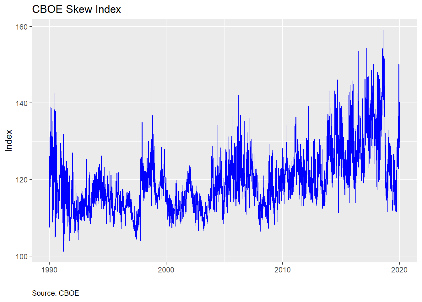
For reference, here’s a chart of the SKEW index
Recall, the SKEW index attempts to quantify tail-risk. In fact, the CBOE provides a nifty table that gives the probability that a 2SD down move will occur in the next month based on the index. We provide an interpolated example below.
| Skew | Probabiilty |
|---|---|
| 100 | 2.30 |
| 105 | 3.65 |
| 110 | 5.00 |
| 115 | 6.35 |
| 120 | 7.70 |
| 125 | 9.05 |
| 130 | 10.40 |
| 135 | 11.75 |
| 140 | 13.10 |
| 145 | 14.45 |
| 150 | 15.80 |
| 155 | 17.15 |
| Source: CBOE, OSM estimates |
In our last post, we showed that these probabilities over-estimated the frequency of a down move, as shown in the graph below.
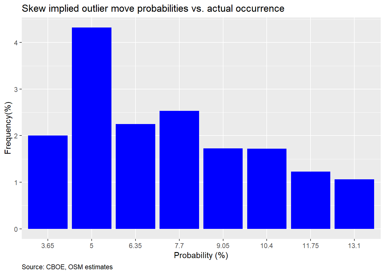
However, we admitted that we were using a rough rule-of-thumb of a decline of greater than 9% over a 30-day period as the expected downside. This approximation is based on the historical annualized volatility of 16% on the S&P 500. That may have been unfair given that volatility is volatile and the VIX reflects that. Now, we calculate the expected magnitude of a 2SD down move based on the VIX. We then see how close the expected probability based on the SKEW matches up with the actual frequency.
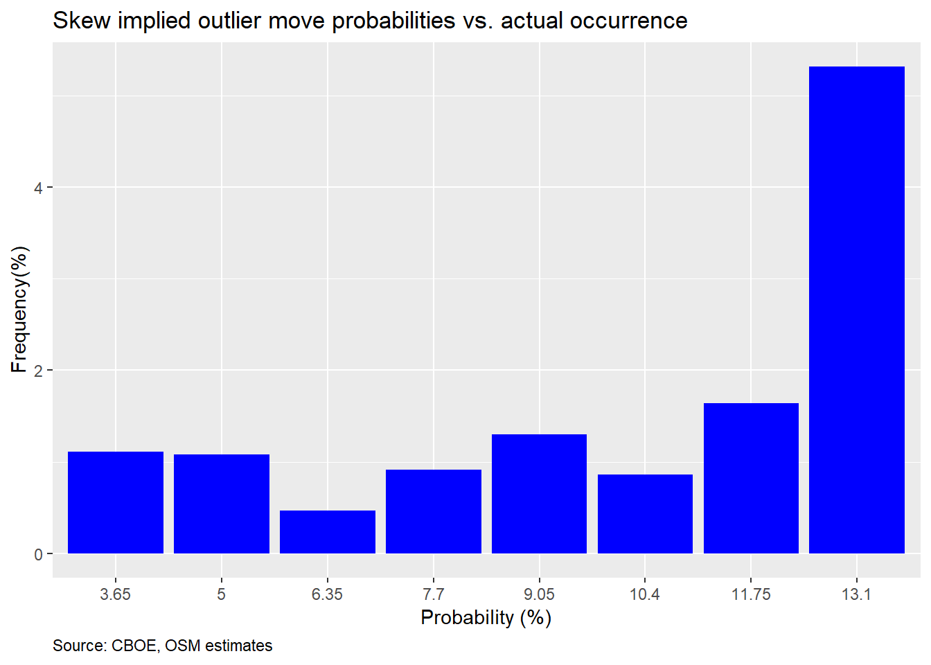
That does not look too good, In fact, it’s even worse that using an approximation, and, it is consistently poor across the board. Even the tallest bar is less than half of what the SKEW expects. Perhaps we should check 3SD moves, as suggested in the introduction. However, when we did that, there were only two buckets among twelve in which the S&P moved equal to or greater than the expected 3SD magnitude. Hence, there’s no point in showing a nearly empty graph. However, we’ll include the code below if you want to see for yourself.
Maybe we’re missing something. One problem is that we’re only looking at the return on the S&P 500 one month hence (effectively 22 trading days). But the options have to price in the potential for a 2SD move prior to the 30 day expiration. To try to account for that, we calculate the max drawdown for every 30 day forward period associated with each daily close of the SKEW index. We then compute how often the max drawdown was at or below the implied 2SD down move. The chart is below.
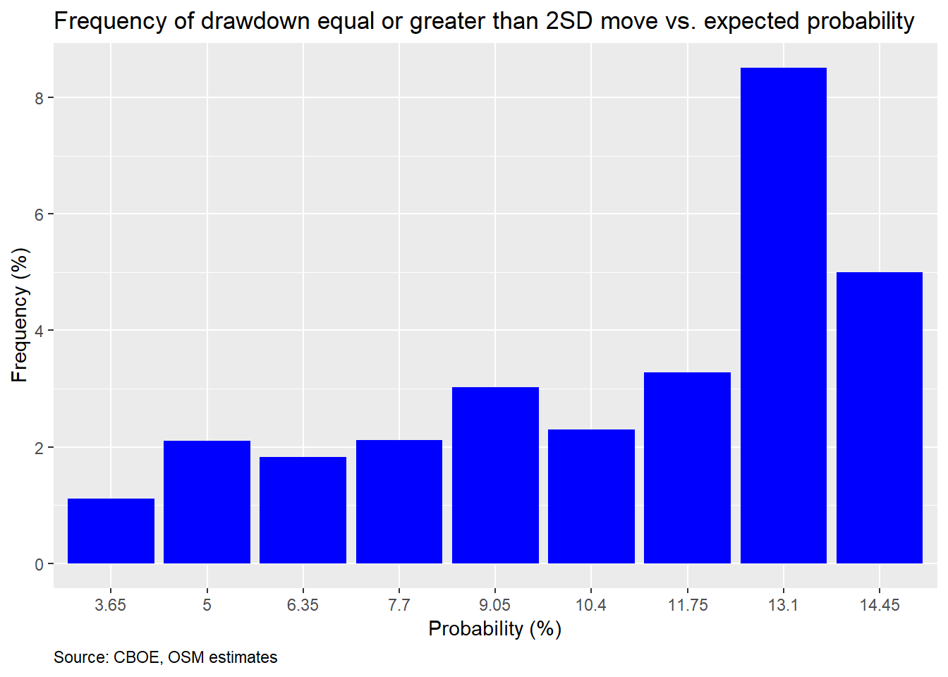
This is not much better but at least its modestly upwardly sloping.
The foregoing analysis suggests that the SKEW index is not very accurate at predicting major moves in advance. In general, it overestimates the frequency of moves greater than 2SD. Additionally, the poor predictive performance does not appear to have any consistency or clustering, which means that it seems unlikely that we could use the index as an investing indicator, certainly not directionally. We could theoretically apply it to finding overpriced options, but that avenue of research is difficult to reproduce from public data, so we may shelve that for now.
Why is the SKEW so poor at prediction? We won’t offer an exhaustive answer here. But we believe a major reason is that market makers need to price in a larger-than-likely down move to ensure they stay in business. In general, the demand to buy puts is higher than for calls. If, as market maker, you’re obligated to be on the other side of that trade—selling puts—you want to make sure if you’ve priced in a bit of cushion so that if you’re wrong, besides being compensated to take risk in general, you can trade again tomorrow. Selling puts entails an unknown, but not unlimited, amount of risk.
It’s easiest to see this over pricing of downside risk in the scatter plots below. Here, we graph the 1SD and 2SD VIX-implied expected vs. actual moves with the 45o line to delineate a one-to-one relationship. As we can see, the actual moves are generally below the expected.
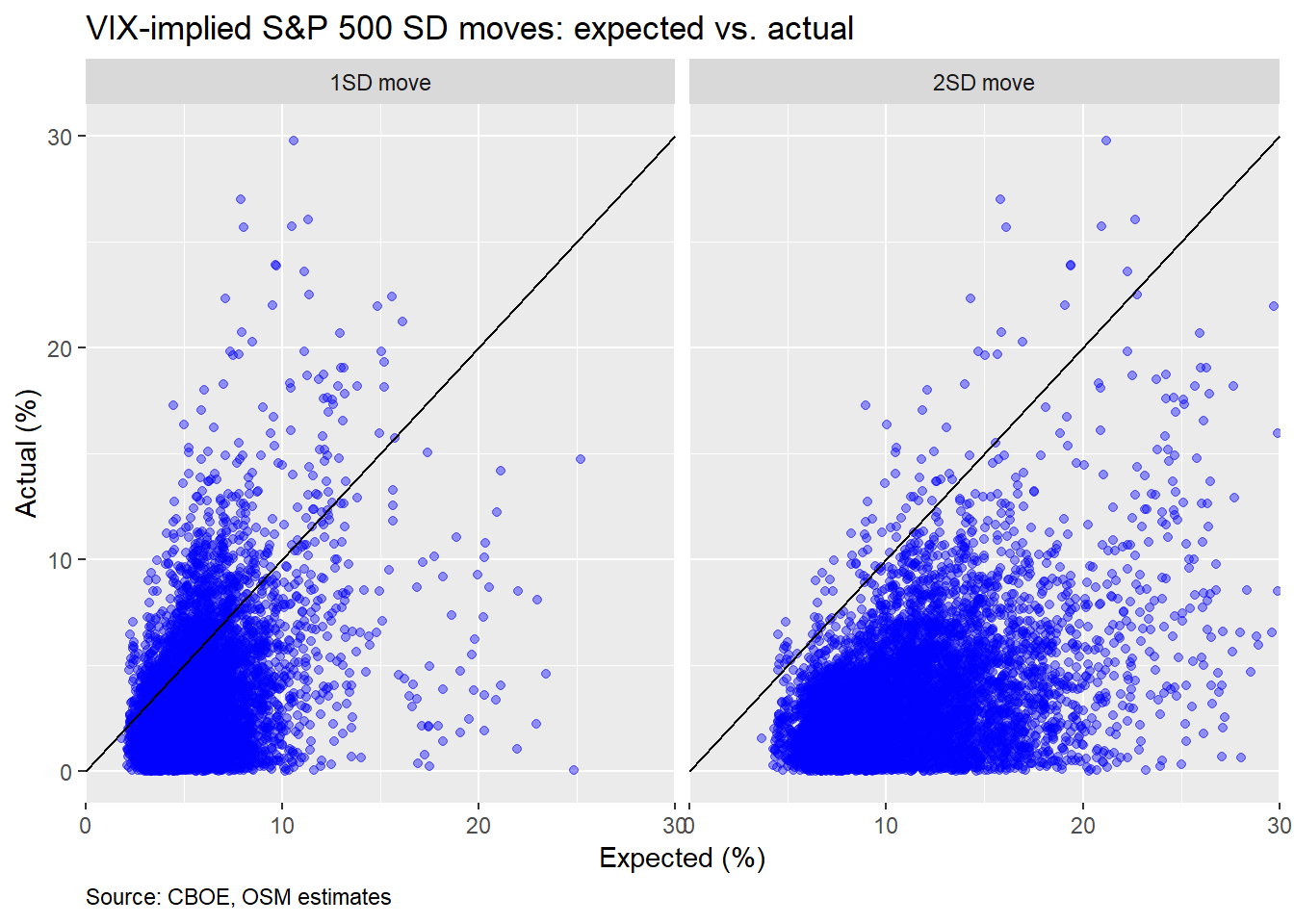
In fact, about 82.9% of the time, the one month move is below the expected 1SD move and 98.8% of the time it is below 2SD. If this were a normal distribution, those numbers should be 68% and 95%.
This begs the question why, if there’s such a wide (and relatively obvious) difference, it isn’t being exploited away? Answering that question has offered academics fertile fields of many cud-chewing opportunities. We obviously can’t even begin to answer it here. But the power of R programming affords a quick and dirty data chug to offer a hypothesis.
The short answer: in months when the market is negative, not only is the end month move greater than expected, the intra-month drawdown is also much greater. Here’s a chart that shows the intra-month drawdown for down months.
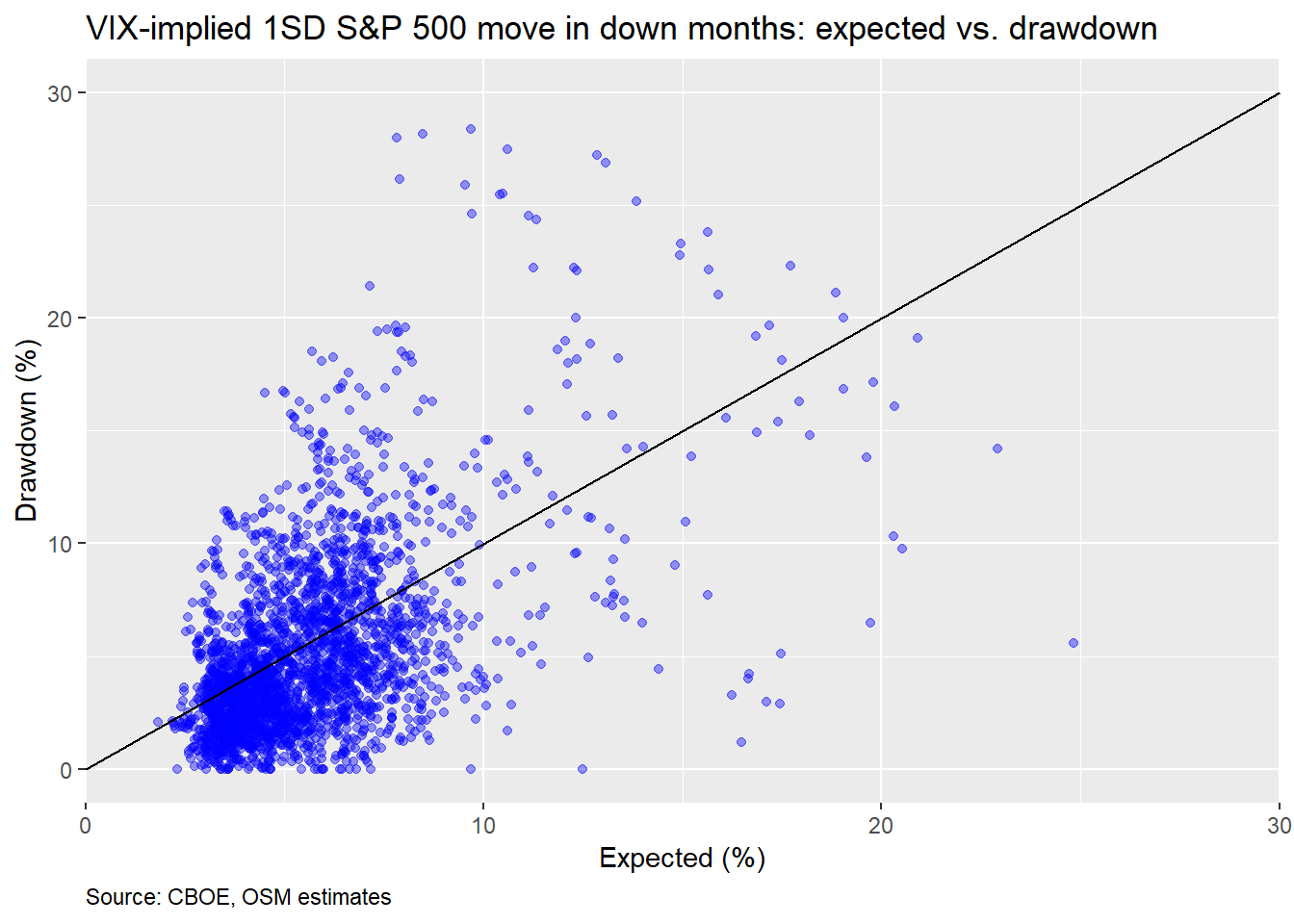
We can see many more of the total points cluster above the 45o line than in the other graphs. In fact, about 36.7% of max declines in down months are greater than the expected 1SD move. And in the down months, the actual decline is greater than the expected 1SD 20.3% of the time. If this were a normal distribution, one would expect only about 16% of the monthly declines to be greater than 1SD and 32% to exceed that 1SD level at least once in the period.
What does this suggest? Even if the VIX overestimates the magnitude of down moves on average, in the down months it still underestimates the decline. Alternatively, the impact of upwardly trending markets skews the average. All of which suggests that trying to exploit this anomaly is really about predicting the market direction. And if you’re able to do that, you’re probably better off speculating on direction, than collecting a 3-4% mispricing.
In the end, we’ve probably exhausted the discussion on the usefulness of the SKEW as a predictive tool. We’ve also looked at reasons for its poor performance and scratched the surface of the thorny volatility risk premium puzzle. Probably enough for one post. Until the next post, we present our code below. For comments and questions, our email is below the code.
# Load package
library(tidyquant)
library(knitr)
library(kableExtra)

# Load data
skew <- readRDS("skew.rds")

# Graph
skew %>%
  ggplot(aes(date, skew)) +
  geom_line(color = "blue") +
  labs(x = "",
       y = "Index",
       title = "CBOE Skew Index",
       caption = "Source: CBOE") +
  theme(plot.caption = element_text(hjust = 0))

# 2SD & 2SD probability vectors
seq <- seq(100,160,5)
skew_idx <- cut(seq[-1], seq)
prob <- c(0.023, 0.0365, 0.05,
          0.0635, 0.077, 0.0905,
          0.104, 0.1175, 0.1310,
          0.1445, .158, 0.1715)
radj_prob <- data.frame(skew = skew_idx, prob = prob)

prob1 <- c(0.0015, 0.0045, 0.0074,
           0.0104, 0.0133, 0.0163,
           0.0192, 0.022, 0.0251,
           0.0281,0.031,0.0339)

radj_prob1 <- data.frame(skew = skew_idx, prob = prob1)

# CBOE interpolated 2SD probability table
data.frame(Skew = seq(100,160,5),
           Probabiilty = prob*100) %>%
  knitr::kable("html",
               caption = "CBOE estimated risk-adjusted probability (%)") %>%
  kableExtra::footnote(general = "CBOE, OSM estimates",
                       general_title = "Source: ")


# NOT SHOWN: CBOE interpolated 3SD probability table
data.frame(Skew = seq(100,160,5),
           Probabiilty = prob1*100) %>%
  knitr::kable("html",
               caption = "CBOE estimated risk-adjusted probability (%)") %>%
  kableExtra::footnote(general = "CBOE, OSM estimates",
                       general_title = "Source: ")


skew_cuts <- cut(skew$skew, seq(100,160,5))
probs <- c()
for(i in 1:length(skew_cuts)){
  probs[i] <- as.numeric(radj_prob[which(skew_cuts[i] == radj_prob$skew),][2])
}

probs1 <- c()
for(i in 1:length(skew_cuts)){
  probs1[i] <- as.numeric(radj_prob1[which(skew_cuts[i] == radj_prob1$skew),][2])
}

skew <- skew %>% mutate(prob_2sd = probs,
                        prob_3sd = probs1)

# Graph
skew %>%
  mutate(sp_move = ifelse(sp_1m <= -0.09, 1, 0)) %>%
  na.omit() %>%
  group_by(prob_2sd) %>%
  summarise(correct = mean(sp_move)) %>%
  filter(!prob %in% c(0.023, 13.1, 14.45, 15.8,0.1715)) %>%
  ggplot(aes(as.factor(prob*100), correct*100)) +
  geom_bar(stat = "identity", fill = "blue") +
  labs(x = "Probability (%)",
       y = "Frequency(%)",
       title = "Skew implied outlier move probabilities vs. actual occurrence",
       caption = "Source: CBOE, OSM estimates") +
  theme(plot.caption = element_text(hjust = 0))

# 2SD probability based on implied 2SD move
skew %>%
  na.omit() %>%
  group_by(prob_2sd) %>%
  summarise(correct = mean(sp_1m <= -two_sd/100)) %>%
  filter(!prob_2sd %in% c(0.023, .1445, .158, 0.1715)) %>%
  ggplot(aes(as.factor(prob_2sd*100), correct*100)) +
  geom_bar(stat = "identity", fill = "blue") +
  labs(x = "Probability (%)",
       y = "Frequency(%)",
       title = "Skew implied outlier move probabilities vs. actual occurrence",
       caption = "Source: CBOE, OSM estimates") +
  theme(plot.caption = element_text(hjust = 0))

# NOT SHOWN: 3SD probability based on implied 2SD move
skew %>%
  na.omit() %>%
  group_by(prob_3sd) %>%
  summarise(correct = mean(sp_1m <= -three_sd/100)) %>%
  ggplot(aes(as.factor(prob_3sd*100), correct*100)) +
  geom_bar(stat = "identity", fill = "blue") +
  labs(x = "Probability (%)",
       y = "Frequency(%)",
       title = "Skew implied outlier move probabilities vs. actual occurrence",
       caption = "Source: CBOE, OSM estimates") +
  theme(plot.caption = element_text(hjust = 0))

## Drawdown analysis
# Create drawdown vector for max drawdown during any 30 day period
drawdown <- c()
for(i in 1:(nrow(skew)-21)){
  dat <- skew$sp[i:(i+21)]
  ret <- dat/dat[1]-1
  drawdown[i] <- min(ret)
}

drawdown <- c(drawdown, rep(NA, nrow(skew) - length(drawdown)))
skew$drawdown <- drawdown

# Bar chart of relative of frequency of drawdowns greater than 2SD vs SKEW-implied probability
skew %>%
  na.omit() %>%
  group_by(prob_2sd) %>%
  summarise(drawdown = mean(drawdown <= -two_sd/100)) %>%
  filter(!prob_2sd %in% c(0.023, .158, .1715)) %>%
  ggplot(aes(factor(prob_2sd*100), drawdown*100)) +
  geom_bar(stat = 'identity', fill = "blue") +
  geom_text(aes(label = round(drawdown,3)*100), nudge_y = 0.25) +
  labs(x = "Probability (%)",
       y = "Frequency (%)",
       title = "Frequency of drawdown equal or greater than 2SD move vs. expected probability")

# Graph
skew %>%
  mutate(one_sd = vix/sqrt(12)) %>%
  na.omit() %>%
  select(one_sd, two_sd, sp_1m) %>%
  gather(key, value, -sp_1m) %>%
  ggplot(aes(value, abs(sp_1m*100))) +
  geom_point(color = "blue", alpha = 0.4) +
  geom_abline() +
  facet_wrap(~key,
             labeller = labeller(key = c(one_sd = "1SD move",
                                         two_sd = "2SD move"))) +
  scale_x_continuous(limits = c(0,30), expand = c(0,0)) +
  scale_y_continuous(limits = c(0,30)) +
  labs(x = "Expected (%)",
       y = "Actual (%)",
       title = "VIX-implied S&P 500 SD moves: expected vs. actual")

# Frequencies
act_exp_1sd <- skew %>%
  mutate(one_sd = vix/sqrt(12)) %>%
  summarise(actual = round(mean(abs(sp_1m*100)<= one_sd, na.rm = TRUE),3)*100) %>%
  as.numeric()

act_exp_2sd <- skew %>%
  summarise(actual = round(mean(abs(sp_1m*100)<= two_sd, na.rm = TRUE),3)*100) %>%
  as.numeric()

# Drawdowns vs
skew %>%
  mutate(one_sd = vix/sqrt(12)) %>%
  na.omit() %>%
  filter(sp_1m <= 0) %>%
  ggplot(aes(one_sd, abs(drawdown)*100)) +
  geom_point(color = "blue", alpha = 0.4) +
  geom_abline() +
  scale_x_continuous(limits = c(0,30), expand = c(0,0)) +
  scale_y_continuous(limits = c(0,30)) +
  labs(x = "Expected (%)",
       y = "Drawdown (%)",
       title = "VIX-implied 1SD S&P 500 move in down months: expected vs. drawdown")

down_move <- skew %>%
  mutate(one_sd = vix/sqrt(12)) %>%
  filter(sp_1m <= 0) %>%
  summarise(actual = round(mean(abs(sp_1m*100) >= one_sd, na.rm = TRUE),3)*100) %>%
  as.numeric()

draw_down <- skew %>%
  mutate(one_sd = vix/sqrt(12)) %>%
  filter(sp_1m <= 0) %>%
  summarise(correct = round(mean(drawdown <= -one_sd/100, na.rm = TRUE),3)*100) %>%
  as.numeric()