Implied risk premia
In our last post, we applied machine learning to the Capital Aset Pricing Model (CAPM) to try to predict future returns for the S&P 500. This analysis was part of our overall project to analyze the various methods to set return expectations when seeking to build a satisfactory portfolio. Others include historical averages and discounted cash flow models we have discussed in prior posts. Our provisional analysis suggested that the CAPM wasn’t a great forecasting model. The main reason: it’s more descriptive than predictive. Hence, we figured that if we had some way of forecasting future risk premia, we might be able to produce a better predictive model.
There are a couple of ways to do this. One is to reverse engineer the risk premia implied by current prices. Another is to build a moving average or GARCH model. For this post, we’ll focus on the first method for three reasons. First, as current prices are meant to reflect the net present value of future cash flows, such prices should contain information about future returns. Second, there is actually publicly available data that we can use. Third, we don’t want to fall down the GARCH rabbit hole just yet.
Before we start, we want to highlight that we’re now going to include a Python version of the code we use for our analysis and graphs. You’ll find that code at the bottom of the post. While it may not replicate precisely what we do with R, it should come close. If you have any questions (or the code doesn’t work!), drop us an email at the address below.
Now, here’s the road map. We’ll briefly explain how to reverse engineer implied risk premia. Then we’ll look at data on risk premia, compiled and published by New York University (NYU) professor and valuation guru Aswath Damodaran to see how such a system works in practice. Finally, we’ll run a couple of machine learning models to test out implied risk premium as a predictor of future returns. Let’s begin.
The premise behind implied risk premia is simple. Look at an asset’s price today; forecast its future cash flows; and then find the discount rate that makes those cash flows approximate the current price. As shown in Discounted expectations, the primary model to discount future cash flows is the Gordon Growth model, as given by the following formula:
\[V_{t_{0}} = \frac{CF_{t_{1}}}{(r - g)}\]
Where:
V = value
CF = cash flow
r = discount rate
g = growth rate
t0 and t1 = time at the present and time in the future
If you want a quick and dirty calculation for the implied risk premium, this one will do. In fact, in our DCF post we showed how if you used nominal GDP growth as a proxy for the cash flow growth rate, you could easily re-arrange the terms and back into the required return. The implied risk premium is essentially the same, except you use the market’s expectations for cash flow and growth rates to solve for the required return. This return then “magically” becomes the implied risk premium, since we’re assuming that it adequately compensates the owner for bearing the risk associated with that asset.
The market’s expectations for future cash flows is not immediately observable, however. Hence, one can only approximate such expectations by making some simplifying assumptions, using consensus estimates, or relying on experts like Prof. Damodaran to do it for you.
Additionally, you can extend the forecast period to reflect the near term cycle or some other putative insight you might have about the future. Generally, you’ll add cash flow periods discounted by the appropriate factor to the right side of the equation above. Thus a two-stage model—one stage for explicit forecasts and another for constant growth— becomes the following for two periods of explicit forecasts.
\[V_{t_{0}} = \frac{CF_{t_{1}}}{(1 + r)} + \frac{CF_{t_{2}}}{(1 + r)^2} + \frac{CF_{t_{2}}(1+g)}{(r - g)(1+r)^2}\] Clearly, even a two-stage cash flow model gets complicated pretty quickly. If you’re able to “see” the algebraic solution for r, the discount rate, you probably don’t need to read the rest of this post. In practice, the discount rate is often solved iteratively, using some sort of approximating algorithm.
Now that we’ve got the concept covered, we’ll move on to the data analysis. We’ll pull yearly and monthly implied risk premia data that Prof. Damodaran regularly publishes on his website. His DCF is even more complicated than the one shown above, as is his method for teasing out the risk premium. We won’t get into the detail here, Damodaran offers a clear explanation his site. But we will mention that for the annual data, a five period cash flow estimation is used as well as an explicit calculation of the excess return, which yields the risk premium. Damodaran also calculates different risk premia based on different cash flow estimates—dividends or free cash flow to equity, for example.
Let’s now examine the data, then we’ll build a machine learning model. First, we present the one-year forward return for the S&P 500 vs. end-of-year implied equity risk premium (IRP) for the prior year.
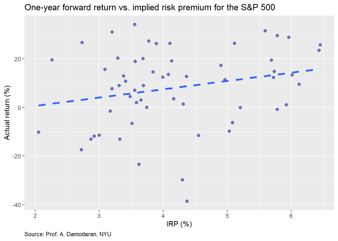
The plot shows a modest linear relationship, with some amount of noise, which is not surprising given financial data. Nonetheless, note the difference in scales between the axes. If we had put them on the same scale, it would look more like a tornado than a snow storm.
Whatever the case, recall that Prof. Damodaran’s model forecasts cash flows for a five-year forward period to derive the implied risk premium. Thus, we present the same data but for the average return for the next five years.
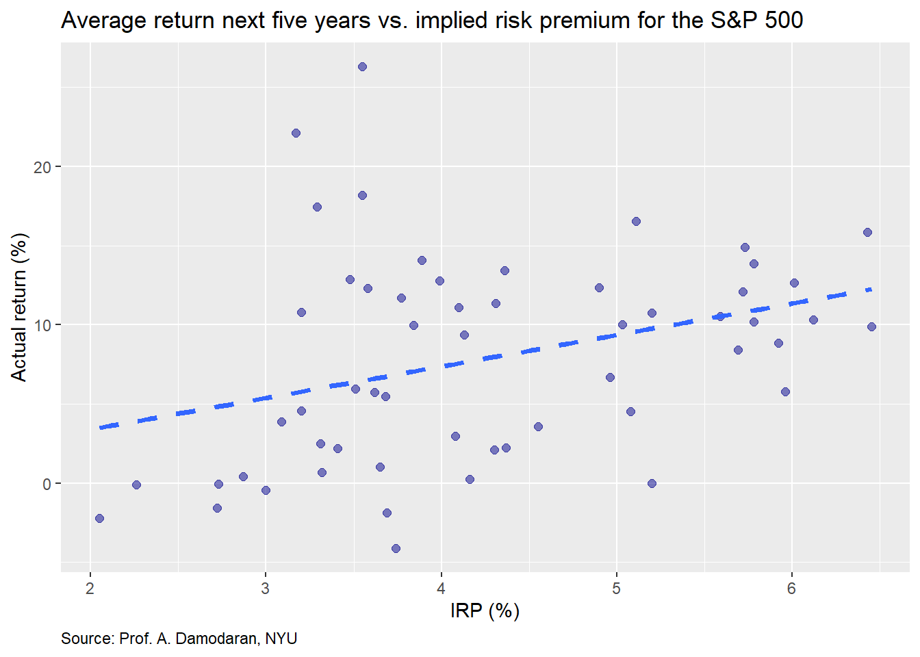
Though not quite as easy to see, the relationship is not quite as strong as the one-year forward return. Indeed, if were to run linear regressions on both sets of returns, we’d find the IRP’s size effect on average returns for the next five years returns is about 40% less than for the one-year forward. But it is still meaningfully positive.
We’ll now turn to the monthly data. Prof. Damodaran publishes the implied risk premium on a monthly basis, starting in Sept 2008. The concept is relatively the same as the annual, but uses the rolling last twelve months of earning as the starting point.
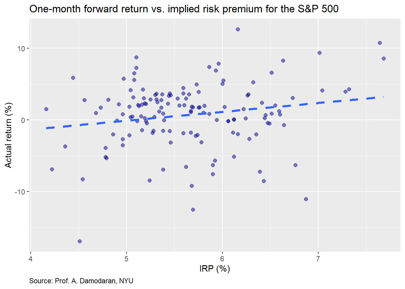
The IRP seems to exhibit a linear relationship on the next month’s return. Let’s compare the IRP on the average monthly return for the next twelve months.
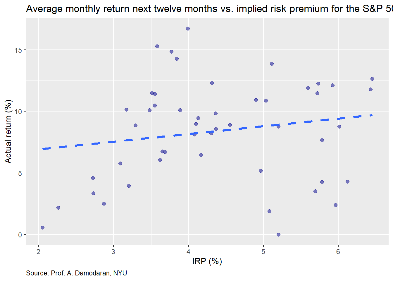
Here the relationship is a bit stronger, though still difficult to see, as there is a fair amount of noise in the month to month in the return data. Finally, we’ll graph the the return in the next twelve months.
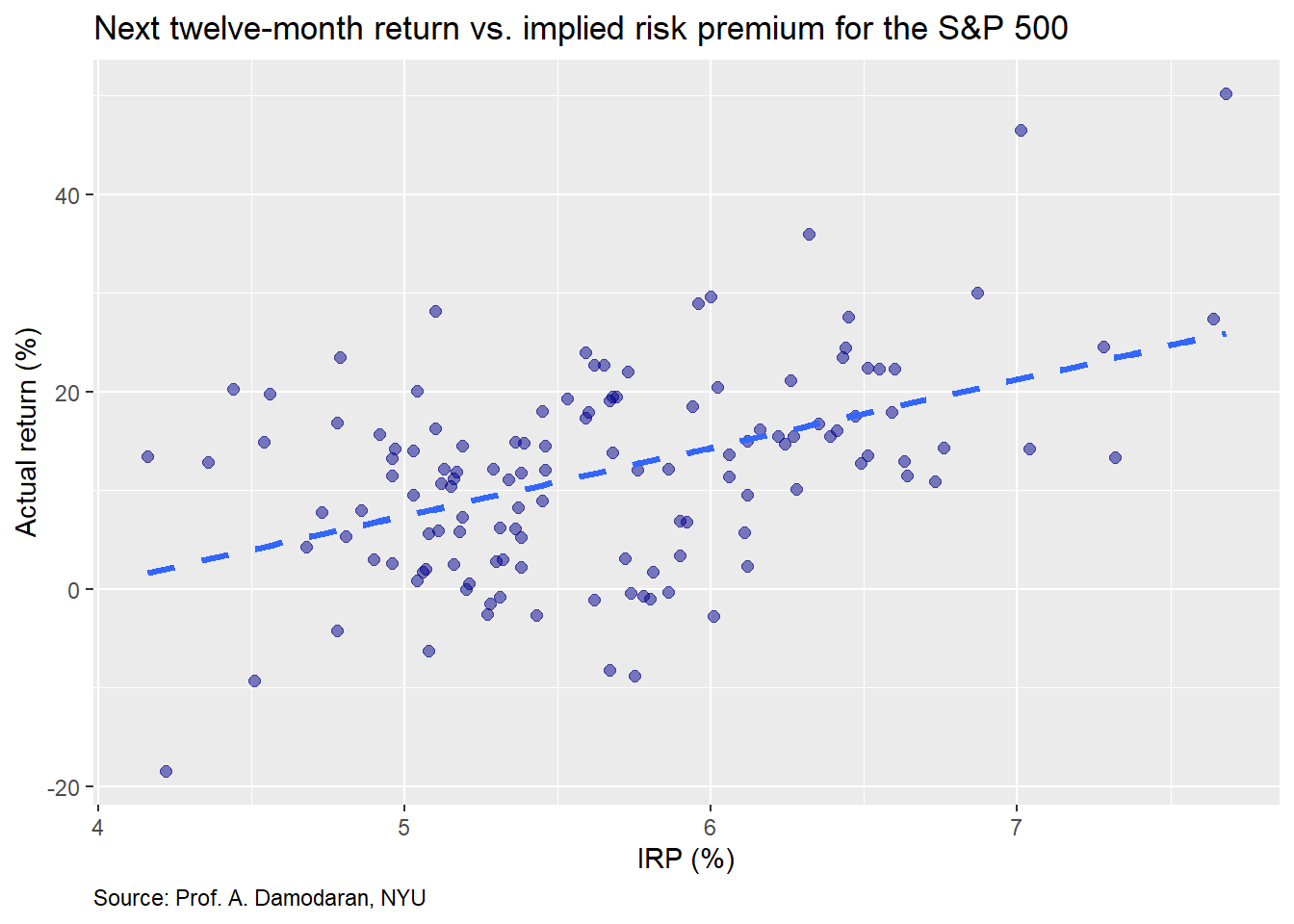
This actually looks like a good graph from the stand point of the clustering and the more positive trend line. Now we’ll move on building some machine learning models based on the annual and monthly data.
For the first model, we’ll use the annual data, training the model on 70% of the data (effectively ending in 2001) and testing it on the remainder. In this model, the predictor is the implied risk premium and the response is the one-year forward return. Our first graph shows the actual vs. predicted return based on the model with a 45o line to highlight the degree of error.
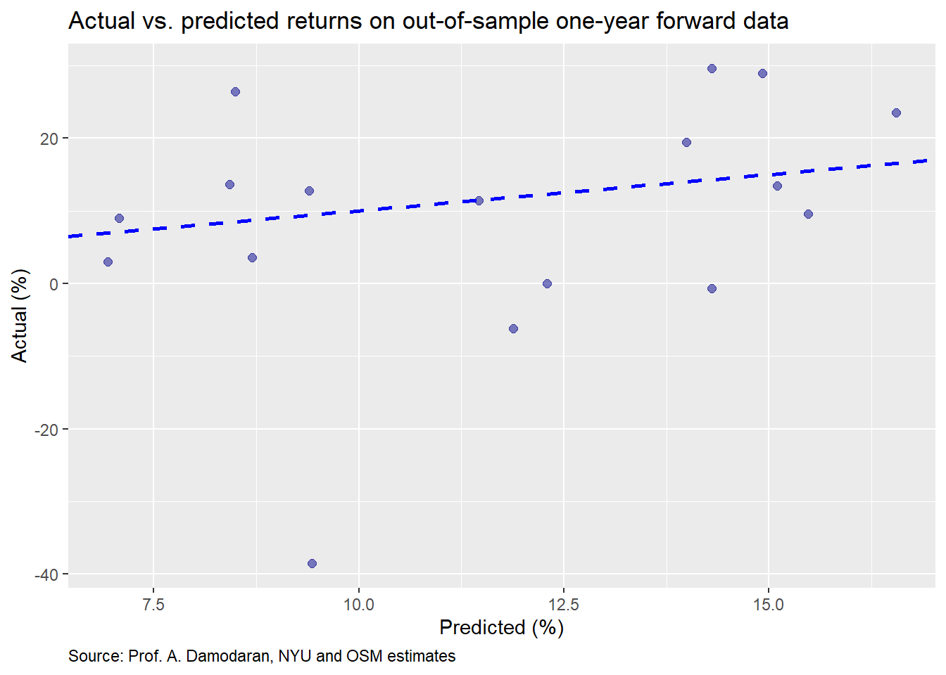
One doesn’t need to spend a lot of time staring at the graph to see that it isn’t terribly accurate. We present the accuracy measures—root mean squared error (RMSE) and RMSE scaled by the average actual value—in the table below.
| Data | RMSE | RMSE scaled |
|---|---|---|
| Train | 0.16 | 1.98 |
| Test | 0.15 | 1.63 |
While it is encouraging that the test set actually experiences a modest improvement in accuracy, that is most likely due to the increase in average return. In fact, the average return in the test set was about 17% higher than the average return on the training set. And that is entirely due to the anomalies of each period. For the heck of it we’ll look at a contingency table for the number of times the model predicted positive vs negative future returns compared with what actually occurred.
| Negative | Positive | |
|---|---|---|
| Positive | 4 | 13 |
Perma-bull! The model never predicted a negative return year. This isn’t as surprising as it might first seem. Since risk premia should generally be positive1, and there’s a modest positive linear relationship between returns and the risk premium, it would be uncommon for the the model to predict a negative return. A logistic model might be better in this case.
We’ll now build a model on the monthly data. As before, we’ll show the actual vs predicted returns on the test set.
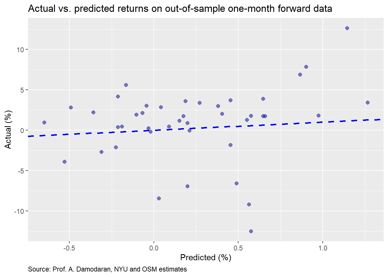
These results are worse than the annual data. The accuracy table is below.
| Data | RMSE | RMSE scaled |
|---|---|---|
| Train | 0.04 | 6.88 |
| Test | 0.04 | 5.25 |
Not much difference in accuracy between the training and test set. We attribute that to the randomness in monthly returns. Let’s move on to the contingency table.
| Negative | Positive | |
|---|---|---|
| Negative | 4 | 11 |
| Positive | 7 | 20 |
What do you know! After we just explained why we shouldn’t be surprised by the model only predicting positive returns, the monthly model does so about 10% of the time vs. actually seeing negative monthly returns about 26% of the time. Without getting too much into the artifacts of the regression equations, the reason that the monthly model was able to predict negative returns is that its intercept is about 60bps more negative, which, on monthly data can make a difference in returns given the smaller size effect. The IRP is also slightly different, but that nuance is not that important for our analysis.
For our final model we’ll use the 12-month forward return and regress that against the monthly IRP. We present the actual vs. predicted return below.
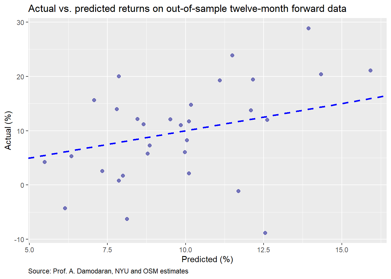
The distribution looks pretty good. Maybe we have a useful model. Let’s check the accuracy.
| Data | RMSE | RMSE scaled |
|---|---|---|
| Train | 0.09 | 0.76 |
| Test | 0.08 | 0.82 |
While the RMSE is higher than the monthly model, that isn’t an apples-to-apples comparison. Critically, the scaled RMSE is lower than the annual model and the monthly model. Now let’s have a look at the contingency table.
| Negative | Positive | |
|---|---|---|
| Negative | 4 | 11 |
| Positive | 7 | 20 |
This looks pretty much the same as the monthly model, which is fine. We weren’t trying to forecast the likelihood of direction.
Where could we go from here? We could run the model on the five-year forward average return, but will save that for the reader. It should be relatively easy to replicate with the code below. As a spoiler, the five-year forward model performs better than the annual or the 12-month forward. The only issue is that it only works on annual data, so can really only be run once a year. The timeliness of the 12-month forward, to our mind, makes it easier to work with, but suffers the drawback of a shorter time series.
Now that we’ve gone through the three methods for setting return expectations, our next posts will compare and contrast their accuracy and ease of use. Then we’ll see how to deploy them in constructing a portfolio. Stay tuned. Lot’s more wood to chop. Until next time, here is the code behind the graphs and analysis. You’ll find the python code after the R code.
# Note: Using R 3.6.2, Rstudio 1.2.1335

## Load packages
suppressPackageStartupMessages({
  library(tidyquant)
  library(tidyverse)
  library(knitr)
  library(kableExtra)
  library(httr)
  library(readxl)
  # library(broom)
  # library(boot)
})


## Load data
## Load data
url <- "http://www.stern.nyu.edu/~adamodar/pc/datasets/histimpl.xls"
url1 <- "http://www.stern.nyu.edu/~adamodar/pc/implprem/ERPbymonth.xlsx"

GET(url, write_disk(tf <- tempfile(fileext = ".xls")))
erp <- read_excel(tf, sheet = "Historical Impl Premiums", skip = 6)
erp <- erp[-61,]

GET(url1, write_disk(tf <- tempfile(fileext = ".xlsx")))
erp_mon <- read_excel(tf, sheet = "Historical ERP")

col_names <- c("year", "sp", "div_yld",
               "t_bill", "t_bond", "bond_bill",
               "erp_ddm", "erp_fcfe", 'erp_fcfes')

df <- erp %>%
  select(Year,
         `S&P 500`,
         `Dividend Yield`,
         `T.Bill Rate`,
         `T.Bond Rate`,
         `Bond-Bill`,
         `Implied Premium (DDM)`,
         'Implied Premium (FCFE)',
         `Implied Premium (FCFE with sustainable Payout)`) %>%
  `colnames<-`(col_names) %>%
  mutate(year = as.integer(year),
         sp_ret = sp/lag(sp)-1,
         sp_fwd = lead(sp_ret))

col_names1 <- c("date", "sp", "t_bond", "erp_12m", "erp_netcfy")
df_mon <- erp_mon[,c(1:3, 9,12)] %>%
  `colnames<-`(col_names1) %>%
  mutate(date = ymd(date),
         sp_ret = sp/lag(sp)-1,
         sp_fwd = lead(sp_ret))

## Graph scatter plot
df %>%
  ggplot(aes(erp_fcfe*100, sp_fwd*100)) +
  geom_point(color="darkblue", size=2, alpha=0.5) +
  geom_smooth(method = "lm", se=FALSE, linetype="dashed", size = 1.25) +
  labs(x = "IRP (%)",
       y = "Actual return (%)",
       title = "Actual return vs. implied risk premium for the S&P 500",
       caption = "Source: Prof. A. Damodaran, NYU") +
  theme(plot.caption = element_text(hjust = 0))

# Five year forward
df %>%
  mutate(sp_ret5 = lead(sp_ret,5, default = 0),
         ret_avg5 = runMean(sp_ret5,5)) %>%
  ggplot(aes(erp_fcfe*100, ret_avg5*100)) +
  geom_point(color="darkblue", size=2, alpha=0.5) +
  geom_smooth(method = "lm", se=FALSE, linetype="dashed", size = 1.25) +
  labs(x = "IRP (%)",
       y = "Actual return (%)",
       title = "Average five-year forward return vs. implied risk premium for the S&P 500",
       caption = "Source: Prof. A. Damodaran, NYU") +
  theme(plot.caption = element_text(hjust = 0))


# One month ahead
df_mon %>%
  ggplot(aes(erp_12m*100, sp_fwd*100)) +
  geom_point(color="darkblue", size=2, alpha=0.5) +
  geom_smooth(method = "lm", se=FALSE, linetype="dashed", size = 1.25) +
  labs(x = "IRP (%)",
       y = "Actual return (%)",
       title = "One-month forward return vs. implied risk premium for the S&P 500",
       caption = "Source: Prof. A. Damodaran, NYU") +
  theme(plot.caption = element_text(hjust = 0))

# Average next 12 month return graph
df %>%
  mutate(sp_ret12 = lead(sp_ret,12, default = 0),
         ret_avg12 = runMean(sp_ret12,12)) %>%
  ggplot(aes(erp_fcfe*100, ret_avg12*100)) +
  geom_point(color="darkblue", size=2, alpha=0.5) +
  geom_smooth(method = "lm", se=FALSE, linetype="dashed", size = 1.25) +
  labs(x = "IRP (%)",
       y = "Actual return (%)",
       title = "Twelve-month forward return vs. implied risk premium for the S&P 500",
       caption = "Source: Prof. A. Damodaran, NYU") +
  theme(plot.caption = element_text(hjust = 0))

## Next twelve month return graph
df_mon %>%
  mutate(sp_ret12 = lead(sp,12)/sp-1) %>%
  ggplot(aes(erp_12m*100, sp_ret12*100)) +
  geom_point(color="darkblue", size=2, alpha=0.5) +
  geom_smooth(method = "lm", se=FALSE, linetype="dashed", size = 1.25) +
  labs(x = "IRP (%)",
       y = "Actual return (%)",
       title = "Twelve-month forward return vs. implied risk premium for the S&P 500",
       caption = "Source: Prof. A. Damodaran, NYU") +
  theme(plot.caption = element_text(hjust = 0))

## Create machine learning function
ml_func <- function(train_set, test_set, x_var, y_var){
  form <- as.formula(paste(y_var, " ~ ", x_var))
  mod <- lm(form, train_set)

  act_train <- train_set[,y_var] %>% unlist() %>% as.numeric()
  act_test <- test_set[,y_var] %>% unlist() %>% as.numeric()

  pred_train <- predict(mod, train_set)

  rmse_train <- sqrt(mean((pred_train - act_train)^2, na.rm = TRUE))
  rmse_train_scaled <- rmse_train/mean(act_train,na.rm = TRUE)

  pred_test <- predict(mod, test_set)
  rmse_test <- sqrt(mean((pred_test - act_test)^2, na.rm = TRUE))
  rmse_test_scaled <- rmse_test/mean(act_test ,na.rm = TRUE)

  out = list(coefs = coef(mod),
             pred_train=pred_train,
             rmse_train=rmse_train,
             rmse_train_scaled=rmse_train_scaled,
             pred_test=pred_test,
             rmse_test=rmse_test,
             rmse_test_scaled=rmse_test_scaled)

  out

}

## Creat Annual model
n_rows <- nrow(df)
train_yr <- df[1:(n_rows*.7),]
test_yr <- df[(n_rows*.7+1):n_rows,]

mod_yr <- ml_func(train_yr, test_yr, x_var = "erp_fcfe", y_var = "sp_fwd")

# Plot actual vs predicted
ggplot()+
  geom_point(aes(mod_yr$pred_test*100, test_yr$sp_fwd*100), color = "darkblue", size = 2, alpha=0.4) +
  geom_abline(color = "slategrey", linetype = "dashed") +
  labs(x = "Predicted (%)",
       y = "Actual (%)",
       title = "Actual vs. predicted returns on out-of-sample data",
       caption = "Source: Prof. A. Damodaran, NYU and OSM estimates") +
  theme(plot.caption = element_text(hjust = 0))

# RMSE output
data.frame(Data = c("Train", "Test"),
           RMSE = c(mod_yr$rmse_train, mod_yr$rmse_test),
           scaled = c(mod_yr$rmse_train_scaled, mod_yr$rmse_test_scaled)) %>%
  mutate_at(vars(-Data), function(x) round(x,2)) %>%
  rename("RMSE scaled" = scaled) %>%
  knitr::kable(caption = "Machine learning accuracy")


# Contingency table
pred_pos <- ifelse(mod_yr$pred_test > 0, "Positive", "Negative")
act_pos <- ifelse(test_yr$sp_fwd > 0, "Positive", "Negative")

table(Predict = pred_pos, Actual = act_pos) %>%
  knitr::kable(caption = "Predicted vs actual positive or negative returns") %>%
  kableExtra:: add_header_above(c("Predicted" = 1, " \\\ " = 1, "Actual" = 1), line = F) %>%
    column_spec(1, bold = T)

## Crate monthly model
n_row_mon <- nrow(df_mon)
train_mon <- df_mon[1:(n_row_mon*.7),]
test_mon <- df_mon[(n_row_mon*.7+1):n_row_mon,]

mod_mon <- ml_func(train_mon, test_mon, x_var = "erp_12m", y_var = "sp_fwd")

# Graph actual vs. predicted
ggplot()+
  geom_point(aes(mod_mon$pred_test*100, test_mon$sp_fwd*100),
             color = "darkblue", size = 2, alpha=0.4) +
  geom_abline(color = "slategrey", linetype = "dashed") +
  labs(x = "Predicted (%)",
       y = "Actual (%)",
       title = "Actual vs. predicted returns on out-of-sample data",
       caption = "Source: Prof. A. Damodaran, NYU and OSM estimates") +
  theme(plot.caption = element_text(hjust = 0))

# Accuracy table
data.frame(Data = c("Train", "Test"),
           RMSE = c(mod_mon$rmse_train, mod_mon$rmse_test),
           scaled = c(mod_mon$rmse_train_scaled, mod_mon$rmse_test_scaled)) %>%
  mutate_at(vars(-Data), function(x) round(x,2)) %>%
  rename("RMSE scaled" = scaled) %>%
  knitr::kable(caption = "Machine learning accuracy")

# Contingency table
pred_pos_mon <- ifelse(mod_mon$pred_test > 0, "Positive", "Negative")
act_pos_mon <- ifelse(test_mon$sp_fwd > 0, "Positive", "Negative")

tab_2 <- table(pred_pos_mon, act_pos_mon)

tab_2 %>%
  knitr::kable(caption = "Predicted vs actual positive or negative returns") %>%
  kableExtra:: add_header_above(c("Predicted" = 1, " \\\ " = 1, "Actual" = 1), line = F) %>%
  column_spec(1, bold = T)

## Create Next 12 month return model
mon_data <- df_mon %>%
  mutate(sp_fwd12 = lead(sp, 12)/sp-1)

n_row_mon12 <- nrow(mon_data)
train_mon12 <- mon_data[1:(n_row_mon*.7),]
test_mon12 <- mon_data[(n_row_mon*.7+1):n_row_mon,]

mod_mon12 <- ml_func(train_mon12, test_mon12, x_var = "erp_12m", y_var = "sp_fwd12")

# Graph actual vs predicted
ggplot()+
  geom_point(aes(mod_mon12$pred_test*100, test_mon12$sp_fwd12*100),
             color = "darkblue", size = 2, alpha=0.4) +
  geom_abline(color = "slategrey", linetype = "dashed") +
  labs(x = "Predicted (%)",
       y = "Actual (%)",
       title = "Actual vs. predicted returns on out-of-sample data",
       caption = "Source: Prof. A. Damodaran, NYU and OSM estimates") +
  theme(plot.caption = element_text(hjust = 0))

# Accuracy table
data.frame(Data = c("Train", "Test"),
           RMSE = c(mod_mon12$rmse_train, mod_mon12$rmse_test),
           scaled = c(mod_mon12$rmse_train_scaled, mod_mon12$rmse_test_scaled)) %>%
  mutate_at(vars(-Data), function(x) round(x,2)) %>%
  rename("RMSE scaled" = scaled) %>%
  knitr::kable(caption = "Machine learning accuracy")

pred_pos_mon12 <- ifelse(mod_mon12$pred_test > 0, 1, 0)
act_pos_mon12 <- ifelse(test_mon12$sp_ret_12 > 0, 1, 0)

# Contingency table
tab_3 <- table(pred_pos_mon, act_pos_mon)
tab_3 %>%
  knitr::kable(caption = "Results") %>%
  kableExtra:: add_header_above(c("Predicted" = 1, " \\\ " = 1, "Actual" = 1), line = F) %>%
  column_spec(1, bold = T)
And here is the analysis and “similar” graphs in Python.
## Note this won't exactly follow the R code. We also have spent as much time beautifying the charts and tables. But you should get the picture.

## Load libraries
import pandas as pd
import numpy as np
import matplotlib.pyplot as plt
%matplotlib inline # if you're in a jupyter notebook
import seaborn as sns

## Load data
from urllib.request import urlretrieve
url = "http://www.stern.nyu.edu/~adamodar/pc/datasets/histimpl.xls"
url1 = "http://www.stern.nyu.edu/~adamodar/pc/implprem/ERPbymonth.xlsx"

## Retrieve annual file
urlretrieve(url1, 'ERPbymonth.xlsx')
df_mon = pd.read_excel('ERPbymonth.xlsx', sheet_name = "Historical ERP")
df_mon.head()

## Retrieve monthly file
urlretrieve(url, 'histimpl.xls')
df = pd.read_excel('histimpl.xls', sheet_name = "Historical Impl Premiums", skiprows=6)
df = df[0:60]

# Prepare yearly data
cols = ['Year', 'Dividend Yield', 'S&P 500', 'T.Bill Rate', 'T.Bond Rate', 'Bond-Bill',
       'Implied Premium (DDM)', 'Implied Premium (FCFE)',
       'Implied Premium (FCFE with sustainable Payout)']

df = df.loc[:, cols]

new_col_names = ["year", "div_yld","sp",
               "t_bill", "t_bond", "bond_bill",
               "erp_ddm", "erp_fcfe", 'erp_fcfes']

df.columns = new_col_names
df['sp_ret'] = df.sp/df.sp.shift(1)-1
df['sp_fwd'] = df.sp_ret.shift(-1)

# Prepare monthly data
new_mon_cols = ['Start of month', 'S&P 500', 'T.Bond Rate',
              'ERP (T12m)', 'ERP (Net Cash Yield)']

df_mon = df_mon.loc[:, new_mon_cols]
df_mon.columns = ["date", "sp", "t_bond", "erp_12m", "erp_netcfy"]

df_mon['sp_ret'] = df_mon.sp/df_mon.sp.shift(1)-1
df_mon['sp_fwd'] = df_mon.sp_ret.shift(-1)

df_mon['sp_ret'] = df_mon.sp/df_mon.sp.shift(1)-1
df_mon['sp_fwd'] = df_mon.sp_ret.shift(-1)

#E EDA
plt.style.use('ggplot')
sns.set()

# Graph annual
plt.figure(figsize=(12,6))
sns.regplot(df.erp_fcfe*100, df.sp_fwd*100, color = "darkblue", ci=None)
plt.xlabel("IRP (%)")
plt.ylabel("Actual return (%)")
plt.title("Actual return vs. implied risk premium for the S&P 500")
plt.text(1.8,-55, "Source: Prof. A. Damodaran, NYU")
plt.show()

# Graph five-year average forward return
sp_ret5 = df.sp_ret.shift(-5)
ret_avg5 = sp_ret5.rolling(5).mean()

plt.figure(figsize=(12,6))
sns.regplot(df.erp_fcfe*100, ret_avg5*100, color = "darkblue", ci=None)
plt.xlabel("IRP (%)")
plt.ylabel("Actual return (%)")
plt.title("Actual five-year forward average return vs. implied risk premium for the S&P 500")
plt.text(1.8,-9, "Source: Prof. A. Damodaran, NYU")
plt.show()

# Graph monthly
plt.figure(figsize=(12,6))
sns.regplot(df_mon.erp_12m*100, df_mon.sp_fwd*100, color = "darkblue", ci=None)
plt.xlabel("IRP (%)")
plt.ylabel("Actual return (%)")
plt.title("Actual monthly forward return vs. implied risk premium for the S&P 500")
plt.text(4,-25, "Source: Prof. A. Damodaran, NYU")
plt.show()

# Graph twelve-month foward return
sp_fwd12 = df_mon.sp.shift(-12)/df_mon.sp-1

plt.figure(figsize=(12,6))
sns.regplot(df_mon.erp_12m*100, sp_fwd12*100, color = "darkblue", ci=None)
plt.xlabel("IRP (%)")
plt.ylabel("Actual return (%)")
plt.title("Actual five-year forward average return vs. implied risk premium for the S&P 500")
plt.text(4,-36, "Source: Prof. A. Damodaran, NYU")
plt.show()

## Machine learning

### Annual model
from sklearn.linear_model import LinearRegression

x = df.erp_fcfe.values
y = df.sp_fwd.values
rows = int(len(x)*.7)

x_train =  x[1:rows].reshape(-1,1)
y_train = y[1:rows].reshape(-1,1)
x_test = x[rows:-1].reshape(-1,1)
y_test = y[rows:-1].reshape(-1,1)

mod = LinearRegression()
mod.fit(x_train, y_train)

pred_train = mod.predict(x_train)
rmse_train = np.sqrt(np.nanmean((pred_train - y_train)**2))
rmse_train_scaled = rmse_train/np.nanmean(y_train)

pred_test = mod.predict(x_test)
rmse_test = np.sqrt(np.nanmean((pred_test - y_test)**2))
rmse_test_scaled = rmse_test/np.nanmean(y_test)

# Graph actual vs predicted
plt.figure(figsize=(12,6))
plt.scatter(pred_test*100, y_test*100, color="darkblue", s=100, alpha=0.5)
xs = pred_test*100
ys = xs
plt.plot(xs,ys, linestyle=":",color='grey')
plt.xlabel("Predicted return (%)")
plt.ylabel("Actual return(%)")
plt.title("Actual vs. predicted results for machine learning model")
plt.show()

# Accuracy output
set = ["training", "training","test", "test"]
rmses = ["RMSE", "RMSE scaled","RMSE", "RMSE scaled"]
dats = [rmse_train, rmse_train_scaled, rmse_test, rmse_test_scaled]

for i in range(4):
    print(rmses[i], " for ", set[i], f"set: {dats[i]:0.2f}")

# Contingency table
preds = np.array(["Positive" if x > 0 else "Negative" for x in pred_test])
acts = np.array(["Positive" if x > 0 else "Negative" for x in y_test])
pd.crosstab(preds,acts, rownames = ["Predicted"], colnames = ["Actual"])

### Monthly model
from sklearn.linear_model import LinearRegression

x = df_mon.erp_12m.values
y = df_mon.sp_fwd.values
rows = int(len(x)*.7)

x_train =  x[:rows].reshape(-1,1)
y_train = y[:rows].reshape(-1,1)
x_test = x[rows:-1].reshape(-1,1)
y_test = y[rows:-1].reshape(-1,1)

mod = LinearRegression()
mod.fit(x_train, y_train)

pred_train = mod.predict(x_train)
rmse_train = np.sqrt(np.nanmean((pred_train - y_train)**2))
rmse_train_scaled = rmse_train/np.nanmean(y_train)

pred_test = mod.predict(x_test)
rmse_test = np.sqrt(np.nanmean((pred_test - y_test)**2))
rmse_test_scaled = rmse_test/np.nanmean(y_test)

# Graph actual vs predicted
plt.figure(figsize=(12,6))
plt.scatter(pred_test*100, y_test*100, color="darkblue", s=100, alpha=0.5)
xs = pred_test*100
ys = xs
plt.plot(xs,ys, linestyle=":",color='grey')
plt.xlabel("Predicted return (%)")
plt.ylabel("Actual return(%)")
plt.title("Actual vs. predicted results for machine learning model")
plt.show()

# Accuracy output
set = ["training", "training","test", "test"]
rmses = ["RMSE", "RMSE scaled","RMSE", "RMSE scaled"]
dats = [rmse_train, rmse_train_scaled, rmse_test, rmse_test_scaled]

for i in range(4):
    print(rmses[i], " for ", set[i], f"set: {dats[i]:0.2f}")

# Contingency table
preds = np.array(["Positive" if x > 0 else "Negative" for x in pred_test])
acts = np.array(["Positive" if x > 0 else "Negative" for x in y_test])
pd.crosstab(preds,acts, rownames = ["Predicted"], colnames = ["Actual"])

### 12-month foward model

mon_data = df_mon
mon_data['sp_fwd12'] = mon_data.sp.shift(-12)/mon_data.sp-1
mon_data.head()

from sklearn.linear_model import LinearRegression

x = mon_data.erp_12m.values
y = mon_data.sp_fwd12.values
rows = int(len(x)*.7)

x_train =  x[1:rows].reshape(-1,1)
y_train = y[1:rows].reshape(-1,1)
x_test = x[rows:-1].reshape(-1,1)
y_test = y[rows:-1].reshape(-1,1)

mod = LinearRegression()
mod.fit(x_train, y_train)

pred_train = mod.predict(x_train)
rmse_train = np.sqrt(np.nanmean((pred_train - y_train)**2))
rmse_train_scaled = rmse_train/np.nanmean(y_train)

pred_test = mod.predict(x_test)
rmse_test = np.sqrt(np.nanmean((pred_test - y_test)**2))
rmse_test_scaled = rmse_test/np.nanmean(y_test)

# Graph actual vs predicted
plt.figure(figsize=(12,6))
plt.scatter(pred_test*100, y_test*100, color="darkblue", s=100, alpha=0.5)
xs = pred_test*100
ys = xs
plt.plot(xs,ys, linestyle=":",color='grey')
plt.xlabel("Predicted return (%)")
plt.ylabel("Actual return(%)")
plt.title("Actual vs. predicted results for machine learning model")
plt.show()

# Accuracy output
set = ["training", "training","test", "test"]
rmses = ["RMSE", "RMSE scaled","RMSE", "RMSE scaled"]
dats = [rmse_train, rmse_train_scaled, rmse_test, rmse_test_scaled]

for i in range(4):
    print(rmses[i], " for ", set[i], f"set: {dats[i]:0.2f}")

# Contingency table
preds = np.array(["Positive" if x > 0 else "Negative" for x in pred_test])
acts = np.array(["Positive" if x > 0 else "Negative" for x in y_test])
pd.crosstab(preds,acts, rownames = ["Predicted"], colnames = ["Actual"])
Unless you’re living in zero or negative interest rate land. But that’s another story!↩