GARCHery
In our last post, we discussed using the historical average return as one method for setting capital market expectations prior to constructing a satisfactory portfolio. We glossed over setting expectations for future volatility, mainly because it is such a thorny issue. However, we read an excellent tutorial on GARCH models that inspired us at least to take a stab at it. The tutorial hails from the work of Marcelo S. Perlin and colleagues. We highly recommend Mr. Perlin’s blog and note that we’ve also used his simfinR package in our series on valuation, which can be found here, here, and here.
In portfolio construction, estimating expected volatility is as important, if not more so, as estimating expected returns. Risk, as we discussed in Portfolio starter kit and SHARPEn your portfolio, and as quantified by volatility, has a profound impact on allocating assets to construct a satisfactory portfolio. Hence, getting your volatility expectations well-grounded should improve portfolio allocation decisions.
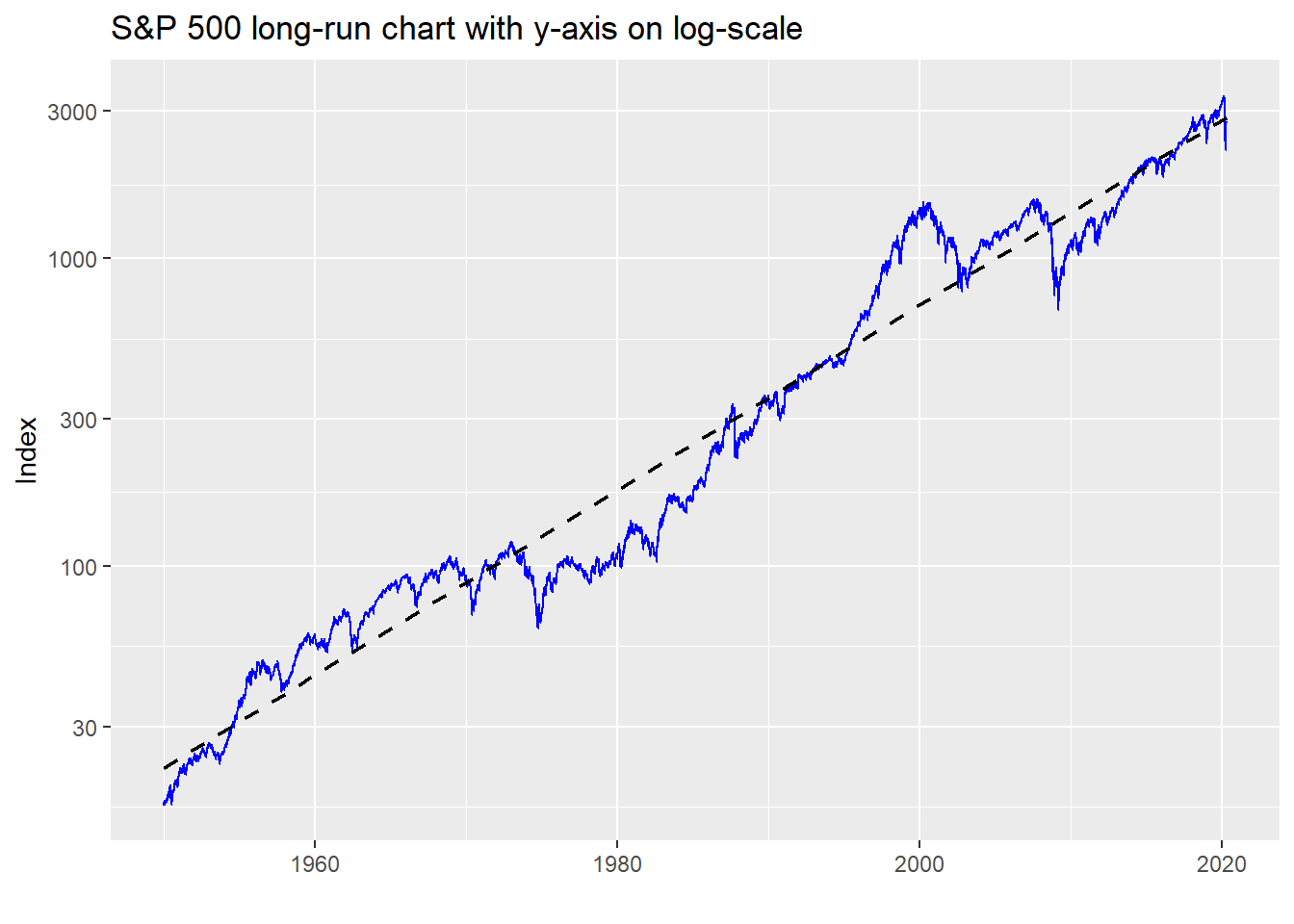
Yet, how do you assign expected volatility? Using the historical, annualized standard deviation of returns is a frequent method, just like using the historical mean return. But the problem is that volatility has different characteristics than returns. One need only look at a long-run graph of the S&P 500’s annualized volatility to see that.
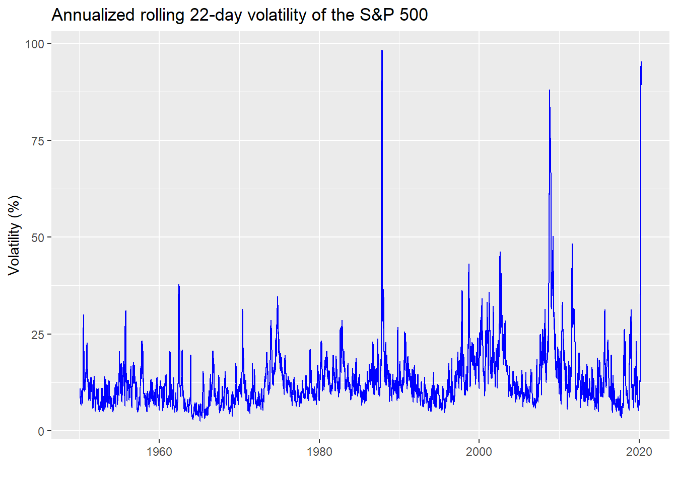
Volatility is, well, volatile. It’s clearly not constant and features periods of relative calm interspersed with gut-wrenching spikes, as anyone who’s been following the stock market recently is well aware. What this suggests is that the aggregating period you use for expected returns and risk should match your investment horizon. If you’re investing for 10 years, you shouldn’t expect to achieve the same results as a 50 year period because volatility can mess with your returns and your head. That is, any period shorter than the long-run will likely see different average returns and volatility, sometimes significantly so, due to the volatility of volatility. Just compare the average return of the 1980-1990 period to that of 2000-2010 vs. the long-term trend in the graph below.
Here’s the rub. As we showed in Mean expectations, there are problems using average returns due to the distribution of those returns and which period is more relevant. These problems apply to volatility but with an additional effect of volatility clustering. That is periods of high volatility tend be followed by high volatility and vice versa. When those volatility regimes switch is unpredictable, yet means you need a sufficiently long horizon to allow returns and volatility to revert to their long-run level. You may enjoy a period of relative calm, only to see a huge spike at the end and suffer far worse returns than expected. Or, it could be the complete opposite. This unpredictability is best seen by comparing two different periods. For example, the period prior to 2000 had very few spikes in volatility above 25% even with Black Monday in 1987. The period after had way more. In fact, as we show in the table below, the period after 2000 saw the frequency of volatility spikes increase by one order of magnitude vs. the period before.
| Regime | Frequency (%) |
|---|---|
| Post-2000 | 13.4 |
| Pre-2000 | 3.0 |
What that implies is, even if your average return estimate is relatively accurate, if volatility is under-estimated, then your end of period return could be significantly different (likely worse, though better is possible too) due to compounding and path dependency. How does one adjust for this with historical data?
Bootstrapping, which we introduced in the previous post, is one way to solve this problem. In this case, your sample size would be the same as your investment horizon. If your horizon is 10 years, you’d repeatedly sample 10-year periods out of the entire series and then average across those samples.1 This approach might not capture volatility clustering, however. To do that, you could sample in blocks as we did in this post. While this would likely capture the clustering, deciding on block length would be arbitrary without using more sophisticated methods to choose appropriate correlation lags.
A third way is to simulate future returns. Enter the GARCH model, which provides a solid framework to approximate future returns and volatility while accounting for some of the issues we just highlighted.2 Note we’ve glossed over giving examples of many of the issues around using historical volatility as a proxy for expected future volatility to focus on GARCH model results. Unfortunately, we also won’t do justice to the model in this post, so please read Marcelo Perlin’s blog, for further details.
We’ll now briefly attempt to explain the GARCH model and simulate returns to outline simulation as an approach to setting volatility expectations. The GARCH model attempts to identify a long-run volatility level while accounting for volatility clustering. That is, it estimates an underlying volatility level, but allows for scenarios in which if there are moves larger than the long-run level, they will tend to be followed by more large moves, This is similar to what one sees historically, as shown in the graph below. Please note this graph along with many of the following charts, analyses, and underlying code were adapted from the code used in the GARCH tutorial and can be found on GitHub. Any errors are ours, however.
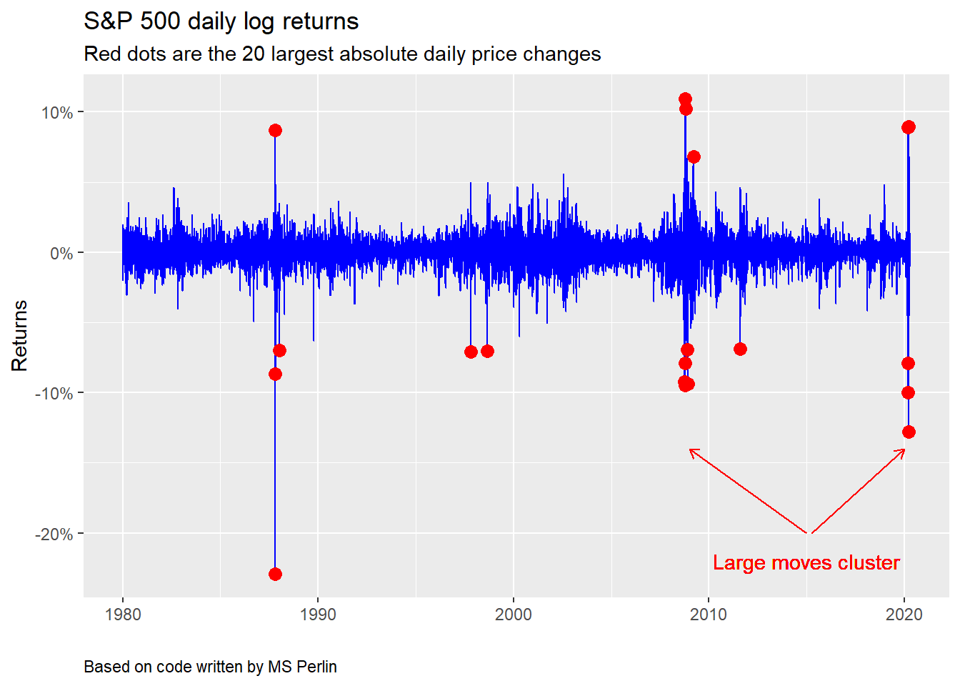
As evident in the chart above, large moves in the S&P tend to cluster around major events—Black Monday in 1987, the global financial crisis, and the covid-19 pandemic, most notably, The GARCH model thus attempts to account for mean reversion in volatility back to the long-run level, while still allowing some “memory” of recent volatility to affect the estimates. To arrive at a working model, one first needs to check that the asset class’s volatility is not constant and that it exhibits some serial correlation. Once that is established, one chooses the parameters (which are generally the length of the lags) to produce the model. Or one iterates different parameter combinations and then chooses which set of combinations to use based on statistical criteria that measure how accurately the model describes the real data. We won’t go through any of that now. Instead, we’ll jump to simulating forward returns and volatility, but you can check out those steps in the Appendix below.
For our simulation, we use the monthly returns on the S&P and a GARCH (1,1) model, which means that we’re using a one period lag on the return and volatility data to calculate the model variables. We plot the simulations below, with a line that identifies the former peak.
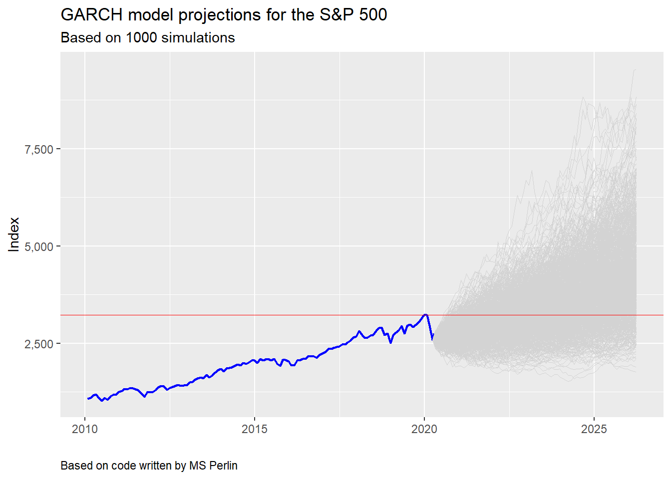
What’s interesting about this plot, whose code is based on the tutorial, is that there is still a reasonably high probability that the S&P never regains its former peak over the next five years. To our mind, this captures entirely possible scenarios, making the model and simulation more realistic. Recall that it took almost six years for the S&P to exceed the peak preceding the global financial crisis.
Given these simulations, one could then calculate average returns and volatilities to use in setting capital market expectations. Note that this simulation may not include another period of high volatility. Other models attempt to account for that, but are beyond our present discussion.
Let’s rehearse what we’ve learned so far. Trying to produce reasonably robust capital market expectations requires a good estimate of future volatility. If you’re using historical results to set these expectations, then you should use a similar historical time period to match the investment horizon. If you don’t, you could be way off in your estimates, due to the volatility of volatility. Bootstrapping and block sampling can help overcome biases in choosing an historical period on which to base estimates. But these approaches may not adequately account for volatility clustering. A potentially better approach, however, would be to simulate future results using a model designed to capture some of volatility’s known effects. Using a GARCH model is one method and doing so produces results that align with previous historical patterns. But, it is only one model.
In our next post, we’ll return to our regularly scheduled programming where we plan to examine discounted cash flow models to set expectations. Until then, the code behind our analyses follows the Appendix, which goes through some of the same steps as the tutorial in choosing a GARCH model.
Appendix
We run through building the GARCH model as illustrated in the tutorial. The tutorial focuses on the Brazil index, Ibovespa; we use the S&P 500.
Step one: Check data fits an ARCH model
The point of this test is to check whether the data is serially correlated and if variance is non-constant. We present the p-values from the test in the table below. Since they are all below 0.05, that tells us that the data exhibits the effects we’re looking for.
| Lag | Statistic | P-value |
|---|---|---|
| 1 | 18.5 | 0.0 |
| 2 | 21.3 | 0.0 |
| 3 | 26.5 | 0.0 |
| 4 | 30.3 | 0.0 |
| 5 | 30.6 | 0.0 |
| 6 | 31.0 | 0.0 |
Step Two: Iterate model specifications to find good model
Iterate through different combinations of lags on the return and volatility data to find the model that produces the lowest value to two statistics commonly used to measure prediction error: Akaike Information Criterion (AIC) and Bayesian Information Criterion (BIC). The tutorial goes into much greater detail than we do. We show the two best models below. We chose to use a GARCH(1,1) in our simulation for purposes of simplicity. We’re not sure we could explain an ARMA (6,6) + GARCH (1,1) model in a short post!
| Criterion | Model | Statistic |
|---|---|---|
| AIC | ARMA(6,6)+GARCH(1,1) | -3.66 |
| BIC | ARMA(6,6)+GARCH(1,1) | -3.57 |
Step three: Simulate
We graphed the simulations above. We show a sample of the results in the table below.
| Simulation (#) | Return (%) |
|---|---|
| 268 | 199.7 |
| 303 | 204.4 |
| 36 | 211.5 |
| 432 | 213.0 |
| 483 | 219.5 |
| 529 | 245.9 |
| 450 | -35.9 |
| 772 | -31.2 |
| 447 | -23.7 |
| 439 | -23.4 |
| 361 | -23.2 |
Using the simulations, one can create a cumulative probability distribution of exceeding the former peak by a certain date (another neat chart from the tutorial). We find that even after five years there’s still around a 20% chance the S&P won’t have surpassed it’s former peak. We’re not sure that’s the right probability, but it’s reasonable given past history.
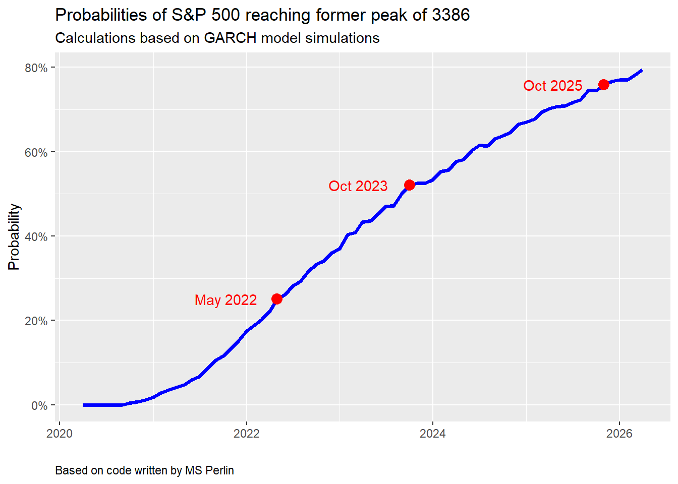
Of course, if we had used daily instead of monthly returns and volatility, the probabilities would have gone up. This is an artifact of the time series—namely, the annualized volatility of the monthly returns is less than that of daily ones. While it is beyond the scope of this post to explain why that is the case, the simple explanation is that there is less noise in the monthly data. Nonetheless, the point is that with a lower volatility, expected moves are lower, thus probability of exceeding some specific level will be lower too.
We have tried to reproduce the results from the tutorial faithfully, albeit with different data. Any errors are ours.
Here’s the code.
## We imported many of the functions found on the github page for the tutorial.
## Please reference that page for the full code. These functions are preceded
## by source('garch_fcts.R')

## NB: Often one will see the dplyr package called directly to get the filter()
## function. This is because one of other packages masks the dplyr function.


### Load packages
suppressPackageStartupMessages({
  library(tidyquant)
  library(tidyverse)
  library(FinTS)
  library(fGarch)
})

options("getSymbols.warning4.0"=FALSE)

### Load data
sp <- getSymbols("^GSPC", src = "yahoo", from = "1950-01-01", auto.assign = FALSE) %>%
  Ad() %>%
  `colnames<-`("price")

sp <- data.frame(date = index(sp), price = as.numeric(sp$price)) %>%
  mutate(log_ret = log(price/dplyr::lag(price)),
         disc_ret = price/dplyr::lag(price)-1)

sp_mon <- sp %>%
  mutate(year_mon = as.yearmon(date)) %>%
  group_by(year_mon) %>%
  dplyr::filter(date == max(date)) %>%
  ungroup() %>%
  mutate(log_ret = log(price/dplyr::lag(price)),
         disc_ret = price/dplyr::lag(price)-1) %>%
  select(-year_mon)

## Plot annualized volatility
sp %>%
  mutate(vol = rollapply(log_ret, width = 22, sd, align = "right", fill = NA)*sqrt(252)) %>%
  ggplot(aes(date, vol*100)) +
  geom_line(color = "blue") +
  labs(x = "",
       y = "Volatility (%)",
       title = "Annualized rolling 22-day volatility of the S&P 500")

## Plot log chart of S&P
sp %>%
  ggplot(aes(date, price)) +
  geom_line(color = "blue") +
  scale_y_log10() +
  labs(x = "",
       y = "Index",
       title ="S&P 500 long-run chart with y-axis on log-scale")

## Table of volatility spike frequency
sp %>%
  mutate(vol = rollapply(log_ret, width = 22, sd, align = "right", fill = NA)*sqrt(252)) %>%
  mutate(Regime = ifelse(date < "2000-01-01", "Pre-2000", "Post-2000")) %>%
  group_by(Regime) %>%
  summarise("Frequency (%)" = round(sum(vol > 0.25, na.rm = TRUE)/n()*100,1)) %>%
  knitr::kable(caption = "Frequency of volatility spikes above 25%")

## Find largest 20 moves
largest <- sp %>%
  dplyr::filter(date >= "1980-01-01") %>%
  top_n(abs(log_ret), n = 20)

## Plot volatility clustering
sp %>%
  dplyr::filter(date >= "1980-01-01") %>%
  ggplot(aes(date, log_ret)) +
  geom_line(color = "blue") +
  labs(title = "S&P 500 daily log returns",
       subtitle = "Red dots are the 20 largest absolute daily price changes",
       x = '',
       y = 'Returns',
       caption = 'Based on code written by MS Perlin') +
  geom_point(data = largest,
             aes(date, log_ret),
             size = 3, color = 'red'  ) +
  geom_text(aes(x = as.Date("2015-01-01"),
                y = -0.22,
                label = "Large moves cluster"),
            color = "red") +
  geom_segment(aes(x = as.Date("2015-01-01"), xend = as.Date("2009-01-01"),
                   y = -0.2, yend = -0.12),
               arrow = arrow(length = unit(2, "mm")),
               color = "red") +
  geom_segment(aes(x = as.Date("2015-06-01"), xend = as.Date("2020-02-01"),
                   y = -0.2, yend = -0.12),
               arrow = arrow(length = unit(2, "mm")),
               color = "red") +
  scale_y_continuous(labels = scales::percent) +
  theme(plot.caption = element_text(hjust = 0))

## Run simulation
set.seed(20200320)
n_sim <- 1000
n_periods <- 72

# source functions
source('garch_fcts.R') # for sim_func. We altered this to include different simulation
# perods; e.g., days, months, quarters, etc.

df_sim <- sim_func(n_sim = n_sim,
                 n_t = n_days_ahead, my_garch, "months", df_prices = sp_mon)

sp_temp <- sp_mon %>%
  dplyr::filter(date >= "2010-01-03") #dplyr::filter masked by some other package!

ggplot() +
  geom_line(data = sp_temp,
            aes(x = date, y = price), color = 'blue', size = 0.75)  +
  geom_line(data = df_sim, aes(x = ref_date, y = sim_price, group = i_sim),
            color = 'lightgrey',
            size = 0.35) +
  geom_hline(yintercept = max(sp_temp$price), color = "red", size = 0.35) +
  labs(title = 'GARCH model projections for the S&P 500',
       subtitle = 'Based on 1000 simulations',
       x = '',
       y = 'Index',
       captioin = "Based on code written by MS Perlin") +
  ylim(c(min(sp_temp$price), max(df_sim$sim_price))) +
  scale_y_continuous(labels = scales::comma) +
  theme(plot.caption = element_text(hjust = 0))


# ARCH test function from MS Perlin
source('garch_fcts.r')

# Run test up to six-month lag
max_lag <- 6

arch_test <- do_arch_test(x = sp_mon$log_ret, max_lag = max_lag)

arch_test %>%
  mutate(statistic = round(statistic,1),
         pvalue = format(round(pvalue,2),nsmall=1 )) %>%
  rename("Lag" = lag,
         "Statistic" = statistic,
         "P-value" = pvalue) %>%
  knitr::kable(caption = "S&P 500 Arch test",
               align = c("l", "r", "r"))

tab_out <- out$tab_out

sp_long <- pivot_longer(data = tab_out %>%
                                 select(model_name, AIC, BIC),  cols = c('AIC', 'BIC'))

sp_best_models <- sp_long %>%
  group_by(name) %>%
  summarise(model_name = model_name[which.min(value)],
            value = value[which.min(value)])

models_names <- unique(sp_long$model_name)
best_model <- c(tab_out$model_name[which.min(tab_out$AIC)],
                 tab_out$model_name[which.min(tab_out$BIC)])

best_model %>%
  mutate(value = round(value,2)) %>%
  rename("Criterion" = name,
         "Model" = model_name,
         "Statistic" = value) %>%
  knitr::kable(caption = "GARCH models with lowest information criterion")


df_sim %>%
  group_by(i_sim) %>%
  summarise(tot_ret = round((last(sim_price)/last(sp_mon$price)-1)*100,1)) %>%
  arrange(tot_ret) %>%
  slice(c(1:5, (n()-5):n())) %>%
  rename("Simulation (#)" = i_sim,
         "Return (%)" = tot_ret) %>%
  knitr::kable(caption = "Top and bottom five cumulative returns")

tab_prob <- df_sim %>%
  group_by(ref_date) %>%
  summarise(prob = mean(sim_price > max(sp$price)))


df_date <- tibble(idx = c(first(which(tab_prob$prob > 0.25)),
                          first(which(tab_prob$prob > 0.5)),
                          first(which(tab_prob$prob > 0.75))),
                  ref_date = tab_prob$ref_date[idx],
                  prob = tab_prob$prob[idx],
                  my_text = format(ref_date, '%b %Y'))

tab_prob %>%
  ggplot(aes(x = ref_date, y = prob) ) +
  geom_line(size = 1.25, color = "blue") +
  labs(title = paste0('Probabilities of S&P 500 reaching former peak of ',
                      round(max(sp$price),0)),
       subtitle = paste0('Calculations based on GARCH model simulations'),
       x = '',
       y = 'Probability') +
  scale_y_continuous(labels = scales::percent) +
  geom_point(data = df_date,
             aes(x = ref_date, y = prob), size = 3.5, color = 'red') +
  geom_text(data = df_date, aes(x = ref_date, y = prob,
                                label = my_text),
            nudge_x = -200,
            # nudge_y = -0.05,
            color ='red', check_overlap = TRUE)